Bristol-based animation studio Aardman is known to many moviegoers for its creations, such as Creature Comforts Chicken Run. But Wallace and Gromit brought special fame to the brand. The brand has many hallmarks and awards that recognize its achievements in the field of animation. Its important feature is the use of clay as a material, which painstakingly and accurately embodies the cute features of the characters so beloved by all from the company’s paintings. Creativity so subtly and excellently put into practice with the help of frame-by-frame animation, which has a huge number of fans worldwide, today opened up its new sides thanks to the rebranding carried out by the company. Few people know those behind the scenes and are the real driving force of this animated holiday. But with the help of changes in the brand strategy its visual identity, these true animation heroes come out of the shadows, receiving well-deserved laurels and recognition from the audience.
The new visualization was created in-house by the entire studio team, becoming an important addition to the team’s amazing work. The new-look celebrates the heritage and accomplishments of the brand and seeks to communicate the future of the company and its working culture, which is the basis of such well-deserved success. Moreover, the emphasis here is on the constant support of new ones in their widest variety. The growth of a range of products consistently at the forefront of today’s entertainment landscape has accelerated the rebrand. And the most important change that needed to be told to the fans and the consumer of the product was the reformatting of the brand into EO – Employee Ownership. In addition, the company began to implement a wide range of works – from the creation of stop-motion films to 3D video games, which was also reflected in the new identity.
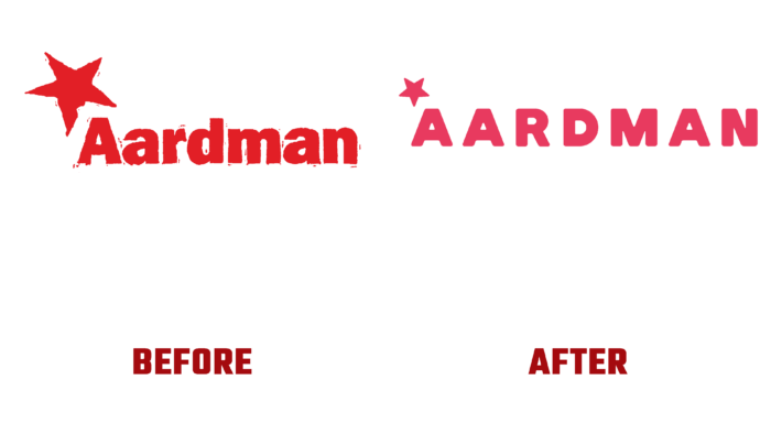
The process of changing the visualization took place with a rethinking of what had already been created earlier, which led to rather mild changes in the corporate style, ensuring its recognizability. Thus, the corporate red color was left, but with a new single shade, a star, and the appearance of familiar characters. Thus, the brand has ensured the preservation of its history, demonstrating commitment and respect for its past. However, the logo, which had a long “work experience,” has been changed significantly. The new look was implemented using different fonts, each carrying its load. Rubik Black was applied in the headings, and the body text was typed using Source Serif Pro.
The new website has been shaped with an important principle in mind – it has become a billboard rather than a traditional brochure. The peculiarity of the work was also taken into account – the creation of characters using hand modeling, which made it possible to introduce fingerprints into the visualization, which gave the brand a more expanded and meaningful look. A second color palette was also created with olive, cream, and pink shades, which made it possible to create unique, fun compositions that increased the attractiveness and degree of recognition.


