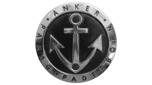
Anker logo is brutal, masculine, and stylish. The emblem conveys strength, power, reliability, and customer loyalty. Motorcycles of the brand ideally keep balance and feel confident on the roads.
Anker: Brand overview
| Founded: | 1902 – 1953 (Motorcycle products) |
| Headquarters: | Germany |
Anker is a German motorcycle brand manufactured by Anker-Werks and its subsidiaries. The Anker logo is imprinted on five bike models: 660, 661, 662, 665, and 666.
Anker-Werks has tried several times to mass-produce motorcycles. The first attempts in 1902 and 1930 were limited to installing engines on bicycle frames, which gave 1.75 and 2.25 horsepower. The work has been most successful since 1949.
Meaning and History
The logo is based on the principle of reliability, confidence, and strong grip of the bike’s wheels with the asphalt of the road—a hint of using the best materials – metal, and leather.
On the emblem is a circle, which is a symbol of the wheel. The iron rim along the edge personified the disks. On the shining metal is the name of the Anker brand.
What is Anker?
A now defunct brand of light German motorcycles manufactured from 1949 to 1953 by the Anker-Werks subsidiary in Paderborn.
Motorcycles got their name from the main company that produced sewing machines. The Anchor machine model was considered the leading one, so in 1906, Bielefelder Nähmaschinen- und Fahrrad-Fabrik AG was renamed Anker-Werks. The words Anchor and Anker are interchangeable; in German, they mean “anchor.” In support of the name, an anchor is drawn in the center of the emblem.
On the logo, the element means high-quality assembly and flawless operation of the device. It is safe to drive a company motorcycle. The convenience and reliability of bikes are time-tested.
The anchor also indicates fidelity. In all three attempts, the company followed the same vector: it worked on creating lightweight products based on a bicycle, improving engines and forks.
Below Anker in a circle on the emblem is an addition: PAMAG Paderborn. The last post-war production of motorcycles began in 1949 and opened in the northeast of Germany in Paderborn. It was handled by a subsidiary set up by Anker-Werks specifically for the transport sector. Its name is an abbreviation that stands for “Paderborner Maschinenbau-AG.”
Due to financial problems, PAMAG was closed after four years in 1953, and the production of motorcycles was transferred to the well-known bicycle company Panther Bikelwerke AG at that time.
Font and Colors
The logo is structured and made of metal and black leather.
- Metallic indicates the main material that the bikes were made of. It is considered an indicator of strength, beauty, and strength.
- Black shows power and confidence and is the main color of the models.
The font is thin, smooth and smooth, and similar to Palomino Sans Two. Hints at the graceful frames of lightweight bikes.
Anker color codes
| Black | Hex color: | #000000 |
|---|---|---|
| RGB: | 0 0 0 | |
| CMYK: | 0 0 0 100 | |
| Pantone: | PMS Process Black C |


