The Suzuki logo is the zigzags of roads, which successfully overcome the cars of this brand. The emblem belongs to hardy and strong cars that are not afraid of loads and always arrive at the destination first.
Suzuki: Brand overview
Suzuki is an international transportation corporation that specializes in manufacturing a wide range of wheeled vehicles. Its range includes various types of cars, ATVs, motorcycles, wheelchairs, and more. The full name of the company is Suzuki Motor Corporation. It has been operating in the specialized market since 1909 when it was founded by industrialist Michio Suzuki. The head office is located in the city of Minami-ku (Hamamatsu). The structure of the company includes 35 plants located in 23 countries and 133 distribution centers operating in 192 countries. In terms of car sales, the corporation is among the top ten in the world. And by the number of motorcycles sold, it ranks third in the Japanese market.
Meaning and History
At first, in the small village of Hamamatsu, entrepreneur Michio Suzuki opened a company for the production of weaving machines, calling it Suzuki Loom Works. To expand his business, which was already successful, the entrepreneur decided to focus on the production of passenger cars. But World War II prevented him from realizing this plan, and he moved on to them later.
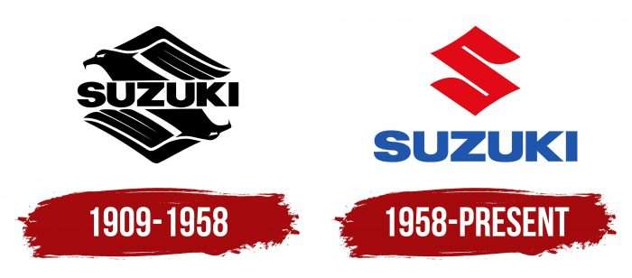
In addition, the plant was widely known for its two-stroke engines, which were produced for motorcycles and cars. After the war, it switched to the production of bicycles with a motor based on them. Motorcycles then came into the arsenal, which brought the company widespread fame. It then moved on to the production of four-stroke engines, cars, and racing cars. Despite this, Suzuki’s automobile division appeared only in 1961. Today, its logo is well-known in all key markets. Overall, the company has two logos.
1909 – 1958
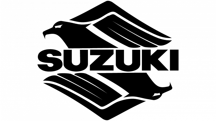
The debut logo was a combination of graphics and text. The developers proposed the capital letter “S” in the form of an eagle. To form the right letter, the bird was placed in a mirror image like on playing cards. In the upper part, the eagle’s head was on the left side and was turned to the left. In the lower part, on the contrary, it looked to the right and was placed down on the right side. The curve of the neck resembled a fragment of the letter “S.” The wing raised upward, adding to the bird’s resemblance to the letter. The upper and lower segments of the initial symbol from the company’s name could be seen in the line of the wing.
The wing consisted of three stripes with pointed ends and one triangular element in the shape of a boomerang. At the end of the beak had a sharp protrusion, which gave the emblem a formidable appearance. The eagle’s focused gaze also indicated the organization’s purposefulness. In the center, the two main figures were separated by the word “Suzuki”. It occupied a horizontal position and was written in broad capital letters, tightly spaced in a line. The font was simple, typed, clean, sans serif.
1958 – today
In 1958, the corporation abandoned the black-and-white logo and opted for a colored one. As the main tone, it used red, with which it colored the graphic sign – the symbol “S.” This time, there is no eagle in it, so you can immediately guess the first letter of the company name. The authors left it angularity, which was formed by the sharp beak and the curve of the wing. By design, the graphic sign now resembles a rhombus. From top to bottom, it has smooth deflections, and the inner parts are decorated with roundings – areas where the tops of the feathers used to be.
Management enlarged the Suzuki name and moved it outside the badge so that in the modern format, it takes up most of the logo. The text is in the same font as before – smooth, geometrically even, wide, simple, chopped. The only difference from the previous version is the blue color that is used instead of black.
Suzuki: Interesting Facts
Suzuki Motor Corporation, headquartered in Japan, boasts a diversified portfolio of vehicles, including cars, motorcycles, and ATVs, making a notable impact globally.
- Foundation: Established in 1909 by Michio Suzuki as Suzuki Loom Works, the company initially catered to Japan’s silk industry, marking the beginning of its long-standing legacy.
- Shift to Vehicles: In 1937, Suzuki embarked on automotive manufacturing, developing prototypes with advanced engines. Although World War II delayed car production, the 1950s saw Suzuki entering the motorized vehicle arena with motorized bicycles.
- Motorcycle Milestones: Suzuki’s contribution to motorcycle engineering includes the T20 or Super Six, introduced in 1965, and the Hayabusa, introduced in 1999. Both models are known for their remarkable speed, leaving a lasting imprint on motorcycle history.
- Automotive Achievements: The Jimny, launched in 1970, is celebrated for its compact design and off-road prowess, while the Swift, introduced in the 2000s, is acclaimed for its design and performance, underscoring Suzuki’s automotive success.
- International Reach: Beyond its Japanese roots, Suzuki enjoys a significant presence worldwide, notably in India, where Maruti Suzuki India Limited has dominated the Indian automotive market for years.
- Racing Heritage: Suzuki’s engagement with MotoGP, including a hiatus and a triumphant return that led to a championship win in 2020 with Joan Mir, reflects its deep ties to motorcycle racing.
- Eco-Friendly Initiatives: Suzuki is engaged in reducing its environmental footprint. It focuses on developing hybrid vehicles and electric scooters, showcasing its dedication to sustainability.
- Technological Frontiers: Suzuki is a pioneer in automotive technology, with developments like the AllGrip 4-wheel drive and advanced safety features enhancing driving experiences and safety.
- Kei Car Expertise: Known for its mastery in crafting kei cars, Suzuki addresses the demand for compact, efficient vehicles in Japan, highlighting its adaptability to market needs.
- Strategic Market Realignments: Suzuki withdrew from the U.S. car market in 2012 to concentrate on its motorcycle, ATV, and marine engine divisions. This strategic pivot reflects its global operational adaptability and focus.
Suzuki’s evolution from its loom-making origins to a significant global entity in the automotive and motorcycle sectors illustrates its commitment to innovation, adaptability, and the continuous pursuit of excellence across diverse markets.
Font and Colors
From the very beginning, the brand logo of the automobile company was based on its name. Moreover, the designers also used the letter “S” for the pictogram, initially depicting it in the form of a powerful, impetuous, and formidable bird.
As an inscription to express its individuality, the car company chose the font Neue Helvetica Pro 93 Extended Black. It was developed by Max Miedinger with the participation of Edward Hoffmann.
The brand palette is simple and includes a limited number of colors. In the first variant, the logo is black and white; in the second variant, it is red and blue.
Suzuki color codes
| Maximum Red | Hex color: | #e20a17 |
|---|---|---|
| RGB: | 226 10 23 | |
| CMYK: | 0 96 90 11 | |
| Pantone: | PMS Bright Red C |
| Dark Powder Blue | Hex color: | #003399 |
|---|---|---|
| RGB: | 0 51 153 | |
| CMYK: | 100 67 0 40 | |
| Pantone: | PMS 286 C |
