The emblem invites the user to get behind the wheel and drive a modern and powerful iron horse. The KTM emblem is full of stability and strength. The emblem represents a large company with an important position in the world of transportation.
KTM: Brand overview
KTM is the largest motorcycle brand, founded in 1934. It started as a small metal workshop, which, under founder Hans Trunkenpoltz, gradually grew into a transportation giant. In 1954, the company switched to the production of motorcycles and supercars. Today, it owns several subsidiaries, and its main sites and headquarters are located in Mattighofen, Austria.
Meaning and History
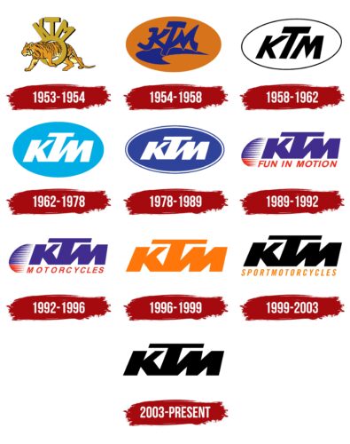
The emblem of the automobile and motorcycle company was developed in 1953, simultaneously with the expansion of the model range. The trademark is based on the abbreviated name of the company – KTM, from the German Kraftfahrzeuge Trunkenpolz Mattighofen (Kronreif Trunkenpolz Mattighofen). From its inception until today, it has changed nine times, but it has always been an abbreviation.
What is KTM?
KTM (short for Kronreif & Trunkenpolz Mattighofen) is an Austrian company that manufactures motorcycles, sports cars, and bicycles. It was founded in 1934 and re-launched in 1992. The factory is owned by Pierer Mobility AG and Bajaj Auto of India.
1953 – 1954
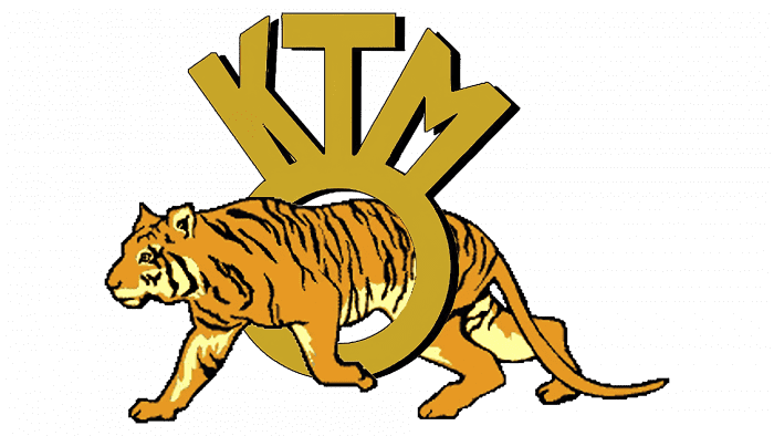
The debut logo featured a tiger passing through a ring with the letters “KTM.” Although this variant was not officially approved, it played an important role in the history of the company’s emblems. It explained how the abbreviation and the circle correlate in other variants. The fact that ring is a polysemantic symbol denoting the inside, the wheel, and movement. The tiger symbolizes strength and energy.
1954 – 1958
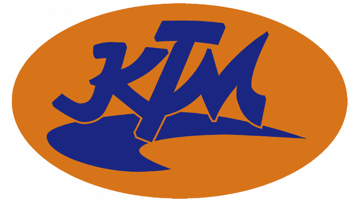
The official logo was approved in the year of the workshop’s rebirth as a major company. The brand name is an orange oval with dark blue lettering in the middle and a semicircle denoting a steep turn.
1958 – 1962
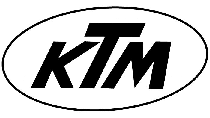
In 1958, the designers offered another variant – minimalist. It has only black letters on a white background, encircled by a thin dark line. The abbreviation is slightly italicized and slanted, but the writing style is strictly geometric, with a highly protruding letter “T.” This variant served as the model for all subsequent changes to the brand’s visual identity.
1962 – 1978
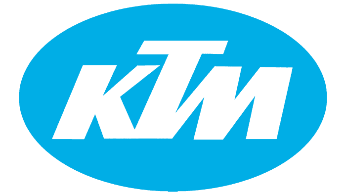
The color appeared in the emblem of this period. Moreover, these are new colors, which were not on the first emblems: a combination of blue and white. The oval shape of the sign remained unchanged, but the letters were adjusted. They became thicker, clearer, and connected at the bottom.
1978 – 1989
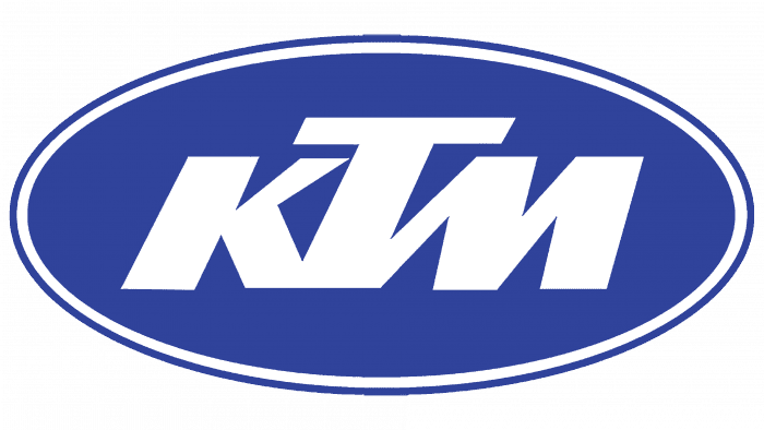
In 1978, a slight redesign was carried out. As a result, a squat inscription appeared in the emblem on a dark blue background – in the form of an elongated oval with a double border. In style, this variant looks more strict than the previous ones.
1989 – 1992
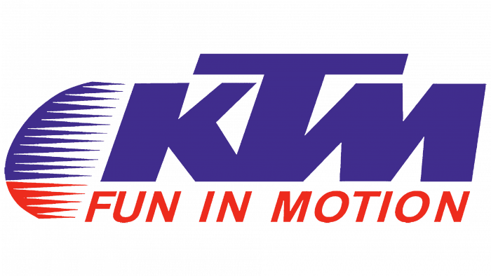
The year 1989 brought radical changes. The developers removed the frame and oval, leaving the abbreviation open. The letters are now blue, and the head “T” is lengthened and covers the neighboring “K” and “M” up to the middle. The slogan “Fun in Motion” appears below the company name, written in red. To the left of the abbreviation is a graphic sign in the form of a semicircle mottled with many thin blue-red stripes.
The emblem was a semicircle dissected by many thin lines and was two-colored, reflecting the style of the inscription – blue top and red bottom.
1992 – 1996
Only the motto was changed: it was replaced by the word “Motorcycles.” This was done to indicate the range of products.
1996 – 1999
In 1996, the brand received the logo in its debut color, orange. This version was again minimalistic, as the slogan and graphic mark disappeared from it. Now, it is a simple abbreviation on a white background. According to the designers’ idea, it expresses the energy and dynamism of the manufacturer.
1999 – 2003
Another color change took place: now the letters became black. And the orange color moved to the lower part, which consists of the word “Sportmotorcycles”.
2003 – today
The current logo is an exact repetition of the previous one but without additional lettering.
KTM: Interesting Facts
KTM, based in Austria, is famous for its off-road motorcycles but has also gained a strong reputation for street bikes.
- Beginning: KTM started in 1934 as a metalworking shop by Hans Trunkenpolz in Mattighofen, Austria. The company didn’t make motorcycles until 1953, with the R100 being its first.
- Racing Success: Known for dominating the Dakar Rally since 2001, KTM proves the reliability and performance of its bikes under tough conditions.
- Street Motorcycles: Beyond off-road bikes, KTM has successfully entered the street motorcycle market with models like the Duke and RC series, which have been praised for their performance and design.
- Motto: “READY TO RACE” encapsulates KTM’s focus on producing competitive, high-performance motorcycles for racing and consumer use.
- Design: KTM’s bikes are known for their aggressive styling and bright colors, especially the signature orange, making them stand out.
- Bajaj Auto Partnership: In 2007, KTM partnered with Bajaj Auto, a major motorcycle manufacturer in India. This collaboration helped KTM expand globally and produce smaller bikes.
- Electric Bikes: KTM leads electric mobility with models like the Freeride E-XC, highlighting its commitment to sustainable transportation.
- Sports Car: The X-Bow, launched in 2008, marked KTM’s entry into sports cars, showcasing its racing expertise and engineering skills in a high-performance, lightweight vehicle.
- Global Presence: With a strong international market presence, KTM’s success beyond Austria underlines its global appeal and commitment to quality and innovation.
- Company Structure: KTM is part of KTM Industries AG, which includes brands like Husqvarna and GasGas. This allows for shared technology and resources.
From a small workshop to a leading name in motorcycle manufacturing, KTM’s story is one of constant innovation, a commitment to excellence, and a passion for motorsport, maintaining its leadership in the industry.
Font and Colors
The main element of the brand’s visual identity is the font, so it is not used much in the graphics. It represents an oval or a semicircle, depending on the year of the logo.
In all but the first two variants, the inscriptions are made in a strict individual font – capital letters, smooth, without serifs, with sharp corners. The emblems reflect the corporate colors of the company: orange, blue, black, red, and white.
KTM color codes
| Black | Hex color: | #000000 |
|---|---|---|
| RGB: | 0 0 0 | |
| CMYK: | 0 0 0 100 | |
| Pantone: | PMS Process Black C |
| Safety Orange | Hex color: | #f2771a |
|---|---|---|
| RGB: | 242 119 26 | |
| CMYK: | 0 51 89 5 | |
| Pantone: | PMS 1585 C |
| Eerie Black | Hex color: | #1c1919 |
|---|---|---|
| RGB: | 28 25 25 | |
| CMYK: | 0 11 11 89 | |
| Pantone: | PMS Neutral Black C |
