The Triumph logo shows that the motorcycles of this brand are able to carry the rider over the abyss, cope with the most difficult road conditions, and pass where other vehicles cannot pass.
Triumph: Brand overview
Triumph is a legendary motorcycle manufacturer. The company was founded by a German immigrant who moved to the UK in 1880 to sell imported bicycles and sewing machines. Seven years later, he opened Bettmann & Co. and began producing two-wheeled vehicles under the Triumph brand. An attempt to switch to automobile production failed during the “Great Depression,” so the factory remained a motorcycle factory.
Meaning and History
The debut motorcycle with the Triumph emblem appeared in 1902. Before that, the brand decorated only bicycles that appeared on the English market in 1887. During the XX century changed not only the models of vehicles but also the emblems of the manufacturer.
It often happened so that one series was designated by one symbol and the second – completely different since the company paid as much attention to design as to the technical component. This means that it is possible to determine the years of existence of this or that Triumph sign only approximately.
What is Triumph?
Triumph is a British motorcycle brand that has existed since 1983, created by John Bloor. The founder bought the rights to the name and production of motorcycles from the previous company, renaming his firm Bonneville Coventry Ltd. As a result, the company continued its line of two-wheeled vehicles. Its main manufacturing sites were in Thailand, and its headquarters were in Hinckley.
1902 – 1906
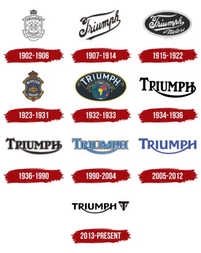
The first emblem, which appeared on a motorcycle in 1902, had been in use since 1887 but adorned Triumph Cycle Co. bicycles. It was an elaborate coat of arms with a crown and six flags. COVENTRY indicated the location of the company.
1907 – 1914
Increased exports led the designers to replace the shield with the words “America, Europe and Australia”. At the same time, the company’s name, in a stylized font, began to appear more frequently on fuel tanks.
1915 – 1922
In 1914, the slogan disappeared. It was replaced by a bold italicized “MOTORS” lettering, which, together with “TRIUMPH,” was placed inside a black horizontal ellipse.
1923 – 1931
In the 1920s, designers brought back the classic shield by adding new colors to it. The center area became blue, the border became dark gold, and a red inverted triangle appeared at the bottom.
1932 – 1933
Triumph’s success in foreign markets led to a major rebranding in 1929. So, there was a whole series of emblems with the image of the globe. Various modifications decorated the fuel tanks of motorcycles until 1933. Some versions were supplemented with the slogan “Triumph All Over The World”.
1934 – 1936
In 1934, a new logo in the form of the word “TRIUMPH” appeared in the Val Page line. The font looked unusual due to the curved line connecting the letters “R” and “H”. The “sweeping-R” trademark appeared much earlier, as early as 1914, but then it was used only on booklets, banners, and posters. It was used on motorcycles from 1931, although its style was slightly different from the first version. The Val Page models used a variant with a thin font.
1936 – 1990
In 1936, the company launched a series of motorcycles designed by Edward Turner. Their logo was as close as possible to the original, presented in 1914 on the cover of the advertising booklet. It differed from the previous version by having clearer lettering. After Meriden’s death in 1983, this mark became the basis of Triumph’s corporate style.
1990 – 2004
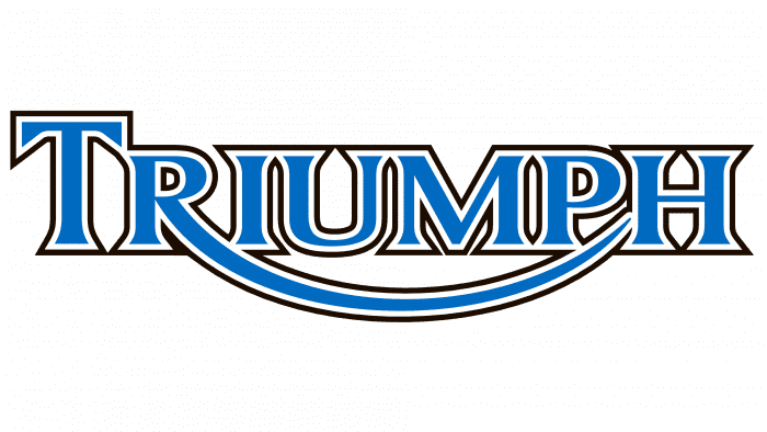
John Bloor’s motorcycles, which debuted in 1990, were decorated with an updated emblem. It was distinguished from the classic version by its blue color, sharply angled serifs, and the changed shape of the line going from “R” to “H.”
2005 – 2012
In 2005, the serifs and outlines disappeared, and the elongated “R” leg became even thinner. The blue color took on a cobalt hue. In 2011, the Daytona 675, Street Triple, and Speed Triple models were given a logo with black letters on a white background.
2013 – today
The final version of the trademark appeared in 2013. It was designed by Wolff Olins Studio in collaboration with Rick Banks, who changed the font, added rounded corners, and reduced the height of the “T.”
Triumph: Interesting Facts
Triumph Motorcycles Ltd is a standout example of British engineering and motorcycle culture, thanks to its interesting history and John Bloor’s revival efforts.
- Background and Comeback: Triumph started in 1902 but ran into financial trouble in the early 1980s. John Bloor bought the Triumph name in 1983, marking the start of a new era for the brand as a major player in the motorcycle world.
- A Fresh Start: John Bloor built a new, advanced manufacturing plant in Hinckley, bearing the Triumph name, to kickstart the brand’s comeback.
- Worldwide Love: Today, Triumph is the biggest British motorcycle maker, known globally for the quality, performance, and unique style of its bikes.
- Innovations and Bikes for Everyone: Triumph leads in motorcycle innovation, offering bikes for riders, including classic, cruiser, adventure, and sport types. Their triple-cylinder engines are particularly praised for their power and smoothness.
- Racing Heritage: Triumph has a rich history in motorcycle racing, including breaking speed records and competing in the Isle of Man TT. This racing spirit has shaped their high-performance models and tech.
- Famous Models: Triumph’s most beloved motorcycles include the Bonneville, Thruxton, and Tiger. These bikes mix classic appeal with modern tech and design.
- Celebrity Fans: Stars like Steve McQueen, James Dean, and Tom Cruise in “Mission: Impossible” have all been seen riding Triumphs, adding to the brand’s cool and rebellious image.
- Customization Culture: Triumph embraces the trend of customizing bikes and supports the community with accessories, special editions, and collaborations.
- Celebrating History: The Triumph Factory Visitor Experience in Hinckley features a museum with historical models and the story of Triumph, plus a tour of their modern manufacturing process.
Triumph Motorcycles represents a blend of tradition and innovation, showing how a storied brand can keep evolving while staying true to its roots in British motorcycle craftsmanship.
Font and Colors
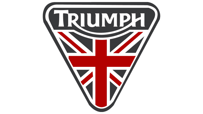
In 2013, the brand introduced an emblem in the form of an inverted triangle with the words “TRIUMPH” and fragments of the Union Jack flag. It is based on the original engine markings from the 1930s.
With the latest logo update, the font has a more symmetrical look. The serifs are gone, the corners are rounded, and the right foot of the “R” transitions to an “H.” The palette is dominated by black, with white used as an additional color.
Triumph color codes
| Black | Hex color: | #000000 |
|---|---|---|
| RGB: | 0 0 0 | |
| CMYK: | 0 0 0 100 | |
| Pantone: | PMS Process Black C |
