


 Harley Davidson Logo PNG
The Harley-Davidson emblem, also known as the Bar-and-Shield, pays tribute to the brand’s history and is known worldwide as the hallmark of the manufacturer of legendary American motorcycles. The modern version of the emblem reflects a new concept focused on the future and the close connection between past and future.
Harley-Davidson began in Milwaukee in 1901 when William Harley designed a small engine for a bicycle. In 1903, Arthur Davidson and Walter Davidson built the first motorcycle in a wooden shed and registered the company. Early models lacked power, so they later introduced a 405 cc engine.
By 1907, production reached 150 bikes, including police sales. In 1909, the V-twin engine appeared, pushing speed close to 100 km/h and shaping a distinct sound. By 1913, output exceeded 12,000 units, with the Indian Motorcycle Company as the main rival.
World War I drove demand. The US Army bought over 20,000 motorcycles, and by 1918, about half of production went to the military. In the 1920s, exports reached 67 countries. During the Great Depression, most US makers collapsed, leaving Harley and Indian. In 1953, the company Indian closed.
In 1965, the company went public. Japanese brands Honda, Kawasaki, Suzuki, and Yamaha gained ground. In 1969, American Machine and Foundry acquired Harley-Davidson, which raised output but damaged quality.
In 1981, managers led by Vaughn Beals and Willie G. Davidson bought the company with Citicorp’s support. In 1983, tariffs on large Japanese bikes provided relief. Production methods improved, the Evolution engine launched in 1984, and the Harley Owners Group was formed.
In 1990, the Fat Boy became a key model. In 2003, more than 250,000 people marked the centennial in Milwaukee. The museum opened in 2008. In 2019, LiveWire launched its electric motorcycle, and in 2022, LiveWire became a separate public company.
Meaning and History

Although the company was founded in 1903, the Harley-Davidson logo appeared several years later: according to one account, in 2009; according to another, in 1910. The brand name immediately became famous in races and endurance tests: the motorcycles took the first seven places.
Janet Davidson invented the famous design. She worked at her uncle Alexander McNabb’s lingerie store and used her artistic talent to create original monograms for delicate textiles. She enjoyed this so much that Janet made a Harley-Davidson badge; she applied it to motorcycles, decorating each tank and wing with a pattern. The elder sister was proud to help her brothers and to help make their dreams come true.
This logo has been in use for over a hundred years. In 1982, the U.S. Patent and Trademark Office officially registered it. The company also used temporary trademarks for anniversary dates. In 1953, when the first Harley-Davidson motorcycle turned 50, the company celebrated the occasion with a new emblem. The design was carefully thought out: the letter “V” indicated the engine type, and owners liked the medallion version so much that the company kept it on the front wings of all 1954 motorcycles.
In 1976, for the USA’s bicentennial, artist Paul Smith revised the mark’s design, adding an eagle. This variant first appeared on Liberty Edition models. In 1978, for Harley-Davidson’s 75th anniversary, the company created another logo, but it appeared only on souvenir products. Soon after, company managers recognized the advertising potential of emblems, and after 1978, they began releasing a special series of motorcycles featuring anniversary emblems for every fifth anniversary.
What is Harley-Davidson?
Harley-Davidson is a legendary motorcycle brand from the USA. Mechanical engineer William S. Harley and three members of the Davidson family (Arthur, Walter, and William) founded the company in 1903. This cult brand’s headquarters is in Milwaukee, Wisconsin.
1910 – 1953
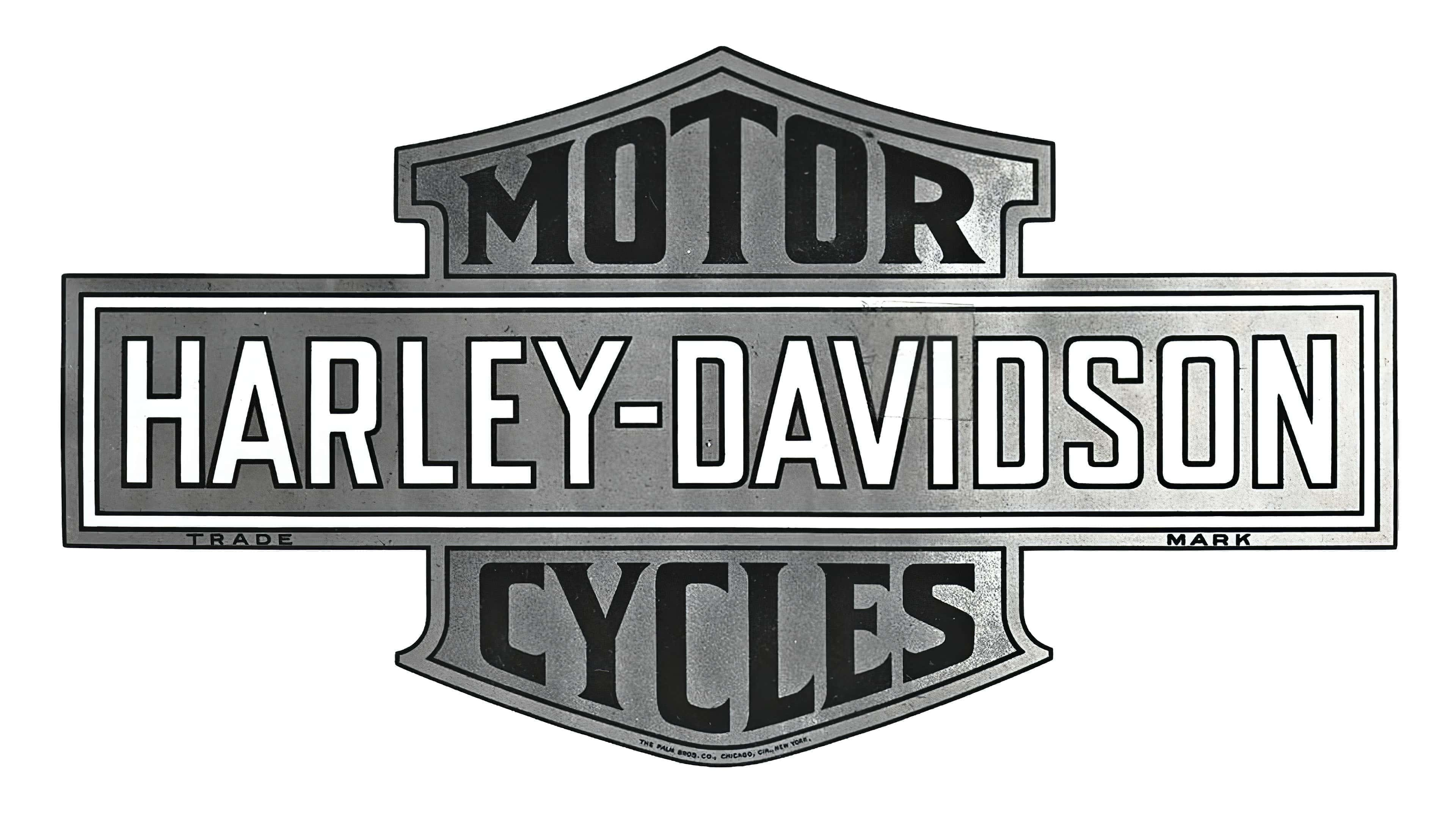
During those years, the phrase “Harley-Davidson” is hyphenated and centered in the brand name. Around the perimeter, it is enclosed in a rectangular frame with a double border. The letters are white, narrow, and elongated. The words “TRADE” (left) and “MARK” (right) appear in small type on the outermost stripe.
A horizontal figure divides two-sided triangles into two halves, resembling shields. At the top is the word “MOTOR,” and at the bottom is “CYCLES.” The letters vary in size: large in the middle and small at the edges, so the words look like pyramids. The triangles are direction indicators.
1953 – 1981
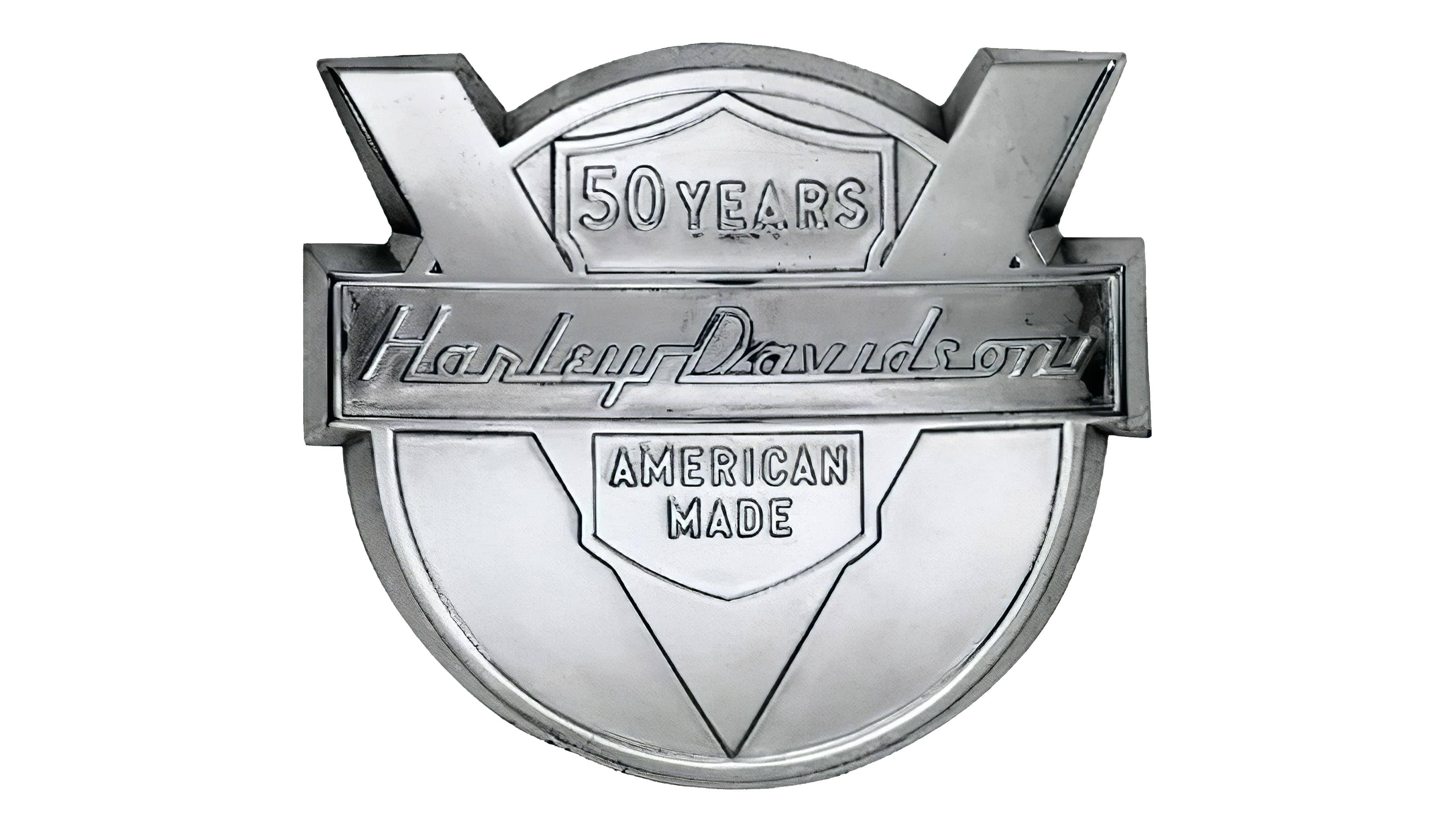
In 1953, an anniversary emblem was introduced, and the administration liked it so much that it adopted it instead of the main emblem. In the center is a horizontal rectangle with the inscription “Harley-Davidson.” It resembles handwritten text and uses a casual font with an engraving-like effect. The letters are connected, semi-cursive.
The rectangle’s background is the Latin letter “V,” indicating the engine type. At the top is a shield indicating the brand’s age: “50 years.” In the sharp triangle formed by the “V” sign, the inscription “AMERICAN MADE” is placed in two rows. All elements are arranged in a circle, giving the logo a medal-like appearance.
1981 – today
The modern version is almost identical to the debut one. The only differences are the decorative design of the shield’s corners and a more compact arrangement of letters in the central inscription.
Font and Colors
The first symbol, invented by Janet Davidson, is called Bar-and-Shield, as it represents a heraldic shield divided in the middle by a horizontal bar. At the top is the inscription “MOTOR,” at the bottom is “CYCLES” (sometimes “COMPANY”), and in the middle is “HARLEY-DAVIDSON.” This version is considered standard, but each company office has its unique logo. The 1965 version is considered iconic. It differs from the classic one with bold letters, wide frames, and a black-and-white color scheme (original).
In 2019, the manufacturer announced a global redesign, saying the first motorcycles with the new emblems would go on sale in 2020. The style change will happen in stages, and the visual concept will evolve by 2025, giving fans time to adjust to the brand’s new look. The old symbol will remain, but as a tribute to a bygone era. It will still be used in the context of the company’s heritage.
The designers of the modern emblem retained the Bar-and-Shield, also known as the shield-and-bar. It represents a heraldic shield divided into two parts by a horizontal rectangle. The new version conveys Harley-Davidson’s modern style. The corners and proportions have slightly changed, and the lines have become a little thinner.
The classic logo contains orange letters “MOTOR,” “CYCLES” (“COMPANY”), and white “HARLEY-DAVIDSON.” The text on the shield uses a non-standard font: “MOTOR” is stretched upward, and “CYCLES” is stretched downward as a frame. The company name is in a standard bold grotesque. The background color is black.
The new, minimalist emblem includes no descriptions. The palette is uniform: the shield is presented in monochrome black and white.