


![]() Yamaha Logo PNG
Yamaha Logo PNG
The Yamaha emblem guarantees speed and perfect riding. A motorcycle of this brand rushes like an arrow in the direction the driver chooses. The emblem predicts good luck and evokes a sense of harmony and balance.
Yamaha Motor traces back to 1887, when Torakusu Yamaha repaired and rebuilt a reed organ in Hamamatsu. This led to the founding of Nippon Gakki in 1897, which later became Yamaha Corporation.
In 1953, Genichi Kawakami initiated an expansion into motorcycles by studying the DKW RT125. The same base influenced BSA and Harley-Davidson.
Yamaha Motor Company was founded on July 1, 1955. The YA-1 launched in August and won the Asama race in 1955 and 1956, linking early sales with racing exposure.
In 1958, Yamaha entered the US market, competing with Honda. Both brands used racing to support exports and product development.
In 1961, Yamaha recorded its first Grand Prix wins in the 125cc and 250cc classes. In 1964, Phil Read secured a world title. In 1972, Giacomo Agostini delivered the first 500cc championship after moving from MV Agusta.
Diversification followed. In 1963, Yamaha released a snowmobile. In 1968, it entered the personal watercraft market, competing with Kawasaki. The company expanded into outboard motors, generators, ATVs, and industrial equipment.
In 1981, Yamaha challenged Honda in a large-scale production campaign. Honda responded with rapid model expansion and price pressure, leaving Yamaha with excess stock and financial losses.
In 1989, Yamaha introduced the PAS electric assist bicycle system, which was later adopted across the industry. In the 1990s, it developed engines for Toyota, Lexus, and Ford, including high-performance units.
In 2004, Yamaha entered Formula 1 engine projects while maintaining focus on MotoGP. From 2004 through the 2010s, Valentino Rossi secured multiple titles, reinforcing its racing presence.
Meaning and History
![]()
In fact, the brand’s career growth began in 1887, when Torakusu Yamaha established Nippon Gakki Co., Ltd. to manufacture musical instruments. Gradually, the successful organization expanded and began opening divisions unrelated to its core business. One of them is the equipment manufacturing subsidiary of the same name.
The transportation division emerged in the post-war years, when demand for pianos decreased while demand for motorcycles and other modes of transportation increased. It gradually moved away from the parent corporation and became legally independent. But financially, it is still linked to Yamaha Corporation (formerly Nippon Gakki), which holds a controlling interest.
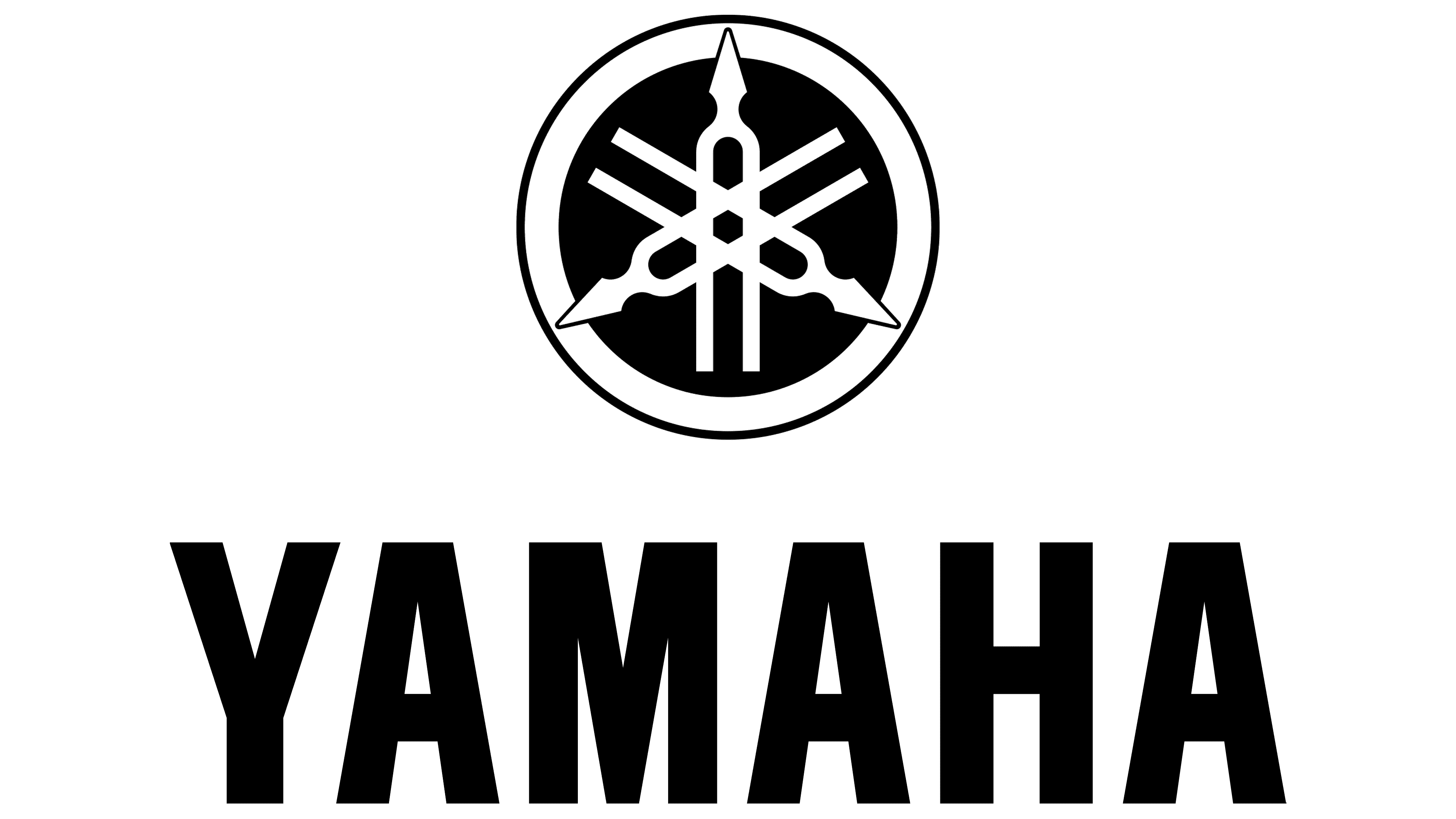
The Yamaha Motor Company logo is a tribute to the founder. It depicts three tuning forks for musical instruments. They are intertwined in an original shape, forming a customized pattern. Throughout the brand’s existence, it had only two corporate symbols. The first one, black-and-white, was used until 1998. The second is a red sign with a metallic sheen, which remains relevant today.
What is Yamaha?
Yamaha is a Japanese multinational corporation founded in 1887. It is one of the world’s leading manufacturers of musical instruments. Since 1955, the company has also produced legendary motorcycles. Its founder is Torakusu Yamaha. The company is headquartered in Hamamatsu City, Shizuoka Prefecture.
1955 – 1964
![]()
The debut logo features a large “M” letter combined with tuning forks. Their outlines can be seen in the letter’s figure and its gaps. In total, there are three stylized instrument tuning forks, one in the center and two others on the right and left. Each of them repeats the written symbol, forming a single structure, since it cannot be considered a textual emblem: it contains only graphics. Three more forks cross each other and are placed at the top, above the word “motorcycle” emblem. In this way, the two-wheeler company is thanking the parent company that makes musical instruments. All elements are surrounded by a thin ring and placed inside an even circle.
1964 – today
![]()
After the redesign, there was a radical revolution in the corporate style, and there are several reasons for this:
- The developers added text to the logo.
- The bulky letter “M” disappeared from the visual identification mark.
- The tuning forks have been reconfigured and placed in a double ring.
The nozzles are positioned to give the rim a hub-like shape. The brand name is in a smooth font. The chopped symbols are clearly visible on a white background and are easy to read.
1998 – present
![]()
This variant of the logo is iconic, as it first appeared in colorful colors. The background circle, edge lines, and lettering are colored red, while the forks and the wide dividing stripe are colored metallic. This is done to emphasize the badge’s similarity to the wheel and rim. In addition, a gradient and sparkling highlights have been added to the circle to make it look more convex.
Font and Colors
The logos of both the main corporation and the transportation division are very similar. This is because the subsidiary manufactured products under the parent company’s brand name and was only separated from it in 1964. In 1976, it received its own trademark, which differed from the basic one in some details.
In the word “Yamaha,” the center element of the letter “M” is symmetrical and has the correct shape, while in the corporate logo, it is shortened. The next difference is in the tuning forks. In the motorcycle manufacturer, the tips extend beyond the inner circle and contact the outer band. While in the emblem of the music giant, the circle is only one, and the forks do not reach the edge at all.

Forks symbolize the unification of rhythm, harmony, and melody. The Yamaha emblem symbolizes the basis of business partnerships: technology, production, and trade. The logo also signifies a powerful life force securely contained within a circle.
Yamaha Motor Co. Ltd. uses a symmetrical typographic emblem in which the middle column of the letter “M” is not abbreviated. The lettering is in a smooth sans-serif uppercase font. The transportation brand’s color palette is black, white, and red, while the parent corporation uses purple only in its logo.