The Benelli logo depicts the leader in its segment. It shows the premium quality and power of the company’s motorcycle engine. The emblem guarantees a long life of the vehicle, during which maximum performance awaits the buyer.
Benelli: Brand overview
Benelli is an Italian motorcycle company owned by the South Korean concern Qianjiang since 2005. Teresa Benelli founded it in 1911 to provide jobs for her sons. At first, it was an automobile repair shop, then a small engine manufacturing business. In 1921, the family produced its first motorcycle.
Meaning and History
In the history of Benelli, there are many emblems of the lion. The proud predator has been decorating the shiny sides of motorcycles for at least a century, emphasizing the visual identity of the brand.
For a hundred years, only the art has changed. Once, it was primitive, which gave the animal a cartoonish appearance. But as the company evolved, the artists updated the logo, making the lion black and white. They also added additional elements with deeper meaning: a laurel wreath (symbolizing victory and triumph) and three stars (portending a successful future).
What is Benelli?
Benelli is an Italian motorcycle brand, the second oldest in the country. It has existed since 1911 and still produces two-wheeled equipment. Currently, the factory is owned by the Chinese company Qianjiang Motorcycle, which is part of the Geely Holding Group. The headquarters are located in Pesaro (Marche).
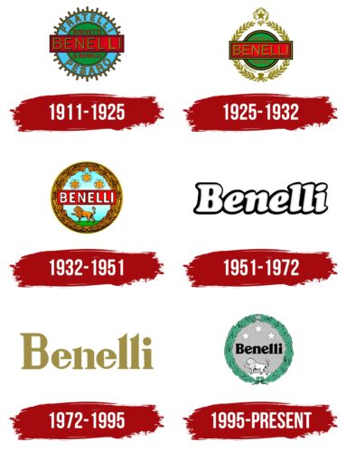
1911 – 1925
The debut emblem of the Italian motorcycle brand resembled a wheel with a studded tire. High and low protrusions were located around the entire circumference and were arranged in sequence. They served as a border. They were followed by a wide azure stripe with two inscriptions indicating the founders of the trademark – “Fratelli” at the top and “Pesaro” at the bottom. Then, there was a green circle, which was crossed horizontally by a red rectangle. There was also the text: “Brevetti,” “G. Benelli,” and the name of the company in large print. The central inscription was yellow with a black border.
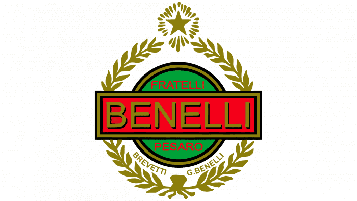
1925 – 1932
In 1925, the developers undertook a redesign of the logo. It turned out to be successful, as it became visually simpler: in place of spikes and stripes appeared a laurel wreath, at the top – a shining star and the central circle were reduced. Some of the inscriptions disappeared – only three remained. Among them – Benelli (in the middle), Fratelli and Pesaro (green background).
1932 – 1951
The designers kept the round shape of the emblem and made some refinements to it. First of all, they finalized the laurel branches, adding more details. To give the wreath a realistic look, they drew veins and berries. They removed the triple frame from the rectangle, enlarged the letters, and made them white. In the upper part of the circle, symbolizing the sky, there are three large stars; in the lower part – a pale green field on which the lion is walking. The predator has a proud posture and a raised paw, with which he points to the left.
1951 – 1972
The year 1951 was a turning point in the history of the logo because, after a long existence of a round logo with a lot of small details, a concise text version appeared. Thus began the era of the letter logo. The shape of the letters changed significantly: they became italicized and lowercase, except for the capital “B”. The dot above the letter “i,” developers made oval and inter-letter spaces painted black. All characters now have a dark outline, so the contrast makes the white characters appear hollow.
1972 – 1995
Delving deeper into the text logo theme, the designers changed the style of the logo. The letters are now serifed, printed, and colored in gold.
1995 – today
At the turn of the millennium, the brand brought back one of its old emblems – from 1932. The adjustments were mainly to the colors and internal elements. The developers painted the laurel wreath in green, the lion, stars, and earth – in white, the sky and background – in metal. In addition, short strokes around the stars were removed, which gave them a glowing effect. In the center, as before, is the company name taken from the previous logo.
Benelli: Interesting Facts
Benelli, a legendary motorcycle name, is celebrated for its history, innovation, and unique designs. Starting in Italy, Benelli represents the pinnacle of motorcycle craftsmanship.
- Italian Origins: Founded in 1911 in Pesaro, Italy, by the Benelli family, the company first repaired bicycles and motorcycles before making its bikes.
- Debut Motorcycle: In 1920, Benelli made its first bike with a single-cylinder engine, marking the start of its legacy in building motorcycles.
- Racing Achievements: Benelli won its first world championship in 1950 with rider Dario Ambrosini, boosting its reputation for performance and dependability.
- Design Innovation: The brand is famous for its creative bike designs, notably the six-cylinder Benelli Sei in the 1970s, the first bike with a six-cylinder engine, highlighting Benelli’s engineering skill and innovative spirit.
- Revival: In 2005, facing economic difficulties and ownership changes, Benelli joined the Qianjiang Group, revitalizing the brand with new models and reaching new markets.
- Diverse Models: Benelli now offers various motorcycles, including naked, sport, adventure bikes, and cruisers, catering to many riders.
- Worldwide Expansion: Since joining the Qianjiang Group, Benelli has grown globally, reaching customers in Europe, Asia, and the Americas.
- Electric Ventures: Benelli is exploring electric motorcycles and scooters, showing its commitment to sustainable and innovative transport solutions.
- Cultural Impact: Benelli bikes are cultural symbols featured globally in films, TV, and media. They encapsulate the passion and excellence of Italian motorcycle engineering, making them cherished by enthusiasts and collectors.
Benelli’s rise from a small workshop to a worldwide motorcycle powerhouse highlights its resilience, inventive approach, and lasting charm. With over a century of history, Benelli continues to enchant riders with its mix of traditional craftsmanship and modern innovation.
Font and Colors
The current logo looks like a silver medallion, from which horizontal lines diverge in both directions. A shadow is cast on the bottom half of the circle, creating a gradient effect.
Inside is a green wreath with detailed leaves. It surrounds the other elements. Below is a lion walking to the left. Above – three white stars with black outlines. In the very center is the name of the company. If earlier the word “Benelli” was placed in a red rectangle, now it is not limited by any frames.
The font of the inscription is vintage, with short serifs. It cannot be considered classic, as the designers used original typographic techniques. The tops of “n,” “l,” and “i” are slightly beveled. The connecting strokes “e” are also uneven: they are stretched upward diagonally.
Benelli color codes
| Silver | Hex color: | #c0c0c0 |
|---|---|---|
| RGB: | 192 192 192 | |
| CMYK: | 0 0 0 25 | |
| Pantone: | PMS Cool Gray 4 C |
| Shamrock | Hex color: | #51c69a |
|---|---|---|
| RGB: | 81 198 154 | |
| CMYK: | 59 0 22 22 | |
| Pantone: | PMS 3395 C |
| Black | Hex color: | #000000 |
|---|---|---|
| RGB: | 0 0 0 | |
| CMYK: | 0 0 0 100 | |
| Pantone: | PMS Process Black C |


