The proud and bellicose Moto Guzzi logo conveys the power and strength of the brand’s motorcycle engines. The masculine design is complemented by excellent “stuffing.” The emblem is oriented to the male audience and is filled with the idea of leadership and greatness.
Moto Guzzi: Brand overview
Moto Guzzi is a legendary manufacturer of motorcycles. It originated from Società Anonima Moto Guzzi, which was founded in 1921 by shipowner heir Giorgio Parodi, his brother Angelo, and mechanic Carlo Guzzi. In 1946, after rebranding, the company was renamed Moto Guzzi SpA. It is now owned by Piaggio & CSpA, and its headquarters, as a hundred years ago, are located in Mandello del Lario.
Meaning and History
During World War I, two pilots and their mechanics had an interesting idea: they decided to team up and create a motorcycle manufacturing company. It was planned that one of them (motorcycle racer Giovanni Ravelli) would test and advertise the technique, the second (Giorgio Parodi) would finance the enterprise, and the third (Carlo Guzzi) would be engaged in production. But Ravelli died in an airplane crash in the last days of the fighting. So, the inseparable trio, which became close despite the difference in social status, was left without a motorcycle racer. Moto Guzzi uses an eagle emblem in his memory.
What is Moto Guzzi?
Moto Guzzi is an old Italian company, one of the first in Europe to start manufacturing motorcycles. It was founded in 1921 and began its activity with the production of two-wheeled transport under the brand GP. Since then, the list of brands has significantly expanded and includes such popular models as Stelvio, Norge, Griso, and California. Moto Guzzi not only produces motorcycles but also participates in various races.
1921 – 1924
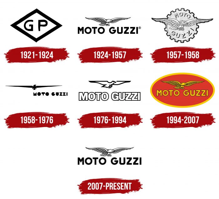
The first experimental motorcycle went on sale in 1921. Its tank was decorated with a diamond-shaped emblem with the inscription “GP”. These were the initial letters of the names of Carlo Guzzi and Giorgio Parodi.
1924 – 1957
The owners of the company decided not to name their motorcycles “GP” to avoid confusion with Giorgio Parodi’s initials. This was insisted on by Giorgio himself. He also suggested using the full version of the Guzzi surname. As a result, the brand was renamed Moto Guzzi and received a new logo. The name, as before, consisted of black letters with serifs. A proud eagle spread its wings above the inscription, a tribute to the fallen pilot Giovanni Ravelli.
1957 – 1958
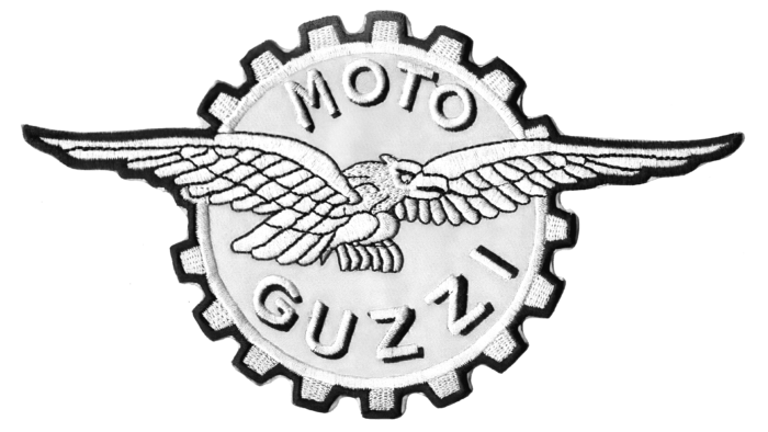
In 1957, the phrase “MOTO GUZZI” was transferred to the gear with rectangular teeth: the first word was at the top, the second at the bottom. The eagle moved to the center.
1958 – 1976
The emblem, which appeared in 1958, was nicknamed Del Gambalunga because of its characteristic elongated shape. The bird and the inscription were retained, but the eagle turned into a long, thin strip of black color, and the company name took its place in the lower right corner. There were rumors that the symbol was associated with fascism, although, in fact, it was just an unfortunate design.
1976 – 1994
After another redesign, the eagle got a clearer outline. The letters became larger, and the distance between the letters became much smaller. Until 1994, white color prevailed in the logo; black was used only for outlines.
1994 – 2007
In 1994, the designers detailed the bird with feathers, legs, and a detailed head. The spacing between characters was increased, making the lettering more legible. All elements remained in place but were repainted yellow and placed inside a red oval with a yellow border.
2007 – today
Graphic agency Metalli Lindberg brought back the black and white version and removed the elliptical border.
The eagle is a tribute to the military pilot Giovanni Ravelli, who was to become one of the founders of the company. In addition, the proud bird symbolizes freedom and is associated with Moto Guzzi motorcycles. The names of the models touch upon the theme of flight in one way or another: Condor, Airone, Astore, Falcone.
Moto Guzzi: Interesting Facts
Moto Guzzi, a legendary motorcycle maker, was founded by Carlo Guzzi and Giorgio Parodi on March 15, 1921, in Mandello del Lario, Italy. Known for its rich heritage, innovative engineering, and unique designs.
- Eagle Logo: The eagle in the Moto Guzzi logo honors Giovanni Ravelli, a founding member and aviator who died in a plane crash after World War I. The logo symbolizes speed, freedom, and Ravelli’s spirit.
- First Bike: The first Moto Guzzi bike, the Normale, had a 500cc single-cylinder engine, showcasing the brand’s focus on reliability and innovation.
- Racing Achievements: With over 3,000 race wins, including 14 World GP Championships and 11 Isle of Man TT victories, Moto Guzzi’s racing excellence has deeply influenced its bikes.
- Wind Tunnel: In 1950, Moto Guzzi built the first motorcycle wind tunnel, enhancing their bikes’ aerodynamics and performance and highlighting their innovation.
- Engine Design: The brand is famous for its air-cooled V-twin engines mounted longitudinally, creating a distinctive look and sound, first introduced with the 1967 V7.
- Mandello del Lario Factory: The original factory is more than just a manufacturing site; it is a gathering spot for Moto Guzzi fans worldwide, showcasing the brand’s community spirit.
- Iconic Models: Moto Guzzi has created many beloved models, like the Le Mans, California, and Griso, each blending style, performance, and comfort.
- Police Bikes: The brand has supplied motorcycles to police forces around the globe, particularly the California model, known for its dependability and performance.
- Piaggio Group Acquisition: Since joining the Piaggio Group in 2004, Moto Guzzi has continued its tradition of innovation with access to more resources and technology.
- Modern Yet Classic: Moto Guzzi maintains its heritage by hand-building every bike in its original factory while embracing modern technology, as seen in the V85 TT adventure bike.
Moto Guzzi’s commitment to innovation, craftsmanship, and distinctive design has earned it a special place in the hearts of motorcycle enthusiasts. It promises a blend of tradition and modernity for the future.
Font and Colors
The bold sans serif font was created specifically for the logo. It vaguely resembles Bernhard Fashion BT (except for the letter “G”). The font also resembles Gotham Bold, Futura Bold, or Gill Sans Bold, although the match is not exact. A similar capital “M” is found in Neutra Face and Verlag fonts.
There are only two colors in the main palette: black and white. It’s a design classic that has characterized Moto Guzzi since 1921.
Moto Guzzi color codes
| Black | Hex color: | #000000 |
|---|---|---|
| RGB: | 0 0 0 | |
| CMYK: | 0 0 0 100 | |
| Pantone: | PMS Process Black C |
