Leading EdTech supplier Anthology has announced a new phase in its development, highlighting its dedication to using technology and education to create transformative opportunities. At Anthology Together 2024, the company’s annual user conference, the new purpose, vision, and brand identity were unveiled, centering around customer-centered innovation.
The new tagline, Power of Together™, underscores the company’s commitment to innovation and quality. It reflects the integration of industry-leading Student Information Systems (SIS), Learning Management Systems (LMS), and Customer Relationship Management (CRM) tools to create a comprehensive, modern EdTech ecosystem.
The company’s new goal is to provide educators and institutions with smart, practical, and relevant ideas to motivate students to succeed and foster institutional growth. The vision is to establish a world where technology and education coexist harmoniously, promoting an environment conducive to advancement. This vision emphasizes how technology and education can transform lives globally.
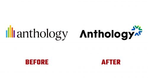
A visual rebranding was unveiled, reflecting the company’s new mission. The revised logo represents the Power of Together. The caret symbol (^) at the start of the company name in the new logo signifies strength and exponential success. This symbol embodies the company’s dedication to helping educational institutions reach new heights through innovative collaboration.
The logo has a simple yet powerful design. The caret, often associated with exponential growth and improvement, is skillfully incorporated into the wordmark. Simple lines and contemporary typography convey a sense of professionalism and forward-thinking. The logo’s color scheme combines blue and green tones, suggesting growth, stability, and trust, symbolizing the company’s commitment to helping academic institutions achieve greatness.
The redesigned visual identity ensures scalability and flexibility across various platforms and media. This flexibility ensures the brand is always recognizable and consistent, whether on print materials, online platforms, or physical signage.
The new branding includes a website redesign that complements the contemporary and approachable style. The website’s streamlined navigation simplifies access to resources and information. Dynamic images and interactive components enhance the user experience, reflecting the company’s commitment to using technology to advance education.
The company provides a suite of solutions tailored to meet the needs of faculty members seeking user-friendly tools to enhance teaching and student engagement and Chief Information Officers (CIOs) aiming to modernize IT strategy and streamline operations. The products offer best-in-class solutions that help users adapt to rapid and unprecedented changes. The integrated data insights from these intelligent, networked solutions help organizations make well-informed decisions.
The solutions are created in close collaboration with clients, ensuring they meet the practical needs of educational institutions. This customer-centric approach differentiates the company from other EdTech providers. The collaborative approach, working closely with educators and administrators, creates solutions that benefit students and institutions.
Flagship SaaS products and auxiliary services, including Blackboard® (LMS), Anthology® Student (SIS/ERP), and Anthology® Reach (CRM), are part of the ecosystem. These solutions benefit millions of students worldwide, helping them realize their full potential. The company continuously develops new features and product improvements, demonstrating its commitment to innovation.
The Power of Together™ is the cornerstone of the educational philosophy, not merely a catchphrase. By promoting a collaborative environment, the company aims to inspire educators and institutions to rethink what’s possible and provide students with life-changing opportunities.
The rebranding marks an important milestone in its development, demonstrating its ambitious goals and commitment to the educational field. This makeover includes a new visual identity, website design, and logo, giving the company a more contemporary appearance aligned with its goals. As the company grows and innovates, it remains dedicated to empowering educators and students through the transformative power of education and technology.


