2021 was the birth of a new French company – Apocope, for the production, design, and sale of creative leather goods. The company located in Paris immediately aroused interest by presenting original design products from natural and recycled leather, natural cork to the domestic market. Its assortment includes a set of important accessories for each person, forming or supporting an individual style and even extravagance. The new brand offers – wallets and business card holders, cases for gadgets and tags, and much more, without which it is impossible to ensure the completeness of your style. To develop its style, the company has invited the creative designers of Brand Brothers to cooperate.
It was decided to base the formation of the new brand on the peculiarity of French culture and urban Parisian style – a manner of conversation called apocopy. This is a compound word from the Greek language – “apo” and “koptein.” It is characterized by a phonetic phenomenon in which the speaker omits one or more sounds during pronunciation – usually in the ending with unstressed vowels. This decision was made to create a unique name, which can be interpreted as demonstrating acceleration, movement, and creating optimal conditions for modern active life. After all, Apocope is a way to save time for the transmission of audio information. In essence, Apocope is a symbol of practicality, which is one of the functions of the company’s leather products and provides real utility to the wearer.
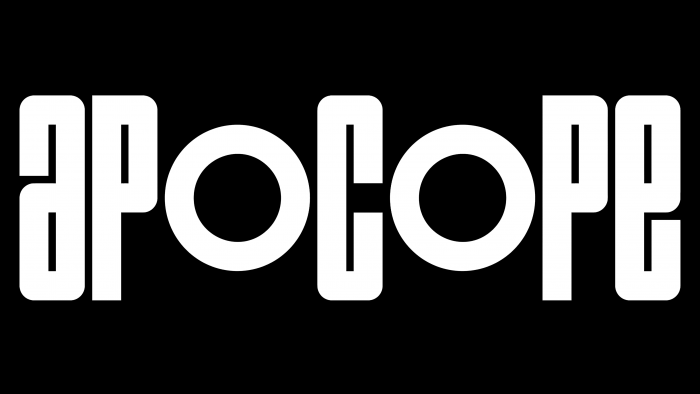
The formation of a graphic image that would provide the uniqueness, attractiveness, and creativity of the style was based on text graphics. The typogram created, which included the full brand name, was a strong, rhythmic composition based on creating symmetry and separability of letters in a word. Two letters “o” were made smaller, one hundred visually focused on them, and the word began to be perceived as three different elements – “ap,” “c,” “pe,” which are considered in the general group, but not as a single word. Such a graphic solution provided the creation of the required visual attention, creating all the conditions for easy memorability. The entire text becomes the main focus of all additional elements combined with it in various solutions. At the same time, a very original and catchy abbreviation is obtained from this name – Apo, for small advertising forms or buttons on the company’s interactive website.


