


![]() Ariel Logo PNG
Ariel Logo PNG
The Ariel logo can be seen on sports cars participating in racing competitions. It represents progress, growth, development, high speed, and forward movement. It is also a symbol of rebirth because the company was closed and relaunched in 2001.
Ariel’s name appeared in the British industry long before its first motorcycle. In 1847, it was used for pneumatic wheels for horse-drawn carriages. In 1870, James Starley and William Hillman applied the name to a light bicycle with wire-spoked wheels, using “Ariel” in the sense of “spirit of the air.” The bicycle sold well, and the name remained in use.
In 1902, Ariel acquired Charles Sangster’s Components Ltd and began building motorcycles. The first model used a Kerry engine with magneto ignition and a float carburetor. At the same time, the company produced three-speed, two-stroke Arielette motorcycles and a small car with a 10-hp twin-cylinder engine. After early financial trouble, Jack Sangster took charge of the motorcycle side in 1918 and expanded the range.
The major technical shift came in 1926, when designer Val Page arrived from JA Prestwich. He redesigned the engine line, and by 1927, Ariel had a new range of four-stroke singles later known as the “black Ariels.” Page also developed the Red Hunter, a light overhead-valve single popular with riders and sports users. In 1928, Edward Turner brought Sangster the idea for the Square Four engine, which BSA had earlier rejected. Ariel showed the prototype at Earls Court in 1930, and the 500 cc Square Four entered production in 1931.
After Components Ltd collapsed in 1932, Jack Sangster bought back the brand and equipment, forming Ariel Motors (JS) Ltd. The Square Four grew to 601 cc, then to the 995 cc 4G. In 1951, Sangster sold Ariel and Triumph to BSA. BSA ended Ariel’s four-stroke line in 1959, replacing it with the two-stroke Leader and Arrow. The Bournbrook factory closed in 1963; the last Ariel motorcycle appeared in 1967; and the Ariel name returned in 1999 with Ariel Ltd sports cars in Somerset.
Meaning and History
![]()
What is Ariel?
The company stood at the origins of motorcycle production in Britain. It was closed in the 1970s and revived again in 1999. Now it has 30 employees and produces cars.
1932 – 1951
![]()
The first logo appeared after Components Ltd went bankrupt, and its owner’s son bought out Ariel Components Ltd’s division and renamed it Ariel Motors, an independent company.
The logo was closely associated with motorcycles. To create it, they took the most recognizable bike details and assembled them into an emblem.
She reminded me at the same time:
- Faro. In the company’s models, it was large, round, and located on the steering wheel in front. From the front, this was the most noticeable element.
- Carburetor strips. On the brand’s first models, the unit was visible.
The result was a large burning headlight, the center of which was covered with strips of a carburetor, with an oval plate bearing the name attached. It was this one that was attached to the tank of bikes with two bolts.
The colors were also chosen based on real models. Red, yellow, and black were the main colors of motorcycles at that time, not counting the silvery metal parts.
1951 – 1970
![]()
In 1951, the company was sold to Birmingham Small Arms (BSA), a manufacturer of weapons and all kinds of transport, from bicycles to buses. The company rebranded the brand at its discretion.
The emblem looked like a real work of art. The image is based on a caduceus – a two-winged scepter entwined with two snakes. In Greek mythology, it was given to Apollo’s brother, Hermes. It is a symbol of reconciliation and commerce; it was an important attribute of ambassadors going to the enemy’s camp.
The wings connected the brand with the new owner. On the BSA emblem, the letter B had one wing. Ariel got two fenders, as it was closely involved in motorcycle manufacturing, whereas for BSA this was just one of the directions. The wings themselves symbolized speed. They pointed to the knowledge of two motorcycle companies, which would allow you to create the best models.
At the center of the scepter is a motorcycle wheel. Its spokes were intertwined, and the rim was formed by two snakes, whose heads and tails twisted around the scepter above and below. The snakes became the prototype of the past owners and the new owner. They made a peace deal and ended the dispute. In mythology, Hermes placed a scepter between two fighting snakes, and they instantly calmed down. After buying the brand, motorcycles came out under the BSA Ariel brand.
The Ariel name was shown on a ribbon worn over the wheel and on top between the two fenders. Ribbon – a sign of the winner, hinting at the best models in its segment. The yellow color of the emblem indicates the gold standard in the motorcycle industry.
By the 70s, BSA was on the verge of bankruptcy, as it could not compete with Japanese models. All rescue attempts failed, and the factory closed. The Ariel brand was discontinued even earlier.
2001 – today
![]()
The old name was revived in the last decade of the 20th century. According to Simon Saunders, who registered the Ariel Motor Company (1999), the history of the Ariel brand was too ancient to lose this name forever. The modern company, except for the name, has nothing to do with the one that closed in the late 70s. Its main product is the Ariel Atom, a bodyless minicar. But there is also one motorcycle.
The company logo is a red circle resembling a road sign. Inside is the letter A, stylized as two roads going beyond the horizon. It is associated with travel, fast driving, and long distances. In addition, it resembles three rifles assembled into one, as shown on the BSA logo. This is an allusion to the company’s history.
Below the circle, in thin capital letters, is Ariel’s signature. The letters hint at the company’s limited assortment but show that all of its products are of excellent quality and in demand.
Font and Colors
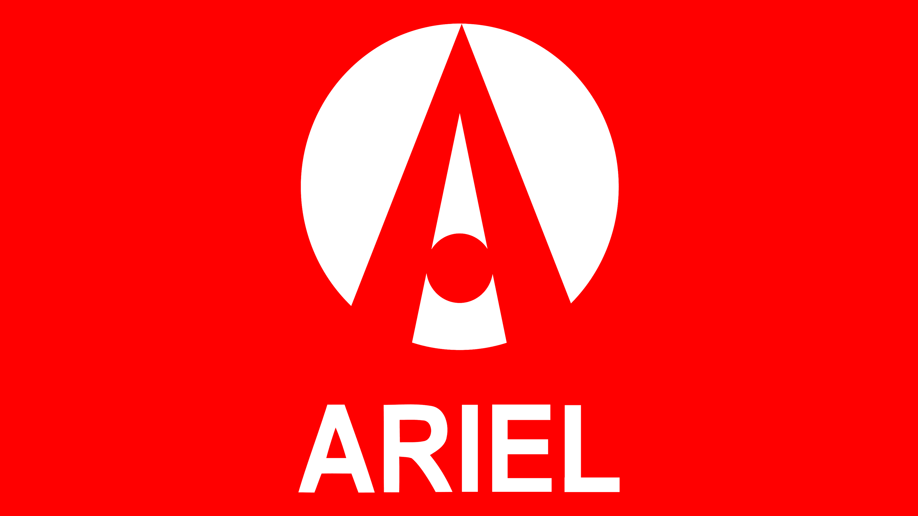
The main colors of the latest logo are red and white. Red represents the energy with which the revived brand is ready to reach the top. It reminds us of the cessation, stopping development for as long as 29 years. Color is a way to attract users’ eyes, associated with the exclamation: “Attention!”
White indicates a new beginning, a path from scratch.

Lettering font: Arial Arabic Bold.