The Arizona Cardinals logo is a visual symbol of the American football team, reflecting its name and some important aspects of its character and values.
The cardinal red color in the logo symbolizes strength, passion, and energy, reflecting the team’s fighting spirit and its pursuit of victory. The red feathers on the cardinal’s head also add dynamism and movement, emphasizing endurance and the speed of the game.
The head of the cardinal overall symbolizes pride, fearlessness, and leadership, which are important values for the team. Additionally, the logo features the cardinal’s yellow beak, symbolizing intelligence and insight. The yellow color also adds brightness and emphasizes self-confidence, which helps the team achieve its goals.
Overall, the emblem of the Arizona Cardinals is a strong and emotional symbol that conveys the values and qualities necessary to win in American football. Passion, energy, strength, leadership, intelligence, and confidence – all these qualities are combined in one bright and memorable logo, which is one of the most recognizable in the world of sports.
Arizona Cardinals: Brand overview
| Founded: | 1898 |
| Founder: | Michael Bidwill |
| Headquarters: | Arizona, U.S. |
| Website: | azcardinals.com |
The Arizona Cardinals are a professional American football team that competes in the National Football League (NFL) as a member of the Western Division of the National Football Conference (NFC). The Cardinals play their home matches at the State Farm Stadium, which was opened in 2006 and is located in the north-western suburb of Glendale, Arizona. The cardinal bird, perched on a football lacing, has been the symbol of the Arizona Cardinals since 1947.
The Cardinals were founded as the Morgan Athletic Club in 1898 in Chicago, Illinois. They joined the NFL in 1920. In 1960, the club moved to St. Louis and played in that city until 1987 (sometimes called “Football Cardinals” or “Big Red” to avoid confusion with the “St. Louis Cardinals” from Major League Baseball).
Before the 1988 season, the team moved west to Tempe, Arizona, a college suburb east of Phoenix, and spent the next 18 seasons playing their home games at Sun Devil Stadium at Arizona State University. In 2006, the club moved to its current home field in Glendale, although the team’s offices and training center are still located in Tempe.
The primary colors of the “Arizona Cardinals” are white and red. The Cardinals moved to Arizona in 1988, and the next year, the Arizona flag was added to the sleeves. The cardinal head – the team symbol – is located on the helmet and emblem of the Arizona Cardinals.
Meaning and History
In 1920, the “Arizona Cardinals” became a member of the American Professional Football Association (APFA). Over the lifetime of the team, the Arizona Cardinals emblem changed eight times and underwent significant changes until 1970, when the team’s symbol – the red cardinal – appeared on it.
The evolution of the Arizona Cardinals logos happened as the team changed names, relocated to new cities, and transitioned from one league to another. What started as a monogram in the form of combined letters “CC” and then turned into the inscription “CARD-PITT” eventually became the red cardinal.
The bird was always drawn differently. On one of the earliest emblems, the cardinal was depicted as a detailed cartoonish illustration; then, it was portrayed as an anthropomorphic muscular character. Over time, artists began depicting only the head, perfecting the version once proposed by Verlander Design.
What is Arizona Cardinals?
The Arizona Cardinals are the oldest but one of the least successful franchises in the National Football League. It has been competing in the league since 1920 and in the NFC West since 2002. The football team from the Phoenix metropolitan area, formed in 1989, was originally called the Morgan Athletic Club. Currently, the “Cardinals” play their home matches at the State Farm Stadium.
1920 – 1934
The first logo of the Arizona Cardinals was presented when they were named the Chicago Cardinals. The 1920s “Chicago Cardinals” logo had the overlapping letters “CC,” “C,” and a regular “C” in red.
1944
In 1944, the “Steelers” merged with the “Chicago Cardinals” and were called “Card-Pitt,” unofficially known as “Carpets” or “Card-Pitt.” The logo featured the word “CARD-PITT.” In the 1945 season, the “Steelers” once again competed solo.
1947 – 1959
From 1947 onwards, the emblem of the “Cardinal” represents a brownish-black cardinal sitting on the stitches of a white football with black outlines.
1960 – 1961
For the first time, a character with a human-like appearance (hands, feet) but a bird’s head – a cardinal – appeared on the logo. The character is in motion as if tossing the ball into the goal.
1962 – 1969
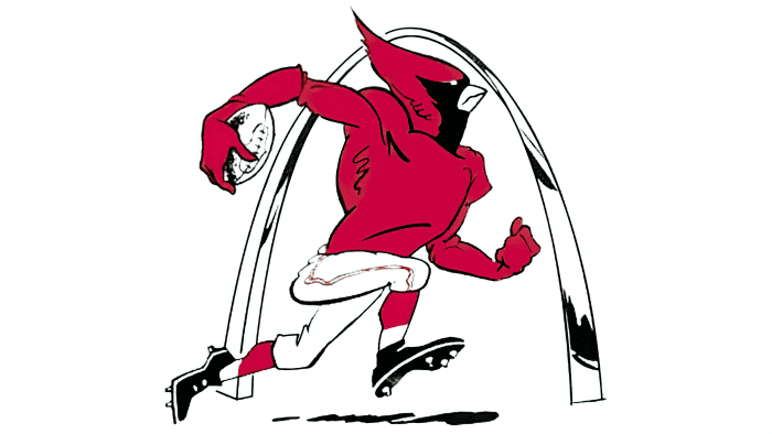
In 1960, the team moved to St. Louis, which also influenced its logo. In 1962, the “Cardinals” emblem changed to a red muscular cardinal carrying a football ball in football attire and running past the St. Louis Arch.
1970 – 1987
In 1970, the logo turned into a streamlined version of the cardinal’s head with a flair. The “Cardinals” logo was designed by Verlander Design. All subsequent modifications were based on the 1970 version.
1988 – 1993
In 1988, due to the relocation to Phoenix, the shape of the cardinal’s head was slightly changed. This was the only change made to the “Cardinals” logo.
1994 – 2004
Minor changes due to the transformation of Phoenix into the state of Arizona in 1994. The “Cardinals” became the “Arizona Cardinals”, so they also changed their logo.
2005 – today
Currently, the “Arizona Cardinals” use a simple emblem that contains the bird’s head without additional elements and inscriptions. It was adopted in 2005, but based on the version presented in 1970. It is the result of three modifications of the original drawing. Over a decade, the Arizona Cardinals logo remained virtually unchanged, but in January 2005, it underwent the first significant changes in a century. The logo with the red cardinal’s head became more sleek and meaner than the previous one. The beak was changed from gold to yellow, and more distinct black outlines were added. This bird looked significantly more aggressive than the previous one. Many fans referred to the previous version as a “parrot.”
It differs from previous versions in more distinct lines, wide outlines, and harmonious proportions. Thanks to quality graphics, the style looks modern. This is particularly noticeable compared to the previous logo since it was created in 1994 without progressive digital technologies.
Arizona Cardinals: Interesting Facts
The Arizona Cardinals, a football team, have been around since 1898. They’re the oldest team in the U.S. that’s still playing. They started in Chicago as the Morgan Athletic Club.
- How They Started: The Cardinals began in 1898 in Chicago. They’ve been part of the NFL since it started in 1920.
- Why “Cardinals”? The Cardinals got their name from the red jerseys they bought in 1901.
- Living in Different Cities: They’ve lived in Chicago, St. Louis, and Arizona since 1988.
- Super Bowl: They played in the Super Bowl in 2009 but lost to the Pittsburgh Steelers.
- Pat Tillman: Pat Tillman was a player who left football to join the army after the September 11 attacks. He died in Afghanistan.
- First Playoff Win in Arizona: Their first playoff win in Arizona was in 1998 against the Dallas Cowboys. Their last win was in 1947.
- Their Stadium: State Farm Stadium, opened in 2006, has a cool design and an open-and-closed roof. It has hosted two Super Bowls.
- Championships: They won NFL championships in 1925 and 1947. The win in 1947 was their last big championship.
- Training Camp: They were the first NFL team to have their training camp in a different state in 1947.
- Larry Fitzgerald: Larry Fitzgerald is a famous Cardinals player known for his catching skills and leadership.
The Cardinals have a long history with many changes, big moments, and famous players. They’ve been part of football for a very long time.
Font and Colors
The professional football team’s trademark from Arizona is associated with its mascot – the red cardinal. It’s the head of this bird that designers depicted, adhering to a simple but characteristic style. The bird looks angry because of the semicircular shape of the eyes and the low-hanging imaginary eyebrow line. In addition, the artists added a sharp beak to make the cardinal look dangerous.
The only inscription on the Arizona Cardinals logo appeared in 1944 when the club was officially called Card-Pitt. In all other cases, designers did not use textual elements, so they did not work on fonts.
The color palette is also quite conservative. It predominantly features a red-pink color, which became the basis of the team’s visual identification in 1920 and is present in almost all emblems, except for the 1947-1959 version, where a brown bird is depicted against the backdrop of a ball. The palette also includes gold and black colors. The first color is used for the beak and the second – for the eye and outline.
Arizona Cardinals color codes
| Cardinal Red | Hex color: | #97233f |
|---|---|---|
| RGB: | 135 0 39 | |
| CMYK: | 0 100 60 30 | |
| Pantone: | PMS 194 C |
| Black | Hex color: | #000000 |
|---|---|---|
| RGB: | 0 0 0 | |
| CMYK: | 70 50 50 100 | |
| Pantone: | PMS Process Black C |
FAQ
What does the Arizona Cardinals logo represent?
The Arizona Cardinals logo illustrates the club’s name. It features the head of a bird from the cardinal family. The main part of the plumage is dark red, the area around the eye and beak is black, the outline is also black, and the beak itself is yellow.
Why are the Arizona Cardinals called cardinals?
Chris O’Brien, the team’s founder, bought old maroon football jerseys from the Chicago Maroons team in 1901. He noticed that the fabric had faded so much that it had turned cardinal red. This is where the name Arizona Cardinals originated.
What is the mascot of the AZ Cardinals team?
The team’s mascot is Big Red, an anthropomorphic cardinal bird. This character first appeared on October 4, 1998, and is remembered by everyone for its unusual appearance. Despite being dressed in simple football attire, it looks very formidable. The cardinal’s wingspan is 7 feet, and it stands 6 feet 4 inches tall.
What color is the Arizona Cardinals’ football uniform?
Three primary colors are used in the football club’s symbolism, distinguishing it from competitors: red, black, and white.


