


 Baltimore Ravens Logo PNG
The Baltimore Ravens logo symbolizes intelligence, collectivism, insight, belief in success, and constant hope. Established in 1996, the club’s style reflects the team’s colors and core brand characteristics.
The Baltimore Ravens are a professional American football team that has competed in the National Football League since 1996. Arthur Bertram (Art) Modell founded the team and owned the Cleveland Browns for 35 years. He then faced financial difficulties when Cleveland authorities refused to pay for the stadium’s reconstruction.
On November 6, 1995, Art Modell announced his intention to move the team to Baltimore, where he was promised an annual operating subsidy of $ 25 million. Despite the controversies, the matter was settled: the “Cleveland Browns” stayed home, along with their uniforms and awards. However, Art Modell retained the existing player contracts and received a new franchise. Thus, Baltimore got an NFL football team for the first time in 13 years since the “Baltimore Colts” moved to Indianapolis.
Arthur Bertram gave up his right to the Browns, and he couldn’t acquire the nickname Colts. The nickname Ravens was chosen in a contest and announced on March 29, 1996. The initial list consisted of more than 100 nicknames. Organizers reduced it to 17 and focus group representatives to 6. People participating in a phone survey preferred three options: Ravens, Americans, and Marauders. After announcing the shortlist, the Baltimore Sun held a fan contest: more than 21,000 of 33,000 people voted for the Ravens. The nickname comes from Edgar Allan Poe’s poem “The Raven,” whose author was born and buried in Baltimore.
Due to persistent financial difficulties, the NFL instructed Art Modell to sell his franchise. On March 27, 2000, NFL owners approved the sale of 49% of the “Ravens” shares to Steve Bisciotti, who already owned a small stake. On April 9, 2004, the NFL approved the businessman’s purchase of the club’s controlling stake. The former club owner retained 1% of the shares and continued working at the headquarters as a consultant.
Meaning and History
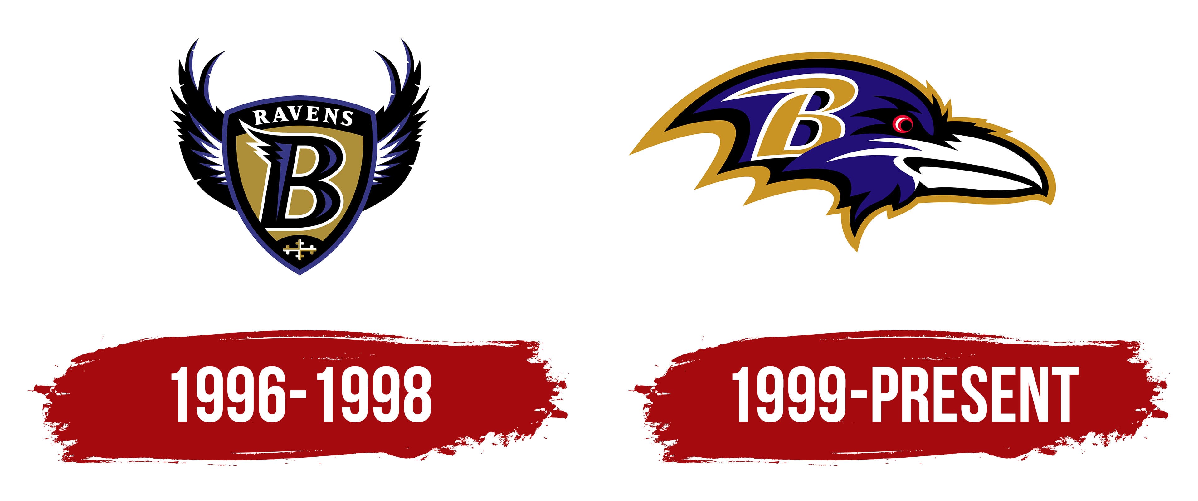
Since 1996, the “Baltimore Ravens” have had two logos. The first had to be changed due to a court decision over copyright infringement. The plaintiff was Frederick Bouchat, an amateur artist from Maryland. Frederick Bouchat was convinced he had seen this design with a winged shield and the letter “R” somewhere before, specifically among his works. Before the football club opened, he faxed his winged-shield design to Maryland’s stadium administration. In exchange, he requested a helmet signed by him. On June 5, 1996, the club introduced a similar logo, but it did not fulfill the designer’s request. The legal proceedings lasted more than ten years. The court ruled that the Baltimore Ravens must pay the copyright holder $100 for each use of this image during future NFL games. Eventually, it changed its brand name while maintaining a connection to the raven theme.
What is the Baltimore Ravens?
The “Baltimore Ravens” is a team that joined the National Football League in 1996. Since 2002, they have competed in the “Northern Division”, previously in the AFC Central. The team’s headquarters is located in the Baltimore suburb of Owings Mills.
1996 – 1998
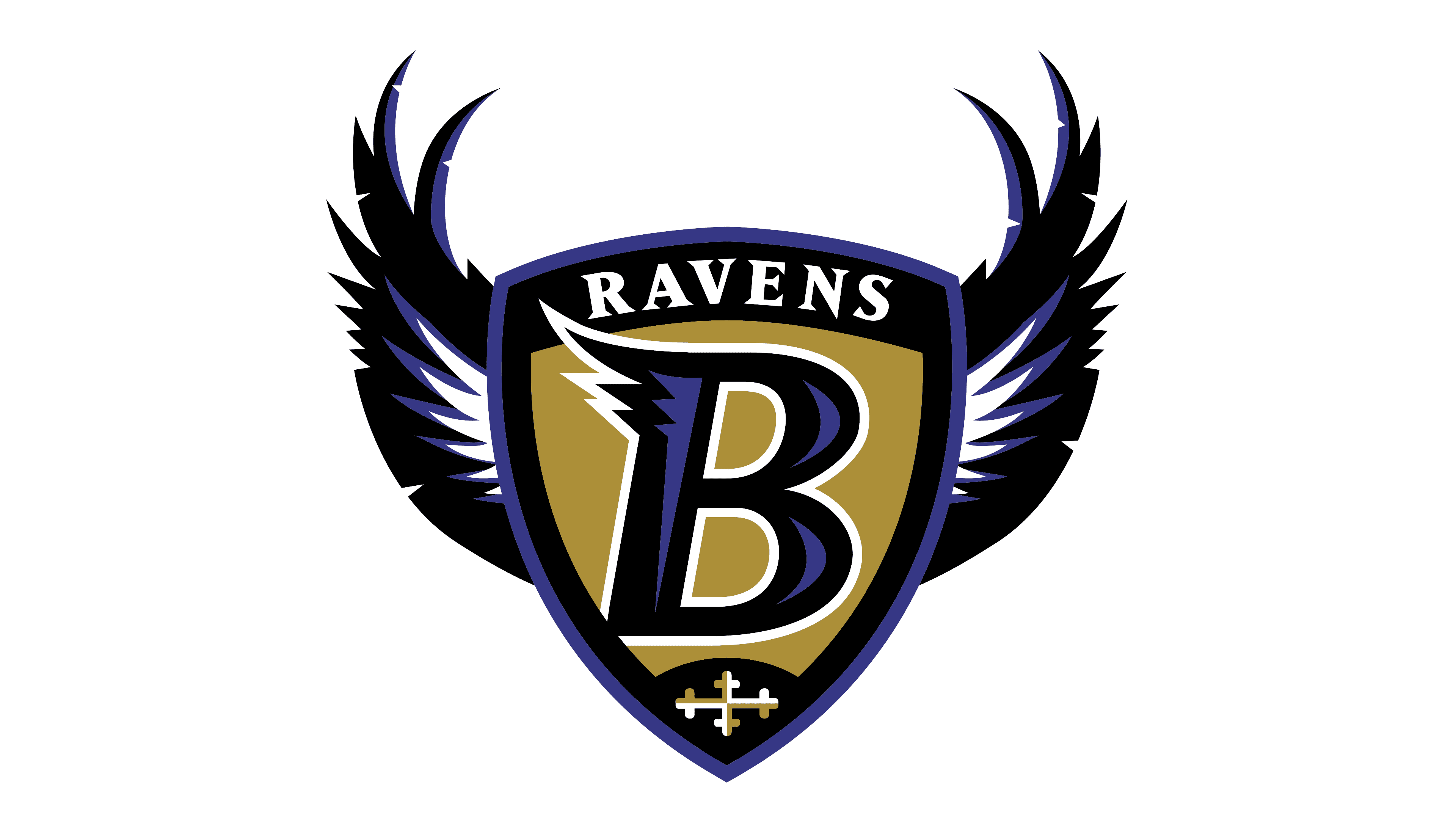
The first “Baltimore Ravens” logo was the infamous “Flying B.” According to “Baltimore Ravens” management, Frederick Bouchat created it independently. The central element is a shield that pays homage to Baltimore’s heraldry. Its triangular, pointed shape reflects old French heraldic traditions from the 13th and 14th centuries. It features the official team colors: purple, black, and metallic gold.
In the center of the shield is the capital letter “B” (meaning “Baltimore”), with three tildes of varying lengths. The word “Ravens” frames it at the top, with a cross at the bottom. This cross comes from runic signs and belongs to early Western European heraldic art. The emblem features raven wings spread over the shield.
1999 – today
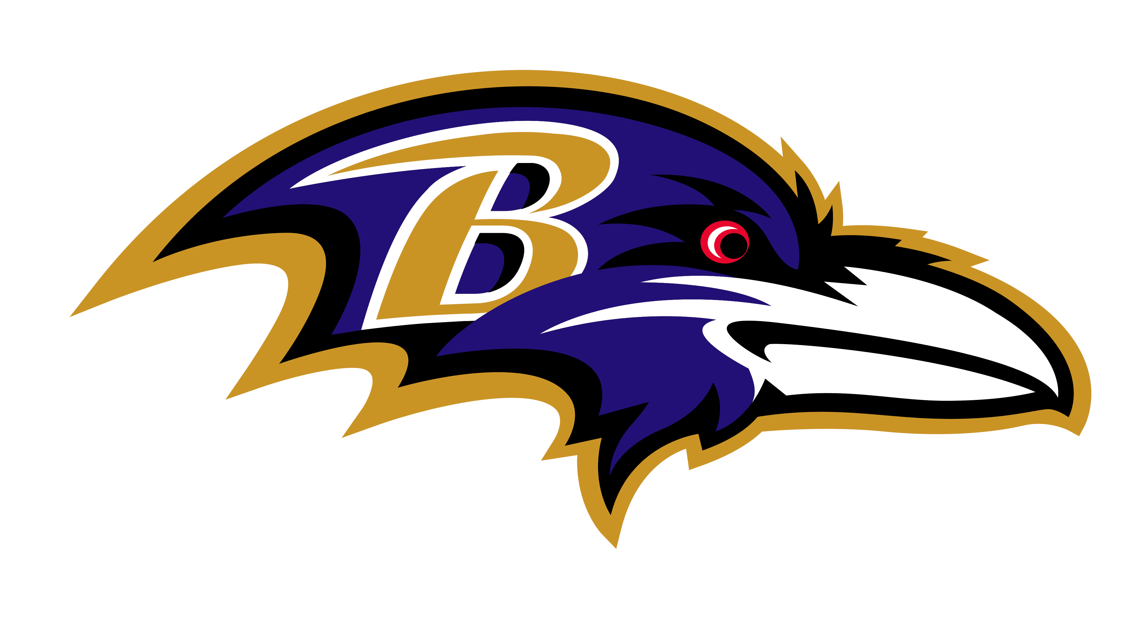
The football club’s current symbol was introduced in 1999 and has not changed since. It proves its complete conformity with the Baltimore Ravens’ concept: the emblem features a raven and a reference to the city’s name. Over 20 years, it has become iconic and is now firmly associated with the team, making it unlikely they will abandon it for a radically new design. Thus, the football players’ uniforms have featured a bird’s head image and the letter “B” on the side for two decades.
Baltimore Ravens fans chose it: The Baltimore Sun ran a poll with three new logo options. The football team abandoned the heraldic format and preferred the Denver Broncos’ style. The new Baltimore Ravens emblem features a profile of a raven’s head. The colors remained the same, but black was used only for borders. The letter “B” with one tilde is superimposed on the left side of the raven’s head. Club owner Art Modell himself insisted on its presence.
Font and Colors
The raven is the eternal theme of the “Baltimore Ravens,” reflected in both club emblems. But while the focus was previously on the wings, the blue head with a large white beak now occupies the center. Moreover, the artist deliberately highlighted the eye in red to emphasize hidden aggression. The letter “B”, the first in the word “Baltimore”, is located on the left part of the logo.
The letter “B” was hand-drawn, and the artist did not use a standard font. They were guided only by their ideas and the football club leaders’ wishes. The letter is unusually stylized: it has no serifs but has an extended horizontal line at the top. Meanwhile, the white outline around “B” complements the primary gold color. The logo’s palette also includes dark blue, red, and black. Designers combined the shades so the overall composition looked cohesive and harmonious.
FAQ
What does the Baltimore Ravens logo mean?
The raven’s head illustrates the team’s name and mascot, and the letter “B” represents the city of Baltimore. The bird looks menacing, demonstrating the spirit of rivalry and the drive to win. The palette corresponds to the official color scheme of the Baltimore Ravens.
Why did the “Ravens” change their logo?
The team had to abandon the first logo after a court ruling following a copyright infringement accusation. An artist sued the “Baltimore Ravens” for allegedly stealing his idea after he sent them a sketch of the emblem and asked for an autographed helmet in exchange. The club representatives not only didn’t give the artist a helmet but also appropriated his work.
Did the “Titans” trample on the “Ravens'” emblem?
Yes, the Tennessee Titans stepped on the Baltimore Ravens’ logo on the football field to assert their superiority and show disrespect. The Ravens retaliated: they defeated their rivals and danced the victory dance on their logo. As a result, Marcus Peters from “Baltimore” was fined $15,000.
How did the Baltimore Ravens get their logo?
When the court ruled that the Baltimore Ravens must pay Frederick Bouchat $100 for each use of the winged-shield logo, the Ravens decided to change the design. This led to a new emblem that remains in use today. It features a raven’s head with a red eye, blue feathers, a white beak, and a wide golden outline.