


![]() Atlanta Falcons Logo PNG
Atlanta Falcons Logo PNG
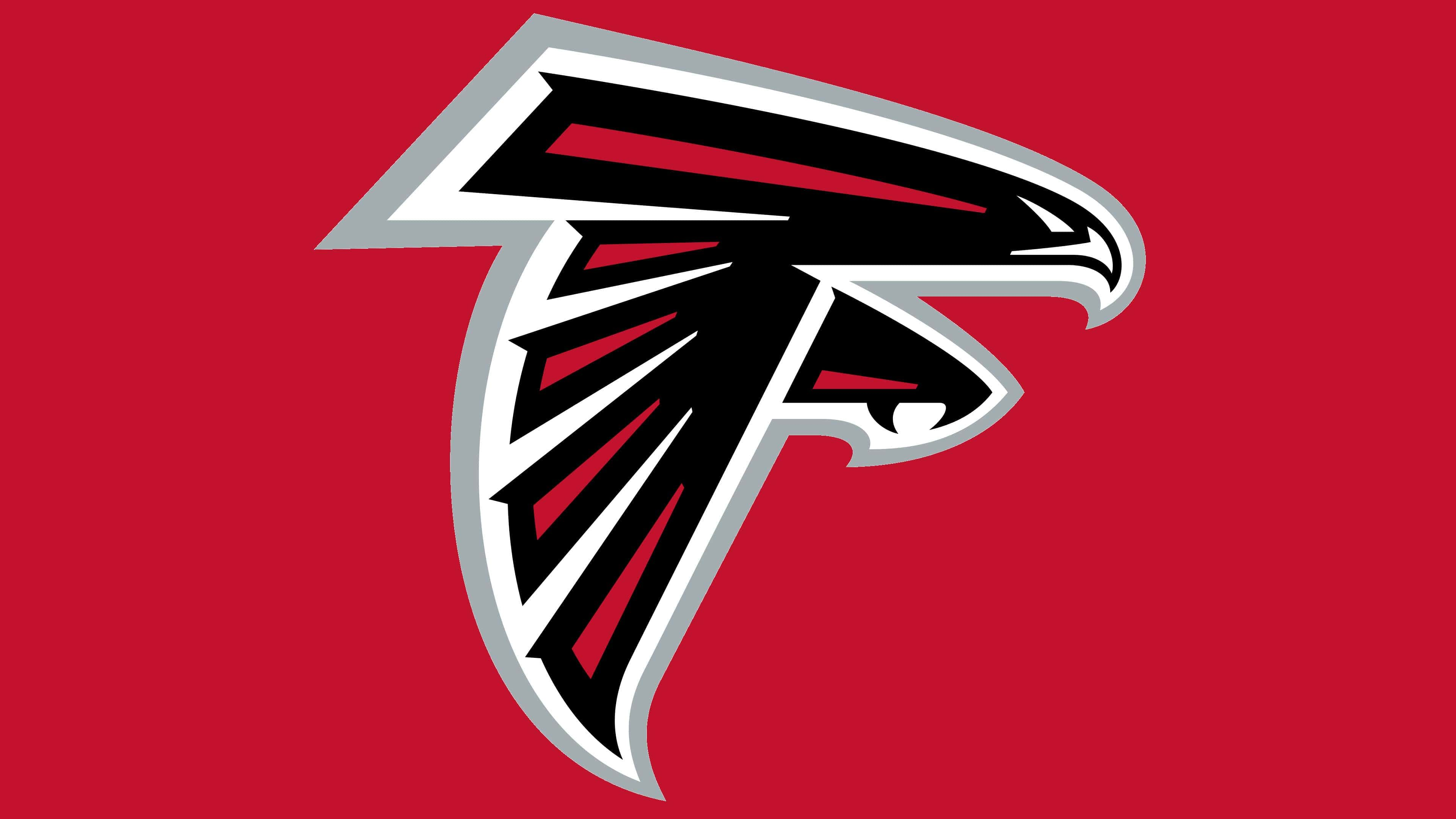
The Atlanta Falcons logo embodies the combative spirit of the era in American football. The image of a falcon in flight, poised to attack, conveys aggression, speed, and power. The red logo symbolizes passion and energy, while black adds drama and strength to the image.
The Atlanta Falcons’ emblem symbolizes energy, speed, power, and the drive to win. It reminds us that the team is always in motion, never stopping, and ready to attack the opponent. This logo symbolizes the team and the city of Atlanta, known for its energy and enthusiasm.
The values of the logo include a fighting spirit, bravery, perseverance, and a will to win. The Atlanta Falcons adhere to high standards of professionalism and work together to achieve success. These values help the team move forward, win competitions, and attract fans who share these values.
The Atlanta Falcons are a professional American football club competing in the National Football League. Its first owner and creator was businessman Rankin Smith. He received the franchise from the American Football League in 1965, which sought to expand its influence into Atlanta. However, its rival, the National Football League, preempted the initiative, so Smith reneged on the previous agreement and bought the team on June 30 for $8.5 million.
After a contest, the team received its nickname on August 29, 1965. Julia Elliott, a schoolteacher from Griffin, was selected from among many people who proposed “Falcons” as the new franchise’s nickname. In her essay, she wrote: “The falcon is proud and dignified, with great courage and fight. It never drops its prey.”
In the late ’90s, a cultural obsession took hold in the club: The Dirty Bird. Initially, the “Dirty Bird” referred to Jamal Anderson’s touchdown dance. Over time, the nickname “Dirty Bird” stuck to the team and became the basis for its official fan song.
The wordmark is “Atlanta Falcons.” From 1966 to 1998, it was depicted in italics with stylized letters “A” and “F.” After the rebranding, the nickname began to be written in all capital characters with tildes. The concept remained the same: City (Atlanta, lowercase), team (Falcons, uppercase). This is a distinctive feature of Mark Verlander’s work.
Rankin Smith managed the team’s day-to-day activities until 1990, when he transferred control to his son, Taylor Smith. Taylor Smith then sold the Atlanta Falcons to businessman Arthur Blank. The new owner bought the franchise in February 2002 for 545 million.
Meaning and History
![]()
The Atlanta Falcons are a professional football club with three emblems that share the same content but differ in style. Mark Verlander, who personally worked on each drawing and listened to the wishes of the team’s owners, is the author of all three versions. The changes were minor, though Verlander considered them radical and opposed such interference with the original. The artist wanted to keep the design as it was until 2003.
What is Atlanta Falcons?
The Atlanta Falcons team entered the National Football League in 1966 and played its first game that year. They managed to set a record by winning several NFC West and NFC South championships. The club’s headquarters are located in Flowery Branch, Georgia, and the Mercedes-Benz Stadium has been their home since 1917.
1966 – 1989
![]()
The first Atlanta Falcons logo was designed by Verlander Design in 1966. The falcon faces right, representing the capital letter “F” from the word “Falcon.” The claw and head of the bird are separated from the wing and tail by a vertical white line. The image has a white inner outline and a red outer outline.
1990 – 2002
![]()
The Atlanta Falcons’ second logo is simplified. This version lacks red accents, and the Predator has a black-and-white outline. The rest remains unchanged: the image resembles the letter “F,” five lines on the wing are the outlines of feathers, and the falcon itself is depicted at the moment of landing.
2003 – today
![]()
The current emblem, adopted in 2003, is similar to the previous two. They share a common motif: a predatory bird with its wings lowered. It is depicted in an abstract style with clear geometry. The elements of the body, legs, and wings have a triangular shape, which is broken by small protrusions:
- A hook-like beak at the edge of the head
- Claws on the leg
- Decorative notches at the ends of the feathers
In the latest design, all the Atlanta Falcons’ identity colors are present: black, white, red, and silver. The line that separated the head from the body was removed. The angles of the elements became sharper, and tildes appeared at the ends. The number of lines on the wing was reduced from 5 to 4. The claws and beaks became larger. The falcon now embodies flight, speed, and aggression.
Designer Mark Verlander opposed such a redesign. He wanted to preserve the spirit of the original logo and insisted on the Atlanta Falcons’ color scheme. However, the Atlanta Falcons sought to start a new era with new colors.
Font and Colors
You can recognize the Atlanta Falcons brand by looking at the schematic silhouette of a falcon. Artist Mark Verlander paid attention to the design, complementing the black drawing with red details. He also gave it dynamism, creating the illusion of motion with a slight tilt forward and down. Thanks to this, the bird does not just soar in the air; it seems to be purposefully flying towards its prey and is about to attack.
The football club’s logo depicts a falcon and a large letter “F.” Essentially, it’s two in one: the bird’s silhouette resembles the first sign in the word “Falcons.” However, the “F” is not written but drawn by hand, and it has an unusual stylized appearance, so it cannot be attributed to regular printed symbols. That is, the designers did not use any of the existing fonts.
The emblem’s palette is concise: only black, red, white, and silver. At the time, artist Mark Verlander opposed red and silver, considering the black-and-white version classic and wanting to keep it an unchangeable part of the Atlanta Falcons’ identity. However, in 2003, adjustments resulted in a much more colorful logo.