The Philadelphia Eagles logo symbolizes the aspiration for success, focus on victory, and unwavering strength, as its mascot is the bald eagle. This bird also conveys high patriotic sentiments: it is the national symbol of the United States. Behind the massive beak and clear lines lies the terror of opponents on the sports field.
Philadelphia Eagles: Brand overview
| Founded: | July 8, 1933 |
| Founder: | Jeffrey Lurie |
| Headquarters: | Philadelphia, Pennsylvania, U.S. |
| Website: | philadelphiaeagles.com |
The Philadelphia Eagles are a professional American football team from Philadelphia, Pennsylvania. The club competes in the National Football Conference East Division and is a member of the National Football League. The franchise was established in 1933 to replace the Frankford Yellow Jackets team.
The Frankford Yellow Jackets were a Philadelphia team that played in the National Football League from 1924 to 1931. Despite being one of the country’s best football teams, it went bankrupt and was reorganized into another franchise with new owners and players. The NFL provided a new franchise to Bert Bell and Lud Wray for a $2,500 entry fee. It is worth noting that these clubs have nothing in common and cannot be considered the same. Essentially, the shareholders simply bought territorial rights to place a team in Philadelphia. Thus, the history of the “Eagles” begins in 1933.
In 1940, the club changed ownership. Art Rooney acquired half of Lud Wray’s share in the “Eagles.” Rooney and Bell exchanged their franchise for Alexis Thompson, who became the majority shareholder for a long time. Bert Bell and Art Rooney moved the players to Pittsburgh. Philadelphia Football Club, Inc. used the name “Pittsburgh Steelers” (Thompson’s former team) until 1945.
Having gained full ownership, Alexis Thompson hired Greasy Neale as the head coach. However, the global crisis caused by World War II hindered the team’s successful development. Thus, the “Philadelphia Eagles” were forced to merge with the “Pittsburgh Steelers,” forming the “Steagles”. After a period of depression, Alexis Thompson remained the principal owner of the franchise until 1963, when it was sold to Jerry Wolman for $5,505,000 (1963-1969). The club was then bought by Leonard Tose (1969-1985), Norman Braman, and Ed Leibowitz (1985-1994).
In 1993, film producer Jeffrey Lurie contacted Norman Braman to purchase the “Philadelphia Eagles.” His uncle, Richard Smith, agreed to help him acquire the franchise. In May 1994, Jeffrey Lurie bought the franchise for $195 million.
When Bert Bell and Lud Wray founded the club, the country was trying to emerge from the Great Depression. At that time, the U.S. president introduced an anti-crisis program as part of the National Recovery Administration, symbolized by an eagle. That’s why this bird was used for the name of the franchise and served as a key element of the new Philadelphia Eagles logo, embodying the team’s spirit and inventiveness.
Meaning and History
One of the most famous professional American football teams, the Philadelphia Eagles, has undergone several logos. However, in all the logos, the key element was an eagle: the bird either held a ball in its talons, carried a helmet into the sky, or flapped its wings on a football helmet. The eagle symbolizes fighting spirit, determination, and inventiveness. The official color scheme includes green, white, black, and gray. They can be found in various combinations on the team’s logos.
What is Philadelphia Eagles?
The Philadelphia Eagles replaced the Frankford Yellow Jackets when it went bankrupt. The franchise was created in 1933 and then entered the National Football League. In 1970, it became part of the National Football Conference, where it still plays in the NFC East. Lincoln Financial Field has been its home stadium since 2003.
1933 – 1935
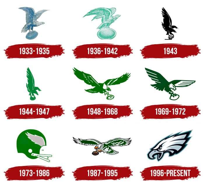
The first logo of the Philadelphia Eagles was introduced in 1933. It depicted an eagle in flight with a ball in its talons. The bird’s wings were raised upward. Its head was turned to the left as if watching the horizon. The central element was drawn in blue-gray in a sketch style and placed on a white background.
1936 – 1942
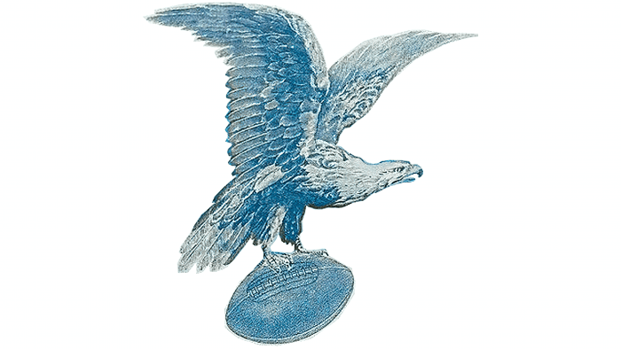
In 1936, a group of managers changed the color palette of the Philadelphia Eagles logo and the design of some details. The eagle became pale green, and the wingspan was altered. The size of the ball was increased, so it seemed that the bird was not flying, gripping the football, but standing on it.
1943
World War II spawned the Phil-Pitt Eagles or “Steagles” – a merger of the Pittsburgh Steelers and Philadelphia Eagles. Although the logo of that period underwent noticeable changes, the overall visual theme was preserved. Designers proposed an image of a swooping eagle with a helmet in its talons. The black color symbolizes the oppressive situation in the world.
1944 – 1947
From 1944, the Philadelphia Eagles logo consistently used green. The 1944 logo depicted a light green eagle flying from the sky and holding a football in its hands. The bird’s eye and lines on its wings were white, and the other elements were emeralds.
1948 – 1968
The 1948 logo began using the concept of a flying eagle, which lasted until 1995. The emblem included an eagle in flight with widely spread wings and a white ball in its paw. It resembled the emblem of “Apollo 11,” depicted on the spacecraft of the first U.S. moon mission. The team wore this emblem until 1969.
1969 – 1972
A new logo was introduced in 1969. The brand style was associated with a flying aircraft: geometrically precise wings were widely spread. The emblem’s design was strict and measured, with straight lines and truncated ends of feathers. The eagle’s head, paws, left-wing, and oval ball were white, and the other elements were green.
1973 – 1986
The next “Eagles” logo was introduced after the 1972 season. Now, it resembled an American football player’s sports helmet. It featured the wings of an eagle, symbolizing ascent and striving to reach the top of the world. The face mask, chin straps, and pad were white, the wing was gray, and the helmet itself was green.
1987 – 1995
It was decided to return to the Eagles emblem from 1948-1968 but slightly modify it to look more modern and vivid. The 1987 emblem had a different direction: the eagle was now flying from right to left. Additionally, more white accents appeared on the bird’s body. The beak and paws were painted in straw-yellow. The ball was made of dark brown. The image of the eagle was outlined in black.
1996 – today
In the modern Philadelphia Eagles logo, the head of the white eagle is rendered in a less realistic style, but the bird retains its aggressive and determined character. The eagle’s feathers hide the letter “E,” representing the team’s name. The bird’s eyes are aggressive, the pose is attacking, and the beak is open in a piercing scream. Overall, it resembles football players before a decisive attack. But the animated style of the image softens the sense of coldness and violence, focusing on determination and the pursuit of victory. The old color palette was also changed. The modern logo uses dark green, black, white, and light gray colors.
Philadelphia Eagles: Interesting Facts
The Philadelphia Eagles are an old football team with a lot of history, including some amazing wins and a dedicated group of fans. They started back in 1933 and have become a big part of Philadelphia.
- Championships: Before the NFL and AFL merged, the Eagles won championships in 1948, 1949, and 1960. Their biggest win recently was the Super Bowl LII after the 2017 season, where they beat the New England Patriots for their first Super Bowl win.
- The “Philly Special”: In that Super Bowl, they did a famous trick play called the “Philly Special,” where the tight end threw a touchdown pass to the quarterback. It was a brave move that helped them win.
- Veterans Stadium: They used to play at Veterans Stadium, where the fans, especially at the 700 level, were super passionate and made it tough for visiting teams.
- Lincoln Financial Field: Since 2003, they’ve played at “The Linc,” known for being eco-friendly, with wind turbines and solar panels.
- Fight Song: Their song, “Fly, Eagles Fly,” is played after touchdowns. It’s a fun tradition that gets all the fans singing along.
- Big Rivalries: They have big rivalries with the New York Giants, Dallas Cowboys, and Washington Football Team. Games against these teams are always a big deal.
- Dedicated Fans: Eagles fans are passionate and loyal. They’re known for being super supportive, making Philadelphia a tough place for other teams to play.
- Team Colors: Their colors are midnight green and white, which are very recognizable. Their uniforms have changed a bit, but these colors are always a big part of their look.
- Hall of Famers: Some of their players, like Chuck Bednarik, Reggie White, and Brian Dawkins, have made it into the Pro Football Hall of Fame because they were so good.
- Helping Out: The Eagles Charitable Foundation also does many good things in the community, focusing on health and education for children.
The Philadelphia Eagles’ story is about not giving up, being a part of their community, and having a lot of team spirit, making them a beloved team in the NFL.
Font and Colors
The Philadelphia Eagles logo features a proud and martial bird – the bald eagle. It is found only in North America and is one of the traditional mascots of the USA. But its image was chosen not just for this reason. After the Great Depression, the club appeared when the country had an anti-crisis program under the auspices of an eagle. Eventually, it became the main conductor of the football program and a symbol of its invincible spirit.
In the early years, the bird was depicted standing on a large oval ball. Then, the ball was reduced so that it fit in the taloned paws. The latest emblem is much simpler in composition. Designers removed the ball and other elements, leaving only the eagle’s head. Angular, elongated feathers combined with long, pointed lines create a sense of movement.
None of the nine Philadelphia Eagles logos contained any inscriptions. Artists relied on the graphic component, so they tried to maintain harmony in colors and shapes. From 1944 to 1995, shades of green dominated the palette. The last redesign changed everything: now the eagle’s head is white, as in reality. The beak and feather tips are light gray, and the outlines are black. The green color remained, but only as a stroke.
Philadelphia Eagles color codes
| Midnight Green | Hex color: | #004c54 |
|---|---|---|
| RGB: | 0 76 84 | |
| CMYK: | 100 0 30 70 | |
| Pantone: | PMS 316 C |
| Silver | Hex color: | #a5acaf |
|---|---|---|
| RGB: | 166 174 176 | |
| CMYK: | 5 0 0 25 | |
| Pantone: | PMS 877 C Metallic |
| Black | Hex color: | #000000 |
|---|---|---|
| RGB: | 0 0 0 | |
| CMYK: | 70 50 50 100 | |
| Pantone: | PMS Process Black C |
FAQ
What does the eagle represent in the Philadelphia Eagles game?
The proud and powerful bird in the Philadelphia Eagles logo symbolizes resourcefulness, determination, and fighting spirit. It also illustrates the name of the football team, originally obtained back in 1933.
Is there a letter E in the Philadelphia Eagles logo?
It is believed that the eagle’s feathered head in the Philadelphia Eagles logo mimics the letter “E”; hence, the bird looks to the left, not right.
Is the emblem of the “Philadelphia Eagles” a bald eagle?
Yes, the current emblem of the football club features a bald eagle – one of the most famous symbols of the United States of America.
Did the “Philadelphia Eagles” change their logo?
The “Philadelphia Eagles” haven’t changed their logo for a very long time. The last time this happened was in the last century – in 1996. Before that, changes occurred very often: designers experimented with various shapes and concepts.

