


![]() Los Angeles Rams Logo PNG
Los Angeles Rams Logo PNG
The Los Angeles Rams logo embodies the club’s name and conveys its key traits, primary goals, and philosophy. The emblem ensures recognizability and demonstrates a connection with the city’s location and respect for its rich history.
The Los Angeles Rams are a professional American football team based in Los Angeles, California. Founded in 1936, they compete in the National Football League (NFL) as a member of the NFC West Division.
Over its nearly 85-year history, the franchise has relocated several times. Initially, it was based in Cleveland, where it was founded. The first move took place in 1946. On January 12, 1946, team owner Dan Reeves received NFL approval to move his team to Los Angeles and to the Los Angeles Memorial Coliseum, which had a capacity of 105,000 at the time, much larger than Cleveland’s municipal stadium.
The second relocation proposal came from Georgia Frontiere, who believed that leaving Los Angeles was necessary to save the club. Under pressure from her, NFL Commissioner Paul Tagliabue relented and approved the franchise’s relocation. The third move occurred after the 2015 season. Several clubs applied to relocate to Los Angeles. The NFL’s management voted for the “Rams.” The “Rams” officially moved to Los Angeles on January 12, 2016.
The club has had many owners. The first was Homer Marshman, the club’s founder. He led the club until 1941, then sold the franchise to Dan Reeves, who owned it until 1971 then followed a long series of owners: Robert Irsay (1971), Carroll Rosenbloom (1972-1979), Georgia Frontiere (1979-1995), Georgia Frontiere with Stan Kroenke (1995-2008), Chip Rosenbloom, Stan Kroenke, and Lucia Rodriguez (2008-2010). Currently, the team’s sole owner is Stan Kroenke.
Given how often the team moved from city to city, its frequent nickname change is understandable. Each time, the team added another city’s name to “Rams.” “Rams” refers to the Fordham Rams, a University of New York sports team.
Meaning and History
![]()
Regarding logos, the Los Angeles Rams are surprisingly changeable. They change their design almost every decade, which often goes unnoticed: artists change one color, add minor details, or turn the image around. However, there were also global changes in the club’s sign history when the focus shifted to football helmets and stylized inscriptions. The latest emblem is just such a case.
What is Los Angeles Rams?
The Los Angeles Rams are an NFL franchise that was initially based in Cleveland but, after several relocations, ended up in Greater Los Angeles. The team’s headquarters are now in Agoura Hills, California, and its home stadium is in Inglewood. The team debuted in 1936 and has since won several dozen championships, including one Super Bowl.
1941 – 1942
![]()
The team’s first logo appeared in 1941. It was the symbol of a ram’s head facing right. The head contained realistic facial features and large blue horns. In this form, the emblem remained in use until World War II. When the war began, the team suspended participation in matches.
1944 – 1945
![]()
In 1944, the “Cleveland Rams” returned to the field. Along with the comeback, the team introduced a new logo. The team retained the ram symbol, but now its head was turned left. The logo’s color palette was revised. The animal’s muzzle was blue, and the horns were white.
1946 – 1950
![]()
The team moved from Cleveland to Los Angeles. The logo remained unchanged for four seasons.
1951 – 1969
![]()
Although the team kept the old Cleveland logo at the new location, the emblem and color changed in 1951. It still had the same realistic animal features and gold horns. 1951 was a successful year for the team; they won the NFL Championship title.
1970 – 1982
![]()
The emblem of that time was similar to the debut logo. The Los Angeles Rams logo removed the blue, leaving only yellow and white. The ram’s head, with horns, is centered inside a thick yellow circle. The ram is attacking with its mouth open, as if trying to catch its breath before the attack.
The top of the circle is written in large letters, “NATIONAL FOOTBALL LEAGUE,” and the bottom is “LOS ANGELES RAMS.” The logo also depicts seven stars on the left and three on the right. All inscriptions and the contours of the other elements are black.
1983 – 1988
![]()
The horns became such a noticeable part of the “Rams” uniform that in 1983, the team adopted the side view of the helmet as its main logo. However, in 1989, the team abandoned the old design in favor of a new, modern one.
1989 – 1994
![]()
This Los Angeles Rams logo was a logical continuation of the 1983 logo, which used the helmet as its symbol. Its debut version vaguely resembled a real helmet, and this version is much more realistic. The helmet is turned to the right and has a face mask. It is blue, with yellow ram horns wrapped around the ear hole.
1995 – 1999
![]()
In 1995, the team moved to St. Louis and changed its logo. The new emblem, which is blue and yellow, features the inscriptions “Rams” and “Gateway to the West.” The St. Louis Arch is the city’s main attraction, so the management reflected this in the emblem.
2000 – 2015
![]()
In 2000, management returned a new club logo due to the emblem’s low popularity and its loss of connection to the club’s roots. Now, it features a stylized ram looking down. The new team symbol warns: “Better surrender or it will hurt!.”
2016
![]()
In 2016, the “Los Angeles Rams” logo was redesigned. A large word, “Rams,” a small white “LOS ANGELES,” and a charged ram’s head at the bottom appeared. The letter “R” resembles horns, perfectly matching the team’s key symbol.
The logo’s color palette also changed: only dark blue, gold, and white are used. The black outline disappeared, replaced by a gold line and the main elements. Visually, the word “Rams” is combined with the ram’s head.
During the same period, designers created another version of the Los Angeles Rams logo. This logo has the same shape but differs in color. Designers removed the dark background and replaced it with white, creating an impression that the ram is looking down. The ram’s head is done in the same style as the word “Rams.” The light outline disappeared; only a few white strokes remained on the horns and muzzle. Like the other elements, the city’s team name is dark blue.
During the same period, the Los Angeles Rams introduced a logo featuring a single letter “R.” It was inspired by the previous logo, which had more detailed elements. This minimalism highlights the club’s key symbol, the ram’s head. Its outline is evident in the updated logo. Illustrators combined the two key figures and stylized them excellently: the upper part of the letter is shaped like a ram’s horn. The logo’s color palette is a combination of gold and blue. There are no contours.
2017 – 2019
![]()
Starting in 2017, the “Los Angeles Rams” logo was designed as the letter “R,” which appeared in the second half of 2016. It adopted its style, graphics, and design. The upper part of the letter still resembles a ram’s horn. It refers to the franchise’s name and the ram’s head. It signifies perseverance, determination, and readiness to attack, all of which are crucial for victory.
The only change in the Los Angeles Rams logo was the color: the letter became white with a dark blue outline.
2020 – today
![]()
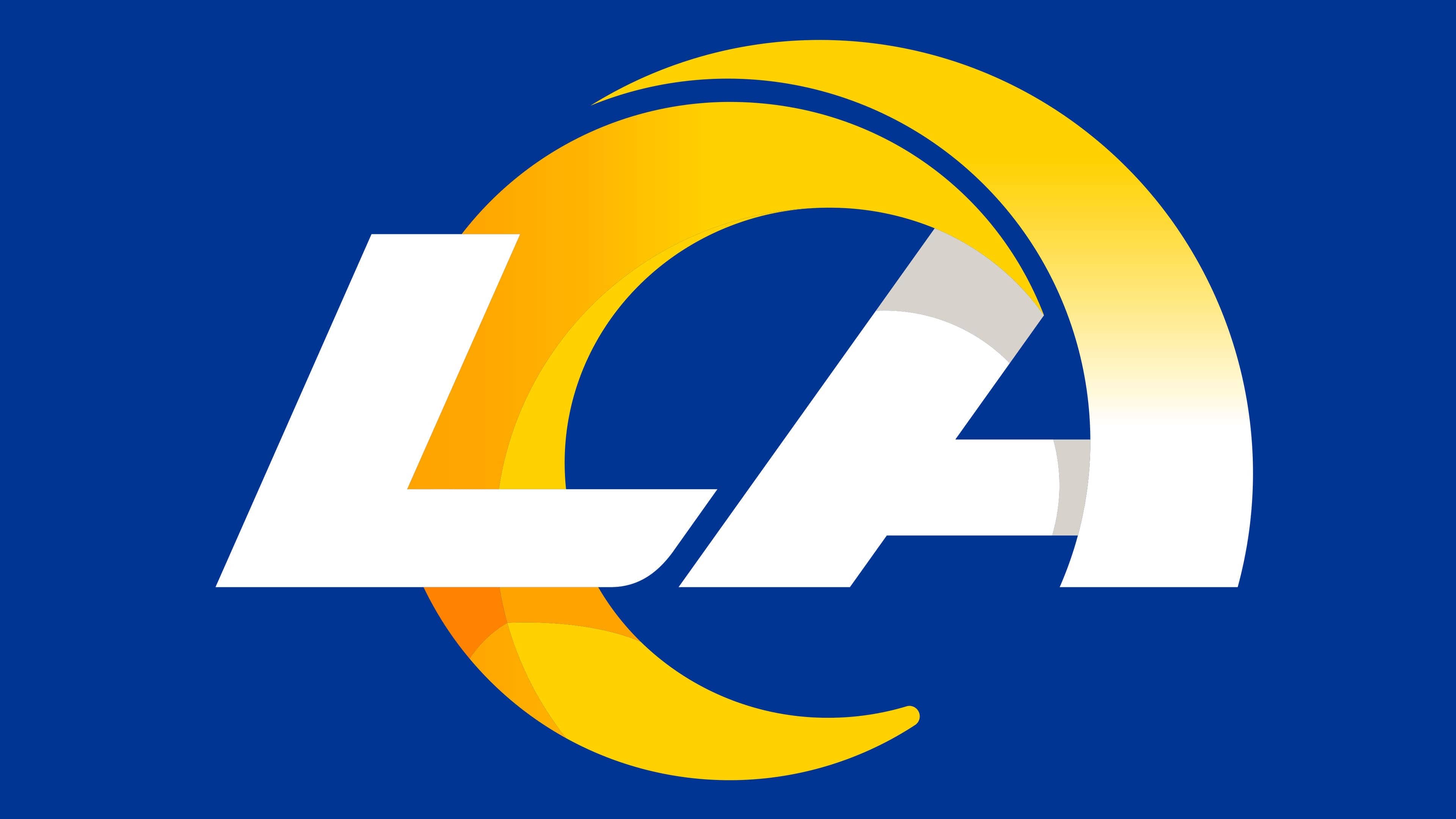
The Los Angeles Rams officially unveiled their new logo and color scheme on March 23, 2020, during a live broadcast on their website and social networks.
In 2020, the designers once again moved away from the classic sign, creating a logo featuring “LA.” Despite its literal content, it is closely associated with the Los Angeles Rams’ most popular symbol, as the top “A” clearly imitates a swirling ram’s horn. This is achieved through the recognizable shape and color transitions from blue to yellow and yellow to orange.
The letters “LA” in the new logo are blue on a white background, but the letter “A” noticeably shifts from blue to various shades of yellow because it mimics the curvature of a real ram’s horns. It’s worth noting that the transition is much more natural when the font is white against a blue background.
The new emblem focused on the horn, which seemed to intertwine with “LA.” This refers to the Rams’ forever connection to the city of Los Angeles. The horn was the main element of the club’s logos for many years. Therefore, as the club said, the gradient color transition is made specifically “to respect the evolution of the horns’ color that historically adorned the rams’ helmets.” The horned symbol in the Rams’ new logo conveys movement, team spirit, and club progress.
Font and Colors
For many years, the team’s main symbol was a ram’s head with large curved horns. However, it occasionally receded into the background: for example, from 1983 to 1994, a version with a football helmet was used, and from 1994 to 1999, the original inscription was used.
In 2020, designers moved away from the classic sign and created a logo with “LA.” Despite the literal content, it is closely related to the team’s most popular symbol, the Los Angeles Rams, as the upper-case “A” clearly mimics a twisted ram’s horn. This is achieved not only by the recognizable shape but also thanks to the color transitions from blue to yellow and from yellow to orange.
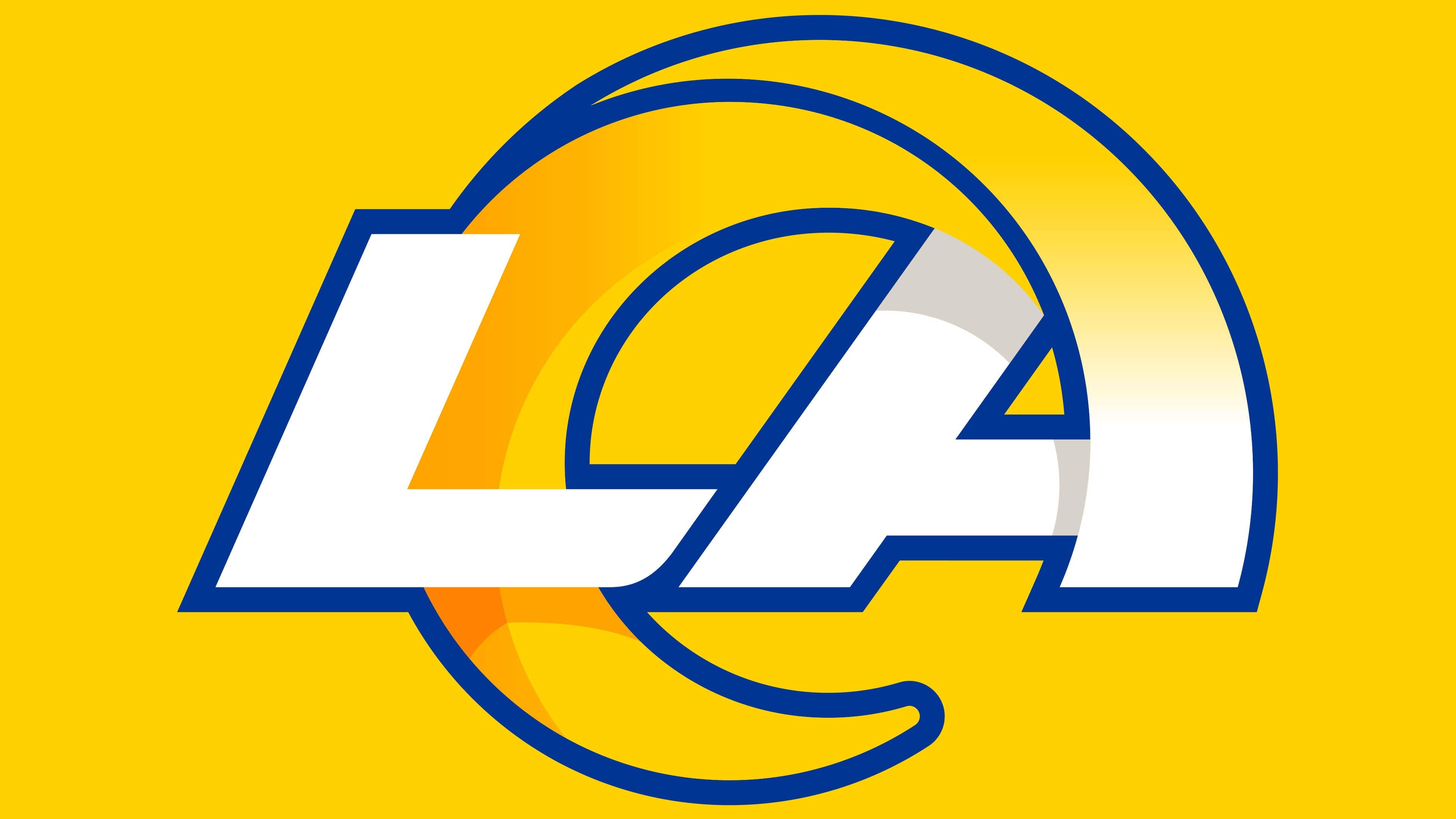
The letters “LA” are slightly tilted to the right and written in a custom sans-serif font. Both are blue, but above the letter “A” is a yellow-orange curved shape with a pointed end. According to the designers, the Hora ram’s horn gradient was used specifically to convey the evolution of the horns’ color in the team’s previous logos. Thus, the new logo’s palette is a tribute to the entire history of the “Los Angeles Rams.” It symbolizes progress and creates a sense of dynamism.