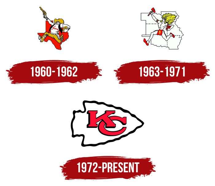
The Kansas City Chiefs emblem reflects their connection to the region’s history and the culture of the indigenous population, symbolizing the courage and determination to achieve victory. Modern minimalism makes the logo recognizable while maintaining its ties to the foundations of previous emblems.
Kansas City Chiefs: Brand overview
| Founded: | August 14, 1959 |
| Founder: | Hunt family |
| Headquarters: | Kansas City, Missouri, U.S. |
| Website: | chiefs.com |
The Kansas City Chiefs are a professional American football team based in Kansas City, Missouri. The team was founded in 1960. The Chiefs compete in the National Football League (NFL) as a club in the Western Division of the American Football Conference (AFC). They are an American Football League (AFL) charter member.
This franchise began its competitive career as the “Dallas Texans,” known as the worst club in the history of American football. However, its founder, businessman Lamar Hunt, moved the players to another location over time. This significant event occurred on May 22, 1963, thanks to Roy Bartle.
He was the mayor of Kansas City and, for some time, persuaded Lamar to do this. Bartle promised to triple the season ticket sales and expand the capacity of the Municipal Stadium to accommodate the team. He proposed this because he wanted to acquire an NFL club and enhance his prestige.
Four days after the move, the team was renamed, although Hunt and head coach Hank Stram initially planned to keep the name “Texans.” They believed it was necessary because Native Americans originally inhabited the area. Nonetheless, the majority decided otherwise. There were several options—”Mules,” “Royals,” “Stars,” and “Chiefs.” And they chose the latter. The club was named in honor of Kansas City Mayor Roy Bartle’s nickname—Chief.
Businessman Lamar Hunt was the founder and first owner of the Kansas City Chiefs. He owned the franchise until his death (from 1960 to 2006). After Hunt’s death, his son Clark was appointed Chairman of the Board of Directors of the Kansas City Chiefs.
Meaning and History
The Kansas City Chiefs are a conservative team. They adhere to old traditions, still using the 1972 emblem. Before that, they had two club signs. The first was a cowboy with a raised gun and a football under his arm. The original character was depicted against the backdrop of the state of Texas because the franchise was called the “Dallas Texans.” After moving, the second logo appeared – a Native American holding an axe and a ball. The backdrop was a map of six U.S. states. This version was used until 1973 when designers developed the current version.
What is Kansas City Chiefs?
They are a professional American football team. They are a member of the NFL and participate in the AFC, representing the Western Division. The franchise originated in 1960 and, for the first few years, was called the Dallas Texans, a name given by founder Lamar Hunt. After moving to Kansas City, it received its current name in 1963. The club joined the NFL in 1970.
1960 – 1962
The logo of that time depicted a shooter with a football standing over the state of Texas in red color. The shooter is dressed in cowboy boots, a vest, a hat, and a sweater with the red word “Texans.” He holds a football and a gun in his hands. He has a belt with cartridges and a holster for the gun. On his legs is a lone star, and the cowboy is smiling.
The Dallas Texans logo uses four colors—coral-red, black, yellow, and white—to signify charm, strength, and determination. Cartoonist Bob Taylor designed the logo. However, with the franchise’s relocation, its design became irrelevant, as North America had other historical traditions.
1963 – 1971
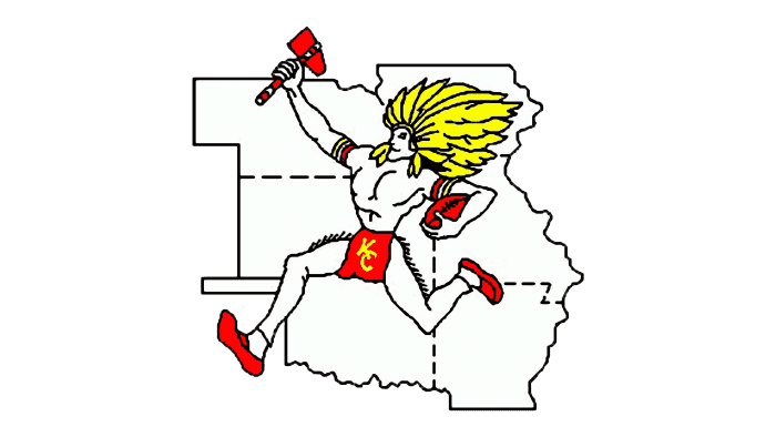
When the franchise moved to Kansas City in 1963, Bob Taylor was tasked with creating a new logo, which remained strikingly similar to its original incarnation. In the new variant, Taylor depicted a running Native American. The cartoonist used elements such as moccasins, a pigskin, an ethnic feather circlet, a tomahawk, and so-called belt clothing made from two leather pieces.
The updated Kansas City Chiefs logo depicts the figure against the backdrop of six U.S. states. The colors remained the same: red, black, white, and yellow. On the belt are the initials of the team’s nickname. The Kansas City Chiefs kept this logo until 1971. It symbolized speed, strength, agility, the desire to win, and the resolute striving of football players for new heights.
1972 – today
The current Kansas City Chiefs logo is almost fifty years old. It was conceived by Lamar Hunt himself while traveling from Dallas to Kansas City. The team’s founder constantly thought about its visual appearance, even on the plane. It was there that he came up with an excellent idea. The businessman sketched it directly on a napkin and then simply refined it, experimenting with circles and ovals. The KC Chiefs logo is done in a minimalist style: there are no figures or small details. It features an arrowhead with interwoven letters “KC” inside. The white arrowhead has a thick black frame.
As Lamar Hunt confessed, the design was not created from scratch. He was inspired by the San Francisco football club emblem: the monogram “SF” inside an oval. Taking it as a basis, the owner of Kansas City Chief came up with his version with different letters and a new frame shape.
Kansas City Chiefs: Interesting Facts
The Kansas City Chiefs are an American football team based in Kansas City, Missouri, that plays in the NFL. They have a lot of history and some pretty big moments in American football.
- Starting: The team was created by Lamar Hunt in 1960 as the Dallas Texans. At first, it was part of the American Football League (AFL). In 1963, it moved to Kansas City and got its new name, the Chiefs. It joined the NFL in 1970 when the AFL and NFL merged.
- Winning Big: The Chiefs have won the Super Bowl thrice. They first won in 1970, then had to wait a long time until they won again in the 2019 season, and they won once more in the 2022 season.
- Arrowhead Stadium: They play at Arrowhead Stadium, known for being loud. It’s even set a world record for the loudest crowd noise at an outdoor stadium.
- Cool Plays: The Patriots are known for having a good offense, especially with coach Andy Reid and quarterback Patrick Mahomes. They make many exciting plays that make fans happy.
- Lamar Hunt Trophy: The trophy given to the AFC champions is named after Lamar Hunt, the team’s founder. It’s a way to remember how much he did for football, including coming up with the name “Super Bowl.”
- Fan Traditions: Chiefs fans have a chant and a “Tomahawk Chop” they do at games, which is pretty famous but has also caused some debates about respecting cultures.
- Famous Players: Some of the team’s players have been so good they’re in the Pro Football Hall of Fame, like Derrick Thomas, Len Dawson, and Tony Gonzalez.
The Kansas City Chiefs have made a big mark in NFL history with their wins, the loudness of their stadium, and how they’ve changed the game. They’ve got a lot of fans and have made some important contributions to their community, too.
Font and Colors
The modern football club symbol is simple in style and content. No elements were used before 1972: cowboys, Native Americans, or schematic maps. The main focus is on the red monogram “KC,” located inside a geometric figure shaped like an arrowhead. This is a reference to the culture of the indigenous people of America. The letters are outlined with uneven black contours, which give them a three-dimensional look. The white arrow also has a dark, wavy border.
Lamar Hunt adhered to minimalism when developing the logo, but not entirely – he opted for a complex font with large rectangular serifs. The letters are slightly stretched horizontally.
The color solution, on the contrary, is very simple. The logo author decided not to experiment. He used only those shades that are part of the Kansas City Chiefs’ official palette: coral-red for the monogram, white for the arrowhead, and black for the wide contours.
FAQ
What does the Kansas City Chiefs logo mean?
Although the Kansas City Chiefs team logos are very diverse, they are done in a single style—caricature. First, the central character is a Texas cowboy in a wide-brimmed hat with a revolver. Then, there is a half-naked Native American with an axe and loincloth. A simplified emblem is used: an arrowhead and the abbreviation KC. It is done with a wavy line.
What font is used in the Kansas City Chiefs logo?
The letters in the central arrow of the Kansas City Chiefs emblem are done in a classic serif font. The glyphs are large, massive, and wide. Thanks to the black shading strip, the symbols seem voluminous.

