


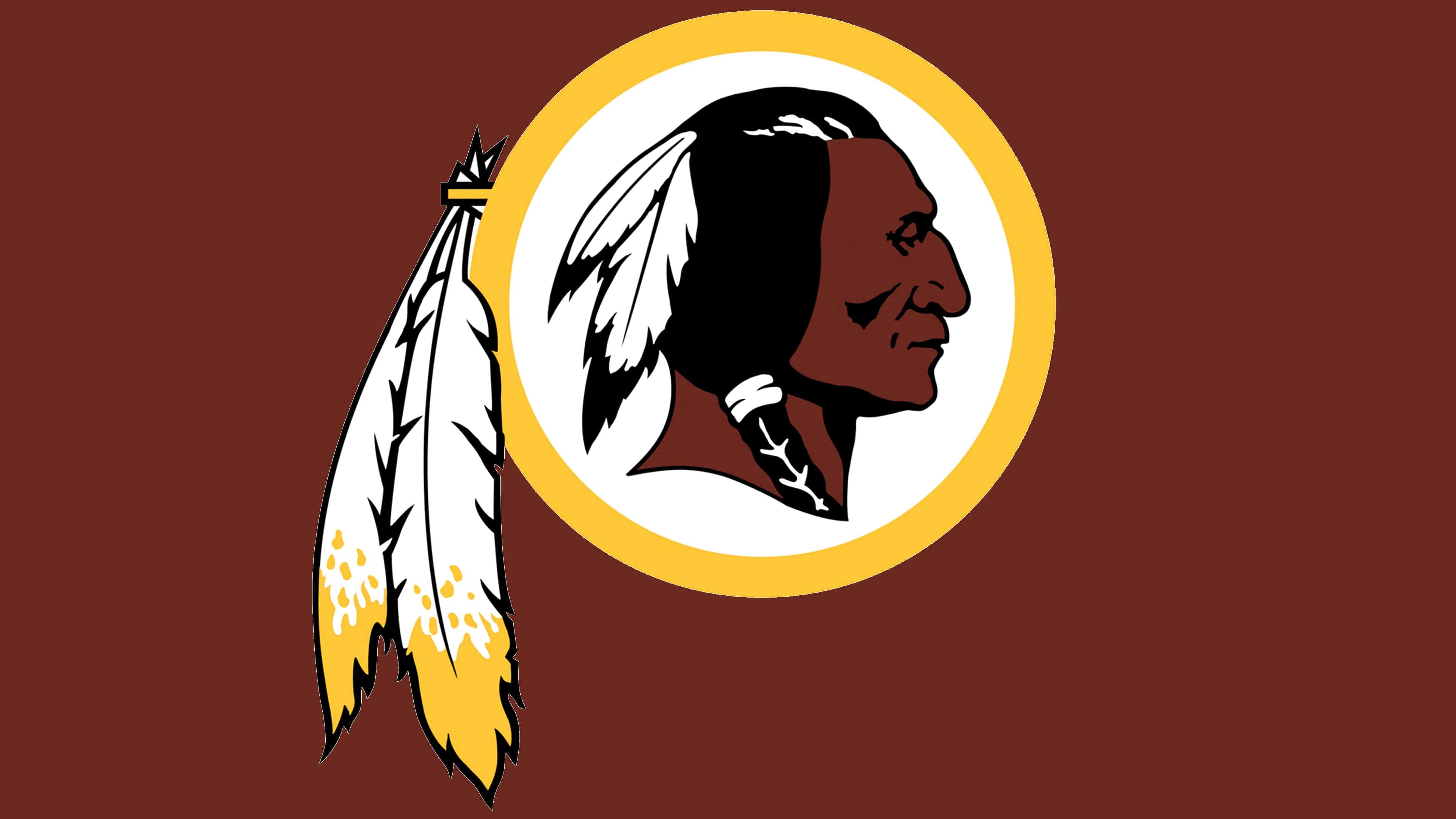
![]() Washington Redskins Logo PNG
Washington Redskins Logo PNG
The Washington Redskins logo indicates patriotism and respect for their roots. Football is not a job but a personal hobby for each club player, which they do with joy. The emblem hints at the team members’ agility, accuracy, and speed.
The Washington Redskins are an American professional football club in the National Football League. The team represents the NFC East Division, which was formed in 1932. The club is located in the Washington, D.C. metropolitan area.
The franchise began with the Boston Braves team. A year after its inception, it was renamed Boston Redskins, reflecting its location. Then George Preston Marshall, founder and first owner, moved her to Washington. This happened in 1937.
In 1969, Marshall passed away, and Edward Bennett Williams bought a controlling stake, becoming the club’s majority owner until 1974. Then, Jack Kent Cooke acquired part of his shares, which automatically gave him equal co-owner status. This was made possible because he already had a 25 percent share of the Washington Redskins: he received it through a deal with George Preston Marshall during Marshall’s lifetime, when he suffered a stroke and was unable to conduct business.
From 1985 to 1997, Cooke led the club and created his foundation. In 1999, Daniel Marc Snyder, who currently heads the franchise, acquired the controlling interest.
Interestingly, Redskins are the first NFL team with a personal marching band and sports anthem (Hail to the Redskins song). The first name came from the eponymous baseball club, the Braves. After moving to Washington, she retained the Redskins option, merely changing the location from Boston to Washington. Now, around the name associated with the image of the native Indian, scandals do not cease since “red-skinned” is considered a politically incorrect, derogatory, and insulting word.
Meaning and History
![]()
Although the brand logo has undergone several changes over its nearly 90-year history, it has visually remained within an Indian theme. The franchise’s official colors are brown, yellow, white, burgundy, and black. At the same time, not all of them are present in each version of graphic symbolism.
What is Washington Redskins?
The Washington Redskins was the previous name of the Washington Football Team, a member of the NFC East. The franchise, provided by the Washington Metropolitan Area Transit Authority, was renamed in 2020. It is one of the top leaders in the National Football League, with over 600 wins.
1932
![]()
At the beginning of its sports career, the team adopted the Boston baseball team’s logo. It was used until 1933. It depicts the red head of a representative of America’s indigenous population in a traditional feather headdress. The element is made in the profile and turned to the left. Facial features and details are formed from white lines. All parts have a double edging in the colors of the base palette.
1933 – 1936
![]()
The emblem of this period is associated with the group’s renaming to the Boston Redskins. She repeats the previous version, but with some differences. Firstly, another style of drawing is close to realistic. Secondly, the details are a yellow circle covering the central element, small strokes on the face, a white background, black hair, and two feathers. Moreover, the Indian’s head is already turned to the right.
1937 – 1951
![]()
Moving the franchise to Washington brought her an updated logo. A Native American head profile is circled in yellow. The hair is now dark brown, and in the braid, a white garter. The feathers have changed shade; now they are brownish-red. The face and neck of the Indian are tanned, with a light redhead: strict features, a serious look.
1952 – 1959
![]()
In 1952, the team began using a different symbolism, featuring the most realistic image of the authentic American population. Designers removed the yellow circle, leaving a free white space. Her hair was jet-black, her skin was brown, and her feathers were a mix of yellow and red.
1960 – 1964
![]()
The logo of these years directly echoes the debut version in red and white. In 1960, the club returned the head of an Indian, sketched in a sketchy silhouette, and turned to the right. It has no exact outlines, only the general lines from the face, neck, two feathers, and hair tied into a bun. The background is a red substrate. There is also a white border.
1965 – 1969
![]()
During these years, the franchise attempted to significantly alter the logo, leaving only feathers from the usual image. Everything else has been removed. The result is a concise graphic sign featuring a sharp spear with two feathers hanging from it. The color scheme has also changed: Yellow is actively combined with white.
1970 – 1971
![]()
Vince Lombardi, a Washington Redskins coach, insisted on a radically new logo. The logo of that period shows the capital “R,” reflecting the team’s name. The sign is placed on a white background in the center of the circle. Like the graphic symbol’s edging, the letter itself is painted in dark red. On the right are two white feathers with yellow tips, a reference to the Native American theme.
1972 – 1981
![]()
In 1972, the club decided to return to the logo used from 1933-1936 and replace the “R” with a symbol representing the indigenous population. A yellow ring appeared on the logo again, inside of which is the head of an Indian looking to the right. He has dark brown skin with a red tint and charcoal-black hair with white feathers. Two side feathers on the edging line remained unchanged.
1982
![]()
This version is the result of a marketing requirement. The developers pressed the side feathers against the ring because the round stickers on helmets did not fit. Also, the designers turned the Indian to the left.
1983 – 2020
![]()
In 1983, the sticker manufacturer began using more flexible material, so the feathers returned to their hanging look. The current version is a simplified, repetitive take on the 1972 logo, with minimal amendments. Among them are dark gray shadows instead of black on the nose, in the corner of the mouth and cheekbones, thickened lines on the face, and even shadows under the chin and neck. It also changed skin color by a couple of tones. This version is under development and was approved by the former head of the National Congress of American Indians, Walter “Blackie” Wetzel.
2020 – 2021
![]()
2021 – today
![]()
Font and Colors
The Washington Redskins Football Club logos live up to their name. They depict either a representative of America’s indigenous population or cultural attributes, such as spears and feathers. The modern version resembles a portrait of an Indian turned in profile. It was developed in 1972, and in 1983, the designers made only slight changes to the colors. This emblem was endorsed by Walter “Blackie” Wetzel, ex-head of the National Congress of American Indians.
The logo’s composition is simple. The center is the head of a dark-skinned man with a distinctive hairstyle and two white-and-black feathers. This element is inside a white circle surrounded by a yellow ring and decorated with two more feathers, the same, but only with yellow edges.
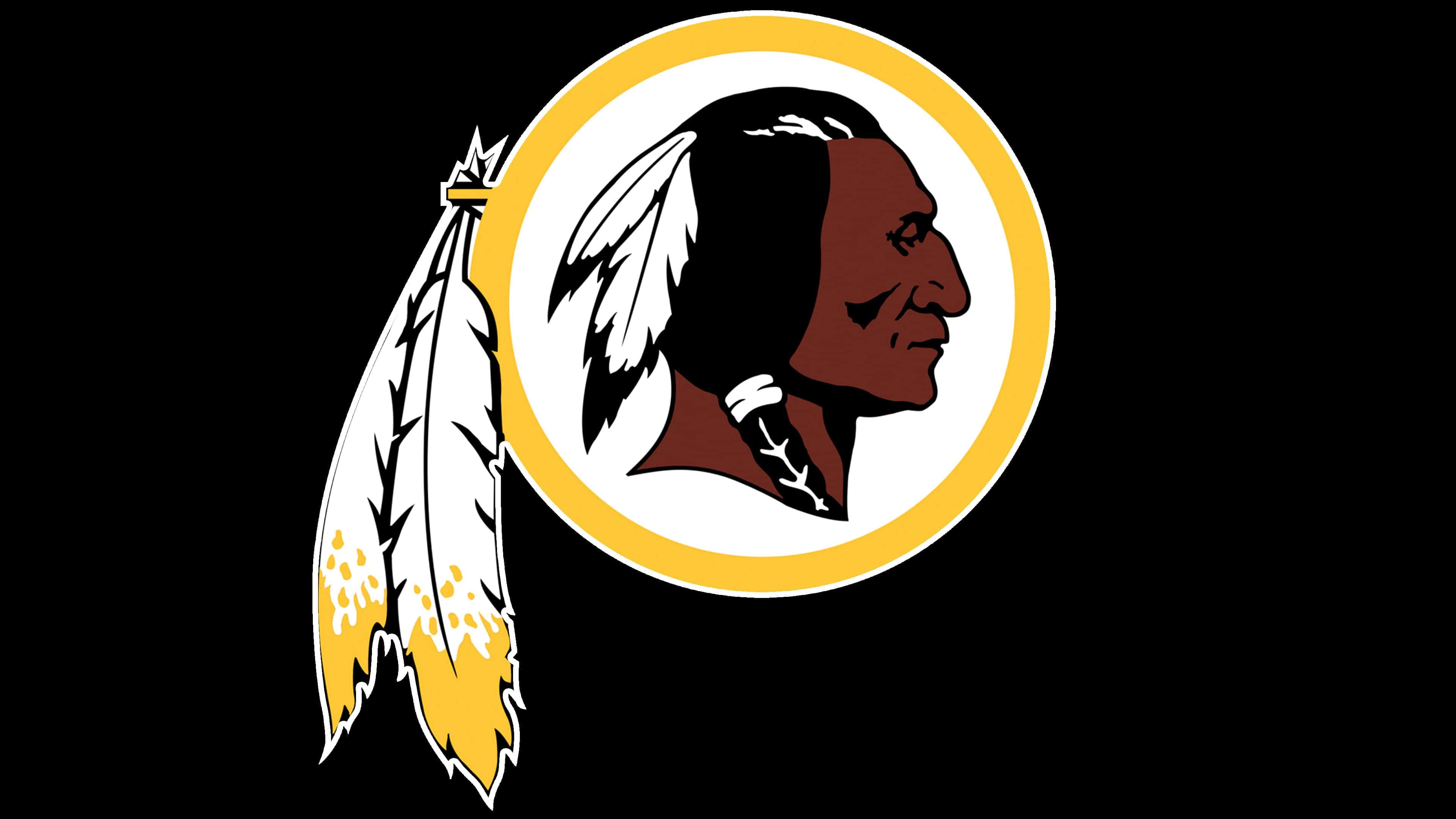
The logo creators did not use the standard typeface or the Washington Redskins’ proprietary font because the team’s logo contains no lettering. All it has is the head of a brown-faced Indian with black hair. The dark palette is complemented by light shades, such as yellow and white. They create the necessary contrast so that the main character, with their characteristic skin color, is immediately visible.