


![]() Tampa Bay Buccaneers Logo PNG
Tampa Bay Buccaneers Logo PNG
The Tampa Bay Buccaneers logo, representing the football club, closely connects to the region’s history. The modern style has added aggressiveness, increasing recognition due to its caricature-like and eccentric elements.
The Tampa Bay Buccaneers were established in 1975 and began play in 1976 as part of the NFL expansion. The project was tied to league growth plans that also involved the American Football Conference, and it required an entry fee of $16 million. In their early seasons, the team rotated between divisions before settling into the NFC’s alignment and forming the NFC South in 2002.
Initial ownership changed quickly. In April 1974, Tom McCloskey received the rights but withdrew within a month. The franchise was then acquired by Hugh Culverhouse, who ran the team until he died in 1994. His son inherited control, but financial pressure pushed the organization toward a sale.
During that period, interest came from figures such as George Steinbrenner of the New York Yankees and Peter Angelos of the Baltimore Orioles. Concerns about relocation grew, but in 1995, Malcolm Glazer purchased the team for $192 million and brought his sons, Brian, Edward, and Joel, into management, securing stability.
The Buccaneers’ name was chosen in 1975 through a contest with more than 400 proposals. Final options included Mariners, Buzzards, and Coastal Tides. The selected name referred to historical pirates active along the Florida coast, later shortened in common use to “Bucs.”
Meaning and History
![]()
The debut logo was presented on April 14, 1975. Its author was Lamar Sparkman, a cartoonist from the Tampa Tribune, who had long worked as a designer for sports clubs. He created a graphic image of a Corsair in a feathered hat, which he used for 20 years. The team’s official colors are orange (referring to Tampa’s citrus industry), red (symbolizing the sun, warmth, courage, and endurance), and white, which serves as the background.
What is Tampa Bay Buccaneers?
The Tampa Bay Buccaneers are a football franchise based in Tampa, Florida. The team’s headquarters, located in the One Buccaneer Place building, and home stadium, unofficially known as Ray Jay, are here. The team has existed since 1974 and has played in the NFC South since 2002.
1976 – 1996
![]()
The “Tampa Bay Buccaneers” emblem was a pirate throughout this period. The artist decided to make the pirate special, unlike the other teams’ pirate emblems. The pirate is depicted with a dagger in his teeth, a large earring, a mustache, and a wide-brimmed hat with a large feather. Bucco Bruce (as he was nicknamed) smiles slyly and squints his left eye. The author admitted that these results are based on combined images of Errol Flynn, Jean Lafitte, and the musketeer D’Artagnan.
1997 – 2013
![]()
In 1997, the club’s management changed the logo to an aggressive one. Its task was to improve the team’s image and add popularity, coolness, and recognizability. Therefore, a dark red pirate flag with a skull and crossed sabers was used instead of the Corsair flag. The depicted Jolly Roger resembles Calico Jack. In the foreground is an orange ball. All elements have a black border and dark strokes, creating a frightening impression.
2014 – 2019
![]()
In 2020, the Tampa Bay Buccaneers introduced a new logo based on the previous version. From a compositional point of view, nothing has changed: the same Jolly Roger menacingly smiles from the dark red flag and looks forward with empty eye sockets. The artists also depicted three sabers: two are crossed under the skull instead of bones, and one more serves as the “mast” for the flag. There is also a football located under Jolly Roger’s head.
In this version, the previous emblem is slightly reworked:
- The skull does not laugh but frowns and smirks.
- The canvas’s palette shifts towards scarlet.
- The red color disappeared from the stylized mast’s handle.
Also removed are the black streaks and the wide border line, which has become somewhat thinner. The football received a scarlet sparkle at the bottom and a white lace. All details are outlined in a dark color.
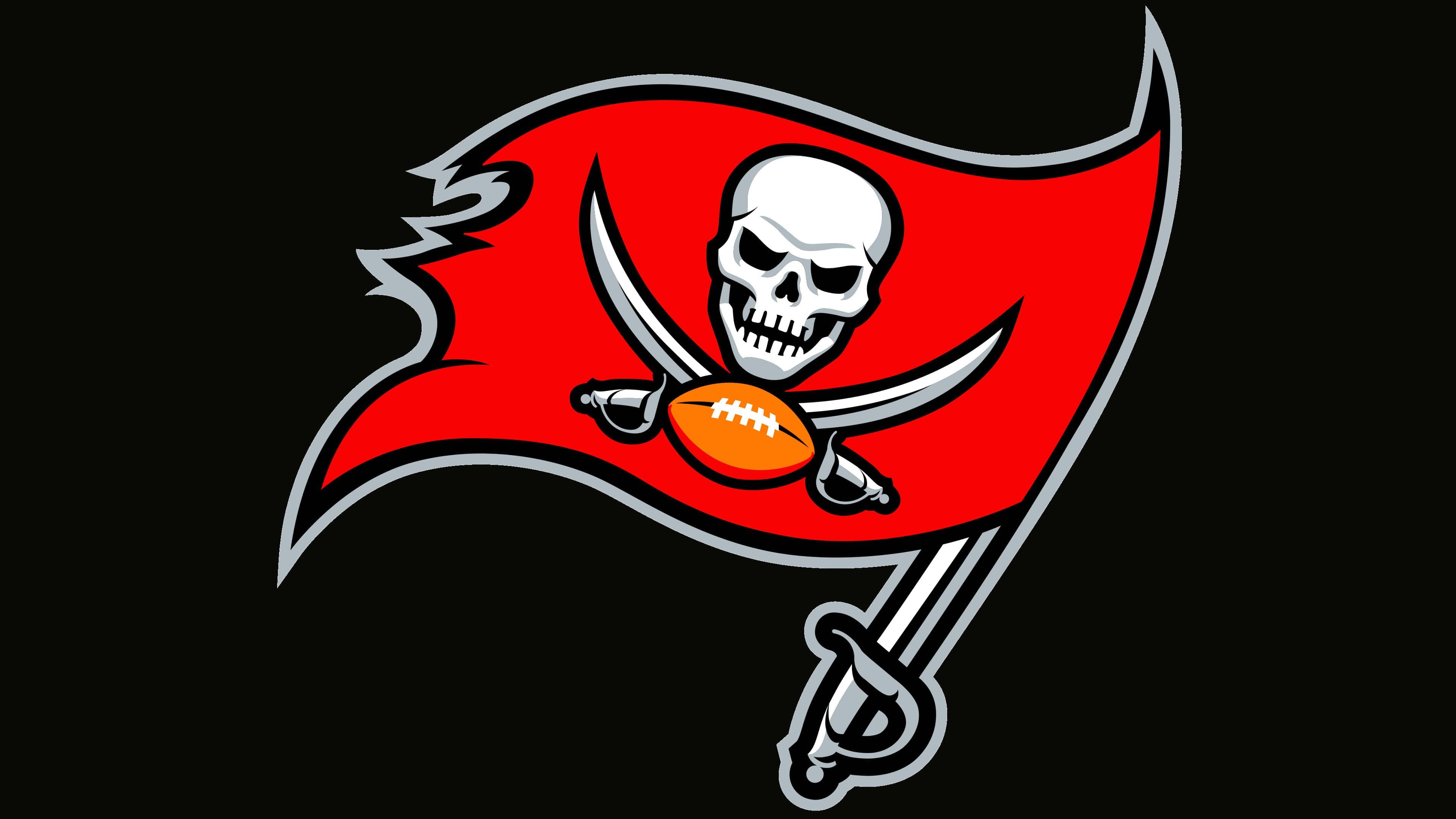
2020 – today
![]()
In 2020, the logo underwent no radical changes, and many fans didn’t notice. However, according to the club, the bright red on the main emblem has become more muted, and the ball’s color has shifted from bright orange to a duller shade.
Font and Colors

Tampa Bay Bucs logo
The current emblem has nothing in common with the first version, a militant corsair, armed to the teeth. This view appeared on April 14, 1975. Its creator was Lamar Sparkman, a cartoonist who worked as a designer for the Tampa Bay Buccaneers team. The portrait of a sailor in a wide-brimmed cloak was used for 20 years until Jolly Roger replaced it.
Depicting a skull with sabers, the artists intended to make it resemble Calico Jack, a famous pirate of the early 18th century. The club, in turn, sought to improve its image and become more recognizable. And in this, it was helped by a new emblem, seemingly aggressive but caricatured and cartoonish.
There is no inscription on the pirate flag or nearby. The logo designers did not create a custom font or use an existing one; they limited themselves to a graphic image of the Jolly Roger. Hence, they carefully chose the colors.
The 2020 emblem differs from the identical 2014 version only in shades. The flag’s canvas is dark red, almost wine-colored. The skull and sabers are traditionally white, with light gray tones that give them volume. The ball, as before, is brown. All contours around the elements are black; only the flag with the “mast” is outlined with a wide gray line.