


![]() Oakland Raiders Logo (Las Vegas Raiders Logo) PNG
Oakland Raiders Logo (Las Vegas Raiders Logo) PNG
The Oakland Raiders logo intricately reflects changes and resilience, with its core meaning remaining unchanged to this day. The pirate face is the primary symbol for teams from different cities, yet it also conveys the tenacity with which they play.
The Oakland Raiders were established in 1960 as a founding member of the American Football League in Oakland, California. The franchise emerged after a Minneapolis ownership group shifted to the National Football League, leaving an opening that Oakland secured on January 30, 1960. Following the AFL–NFL merger in 1970, the team entered the American Football Conference West division.
Initial ownership belonged to Chet Soda. In 1961, control passed to F. Wayne Valley and Ed McGah. A major shift came in 1966 when Al Davis joined as head coach and general manager. He negotiated a new partnership structure, becoming managing general partner with near-total operational control. Valley exited in 1976 after disagreements over the arrangement.
Despite Davis’s influence, the club remained a limited partnership. In 2005, he acquired the McGah family’s stake and became the majority owner, though he held 67% of the shares at the time of his death. In 2011, ownership transferred to Mark Davis and Carol Davis.
The franchise relocated twice, moving to Los Angeles in 1982, returning to Oakland in 1995, and planning a move to Las Vegas in 2020.
The original name “Oakland Seniors” came from a contest run by the Oakland Tribune, but internal preference led to “Raiders,” adopted after nine days. The change reflected a desire for a more motivating identity and practical concerns over the absence of the letter “ñ” in English. Helen A. Davis, who proposed the initial name, received a trip to the Bahamas.
Meaning and History
![]()
The key element of the “Raiders” emblem is the pirate’s head. Over the past 60 years, the iconic “Raiders” head has undergone minor changes while remaining largely unchanged. Throughout its NFL existence, the franchise has used five logos, with three of them remaining virtually unchanged. The official color palette includes black, gray, and white.
What is Oakland Raiders?
The Oakland Raiders were the team’s old name; it is now known as the Las Vegas Raiders. From 1982 to 1994, it was known as the Los Angeles Raiders. In 2020, the franchise moved to Las Vegas, but it was based in Oakland for most of its history.
1960 – 1962
![]()
The earliest logo appeared in 1960 when Chet Soda, the founder and first owner of the team, asked Gene Lawrence Perry, the director of public relations, to find an artist to draw a new logo for the “Oakland Raiders.” Gene Lawrence Perry hired an artist from Berkeley who created a logo depicting a pirate in a football helmet with a solid chinstrap. The head was superimposed on a golden football. It’s believed that actor Randolph Scott, who was incredibly popular at the time, served as the designer’s model. As a result, the franchise received an extremely recognizable logo: the Raider’s chin with an eye patch and a football helmet.
1963
![]()
Al Davis, the team’s next owner, decided to abandon the gold-and-black colors, opting instead for black and white with a silver accent. The 1963 “Raiders” emblem featured a pirate’s head with two swords crossed behind it, set inside a black-and-silver shield. Above the raider’s head, in block-shot style font, was written “THE OAKLAND” in smaller letters than the word “RAIDERS.”
1964 – 1981
![]()
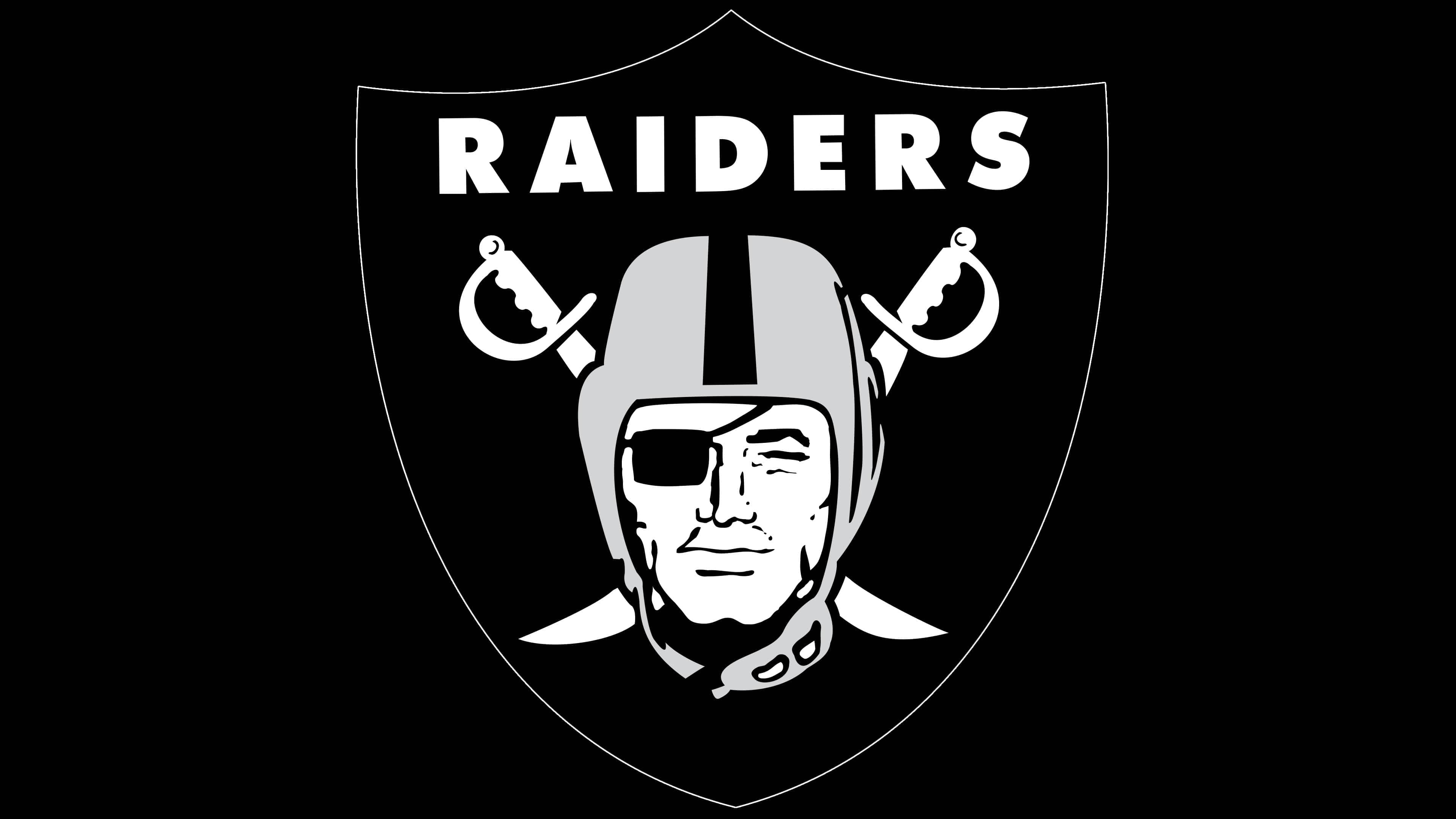
During these years, the “Oakland Raiders” logo remained untouched: the raider’s head and crossed swords were set against a black shield with white lettering. The face is shown in full length, the left eye squinted, and the right covered with a black eye patch. Above the pirate’s head, crossed swords spell out the franchise’s name in white font: “RAIDERS.” It’s written in capital letters. The bold sans-serif font with large lettering looks solid. Key elements are colored light, and the background is dark.
1982 – 1995

Despite moving to Los Angeles, the franchise remained loyal to its original logo. The difference was in the wording: the “Oakland” inscription was removed. Moreover, the new Oakland Raiders logo featured white, black, and gray. For example, the helmet was painted gray with a dark stripe in the middle. The swords were shortened, the shields became black, and the pirates’ facial features were stern.
1995 – 2020
![]()
2020 – today
Font and Colors
The key image of the Oakland Raiders’ emblem is the pirate’s head. It resulted from a creative collaboration between a Berkeley artist and actor Randolph Scott, whose face is depicted on the football team’s emblem. Thus, the image represents not an unnamed character but a real person, incredibly popular in the mid-20th century.
Client Chet Soda developed the emblem under the close watch of Gene Lawrence Perry. The designer created a recognizable image of the raider, featuring a black eye patch and a football helmet that covered most of the head. Expressive face: special emphasis is placed on the determined chin. On the back, two crossed swords are drawn, emphasizing the character’s occupation. Slightly above is the word “RAIDERS.” All elements are set against a black heraldic shield background.
The inscription on the emblem looks standard, although the designers adapted the font specifically for the Oakland Raiders. The bold sans-serif font resembles Twentieth Century MT Ultrabold. The colors were chosen in accordance with the team’s official palette. The swords, face, and the word “RAIDERS” are white; the football helmet is light gray, and the shield, armband, and small details are black.