


![]() Denver Broncos Logo PNG
Denver Broncos Logo PNG
The Denver Broncos logo symbolizes endurance, irresistibility, and commitment to the club’s history. The modern, concise emblem effectively supports the name, reflecting the wild energy and primal fury of the club’s mystical mascot.
The Denver Broncos are a professional football team competing in the Western Division of the American Football Conference in the National Football League. The team was founded in 1960 as a member of the American Football League and joined the NFL ten years later. In 1959, Bob Howsam, owner of the baseball club “Denver Bears,” planned to create a third major league, the Continental League. Therefore, he expanded the “Bears” stadium to accommodate crowds from the Continental League. Unfortunately, Howsam’s ambitions were not realized. To recoup the costs of expanding the “Bears” stadium, he moved the AFL franchise to Denver.
Bob Howsam became the original owner of the “Denver Broncos” team, which was founded in the new league on August 14, 1959. The team debuted in 1960, the first AFL season, as the “Denver Broncos.” The name “Broncos” was the winning suggestion out of 162 entries in a fan contest submitted by Ward M. Vining. The Spanish word “broncos” (mustang, untamed horse roaming the American prairies) alludes to Colorado’s Wild West history. However, the team is not the first to be called “Denver Broncos.” A club with the same name played in the Midwest Baseball League in 1921.
In May 1961, Gerald Phipps purchased the franchise and managed it until 1981, when it was sold to Canadian financier Edgar Kaiser. In 1984, the club was acquired by the Bowlen family (Pat, Marybeth, John, and Bill Bowlen). Pat Bowlen remained at the helm until July 3, 2014. As Alzheimer’s disease progressed, he had to cede the franchise to Joe Ellis, president and CEO of the “Broncos.” Currently, the “Denver Broncos” are owned by Pat Bowlen’s trust fund.
Meaning and History
![]()
Over the franchise’s 60-year history, the Denver Broncos logo has undergone five changes. All Denver Broncos logos feature a Mustang, a reference to the team’s name. The Spanish word “broncos” means a wild horse from the American prairies, an uncontrollable and freedom-loving animal associated with the history of the Wild West in general and Colorado in particular. As for the drawing’s style, it has changed several times. With four redesigns, the club went from a caricatured emblem to a caricature and then to a modernist design. The latest version is considered the most successful, combining deep meaning and artistic value.
The modern logo is radically different from the debut one: rough simplicity has been replaced by modernist minimalism. The modern logo was designed in 1997, at the turn of the millennium, and has remained unchanged to this day.
What is Denver Broncos?
The Denver Broncos are a former member of the American Football League, competing in the American Football Conference of the National Football League, and playing at Empower Field at Mile High. The team debuted in 1960 and, as of 2021, has won three Super Bowls.
1960 – 1961
![]()
The Denver Broncos, owned by Bob Howsam, began their career in the American Football League’s inaugural season in 1960. Their earliest emblem very much resembled a hand-drawn cartoon character. It featured a football player riding a galloping horse. The colors matched the uniform of the time, brown combined with mustard yellow. The player wore ivory-colored cowboy boots, a yellow helmet, and a dark brown shirt with the letter “B” in the center. The bold letter “B” with short vertical serifs represented the franchise’s name. The furious horse raised its front legs while its hind legs were lifted off the ground. The image seemed overloaded with details: a fluffy mane, a flowing tail, spurs, and horse tack.
1962 – 1969
![]()
In 1962, the team introduced a new logo. The overall concept of the Denver Broncos’ emblem remained the same: a football player taming a stubborn Bronco. The shape of the player and the horse was completely changed. Designers made the image more dynamic and slightly aggressive. They sharpened the lines of the mane, tail, and ears. Although the new player didn’t look as relaxed as his predecessor, he still retained some of his predecessor’s optimistic mood.
The mustang attempted to throw the rider off, but the latter tried to stay on the horse, grabbing the reins with his left hand and clutching the ball with his right. The rider didn’t use spurs or a saddle strap. The animal had massive hooves. Bared teeth and flared nostrils were clear signs of aggression. The player wore striped pants and a long-sleeved ’63 Broncos shirt.
If the Mustang and player on the debut Denver Broncos logo were oriented to the left, then in the 1962 version, they were turned to the right. The figures’ external contours were dark blue and white. Short lines extended beyond their limits to create the illusion of movement. The 1962-1969 era brought significant changes to the color scheme. The yellow-brown palette was abandoned; the team’s official colors became dark orange, royal blue, and white.
1970 – 1992
![]()
In the 1960s, the team sought a new logo that would convey the franchise’s key idea. An amateur artist, Edwin Taylor, proposed a recognizable logo, for which he received a thank-you letter, a T-shirt, a cap, and two tickets to a game against the “Kansas City Chiefs.” In 1970, the team adopted the proposed logo and abandoned the familiar concept of “player-galloping-bronco.”
The new logo featured a large orange letter “D” on a blue background, with a galloping white bronco in the center, exhaling steam. The letter “D,” which, of course, stood for “Denver,” was written in the same font as the “B” on the player’s outfit in the 1960 logo. The horse didn’t rise to full height; only its upper body was visible. Artistic elements (smooth strokes that emphasize muscles, lowered eyebrows, an open mouth, and steam from the nostrils) were intended to highlight its strength, power, and aggression. The white horse was outlined in black.
1993 – 1996
![]()
In 1993, the Denver Broncos introduced a moderately modified version of the previous logo to make the image clearer and more noticeable from a distance. Changes affected only details: designers thickened the outer contour, added smooth lines to the mane, removed the stripes with steam, and made the eye entirely black. The letter “D” remained the same as in the previous version. The color palette also didn’t change.
1997 – today
![]()
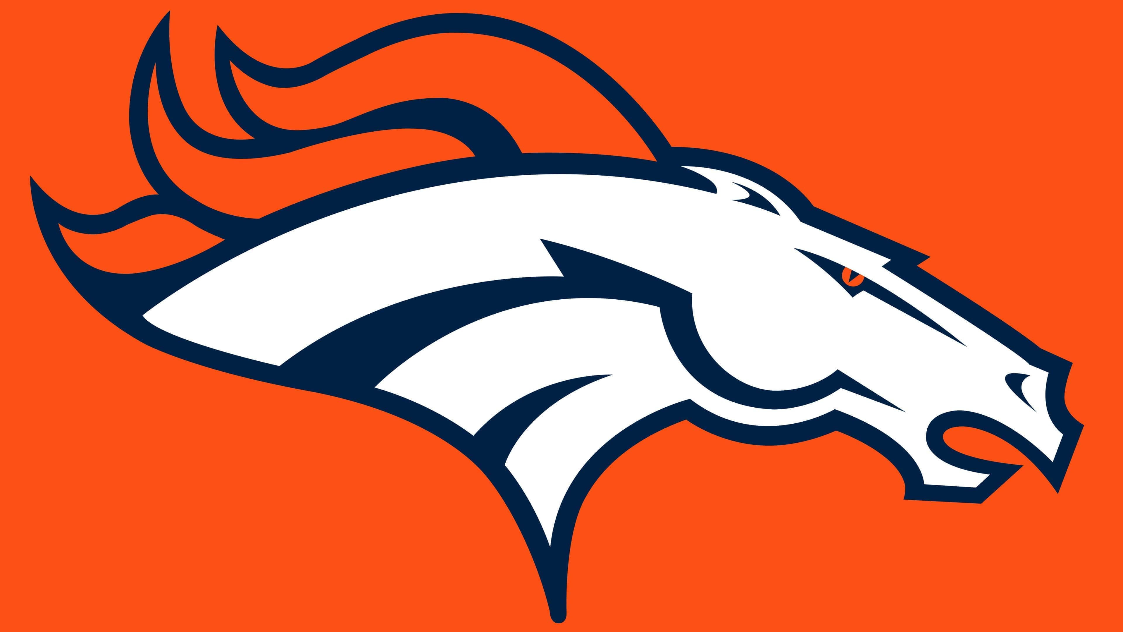
The modern logo was introduced in 1997 after franchise owner Pat Bowlen decided to conduct a complete rebranding. Seeking an exclusive design, Bowlen turned to Nike’s creative staff. He wanted the new logo to include the team’s mascot, Thunder. The development team included David Odusanya, Ken Black, Todd Van Horne, and other company representatives. They faced a responsible yet feasible task: designing the Denver Broncos’ team mascot, a horse named Thunder. The designers finished working on the logo in the fall of 1996. The official presentation took place in early February of the following year. They managed to convey the fury of a primal element through the mystical image of a ghostly mustang from Native American legends. The key ideas were resistance, willpower, and lack of control.
Therefore, the current Denver Broncos emblem features a white horse’s head with an orange mane and eyes. Dark blue lines along the neck symbolize the flow of energy. The orange iris is the fire igniting in the animal’s soul. The mane resembles tongues of flame. The ears are pinned back to create an impression of speed, as if the Mustang is rushing forward. All elements are executed in dark blue. With the team’s corporate style update, royal blue was replaced with dark blue.
The emblem was completed in September 1996 and officially presented on February 4, 1997. The media noticed the famous Nike swoosh on it, but company representatives refuted this. Thanks to modernist simplicity and design, the Denver Broncos’ emblem has lasted for over 20 years.
Font and Colors
The logo’s authors complicated their task: they didn’t make a “portrait” of Thunder Horse; instead, they invested this image with a double meaning. Guided by ancient Indian legends, the designers delved into mysticism, depicting a ghostly mustang with glowing eyes. They felt that this character conveyed the main traits of Denver Broncos players: strength, speed, determination, and freedom-loving spirit.
Not without scandals. Some journalists thought the horse’s head’s external lines closely resembled the legendary Nike swoosh and accused Nike of trying to advertise itself. However, the emblem’s creators immediately refuted this theory.
The developers focused solely on the graphic aspect, so the logo features an image without text. But the drawing itself is quite informative; it tells a whole story that reflects the Denver Broncos’ concept.
The horse’s white color suggests it is a ghost, the disembodied spirit of a mustang from ancient legends. The orange mane can be interpreted as fire because the same orange eye symbolizes the flame in the animal’s soul. The dark blue lines on the neck represent invisible energy flows.