


![]() Buffalo Bills Logo PNG
Buffalo Bills Logo PNG
The Buffalo Bills logo features a stylized depiction of the mascot and a red streak. The streak amplifies the effects of acceleration and movement, lending dynamism to the minimalist buffalo mascot and serving as a display of determination and strength.
The Buffalo Bills are a professional American football team playing in the Eastern Division of the American Football Conference. They began competing as a franchise of the American Football League in 1960. Still, as a result of the AFL-NFL merger in the 1970 season, the club transitioned to the National Football League.
The first owner of the club was Ralph Wilson. Lamar Hunt, the founder of the AFL, offered him a spot in the major league and provided a list of 6 cities. He chose Buffalo: lawyer Paul Crotty struck a profitable deal with Buffalo’s Civic Stadium, offering Wilson full control over the venue and a significant rent discount.
Fans wanted to name the new franchise after the former AAFC Bills, which merged with the Cleveland Browns in 1950. Ralph Wilson supported this idea. The old namesake team was named after the popular quartet Buffalo Bills, which was named after showman and hunter William Frederick Cody. He earned this nickname by killing 4,280 buffalo in eighteen months.
Ralph Wilson passed away in 2014. The football club’s owners became Terrence Pegula and his wife, Kim. They bought the franchise for 1.4 billion dollars on October 10th.
Meaning and History
![]()
Each of the four Buffalo Bills logos is unique. But they all share a common element: the buffalo. Initially, artists depicted two animals, and to show the connection to sports, they added a large elliptical ball and two football players in the team’s white-and-blue uniforms. Then they went minimalist, reducing the number of characters to one player and one buffalo.
1970 was a turning point for the club. At this time, a simplified logo with a red silhouette of the animal appeared. It was used for only three years but served as the basis for the next permanent emblem.
What is Buffalo Bills?
The “Buffalo Bills” are a team competing in one of the four divisions of the American Football Conference of the National Football League. Founded in 1960, it immediately joined the AFC. The club is now based in the Buffalo-Niagara Falls metropolitan statistical area and plays at the Highmark Stadium in Orchard Park, New York.
1960 – 1961
![]()
The central image of the Buffalo Bills logo is a blue football. It serves as the background for other elements. The logo features a herd of buffalo and two football players in the Buffalo Bills’ uniform of the time. Above is the white wordmark “BUFFALO BILLS,” set in block letters. The font is sans-serif.
1962 – 1969
![]()
The second version of the Buffalo Bills logo resembles the first. Designers again made the ball the background. Now, the logo features a brown buffalo in grainy sepia tones and a football player with the number 31 on a blue-and-white shirt. On the head is a white helmet with a red horizontal stripe and a Buffalo image. The wordmark “Buffalo Bills” disappeared; only distinctive equipment remains, indicating affiliation with the franchise.
1970 – 1973
![]()
In 1970, designers changed the original concept. They removed the balls and players. Only the red Buffalo remained the same as in the helmet version of the Buffalo Bills’ emblem. The granularity is low; contours are absent.
2002 (unused)
![]()
This is an unused logo of the Buffalo Bills team. It was created in 2002 when General Manager Tom Donahoe decided to change the players’ uniforms and logo. A stylized letter “B” (meaning Buffalo Bills) in the lower left corner, consisting of one red and one blue bullet. Above it is an image of a charging bison. Fans opposed these changes, so the franchise reverted to the 1974 version.
1974 – today
![]()
The modern Buffalo Bills logo was created by aerospace designer and commercial illustrator Stevens Wright. His wife, Jere Wright, was a production manager at NFL Properties, the group responsible for licensing and branding the league. Jere brought her husband’s talents to David Boss’s attention, who was then the director of creative services at NFL Properties. The boss immediately gave Stevens a significant assignment: to create a new logo for the “Bills.” In the summer of 1973, Stevens Wright presented the “Bills” with several sketches. The team’s general manager, Robert Lustig, responded with a letter expressing his preference for the design that eventually became the “Buffalo” logo. The logo’s creator has always been proud of it, and it’s no wonder: it was created in 1974 and is still used by the team today. It’s been impossible to find a replacement for it: the only new variant offered for consideration in 2002 was immediately rejected by fans as unsuccessful.
The Buffalo Bills’ emblem featured a blue bison, as schematic and minimalist as in the 1970 version. Unlike the previous logo, this one is more dynamic. The movement is indicated not only by the flying posture of the bison but also by the red slanting stripe extending from its white horn. This image includes all the colors of the football club except dark blue. The finished logo debuted in the 40th season.
Font and Colors
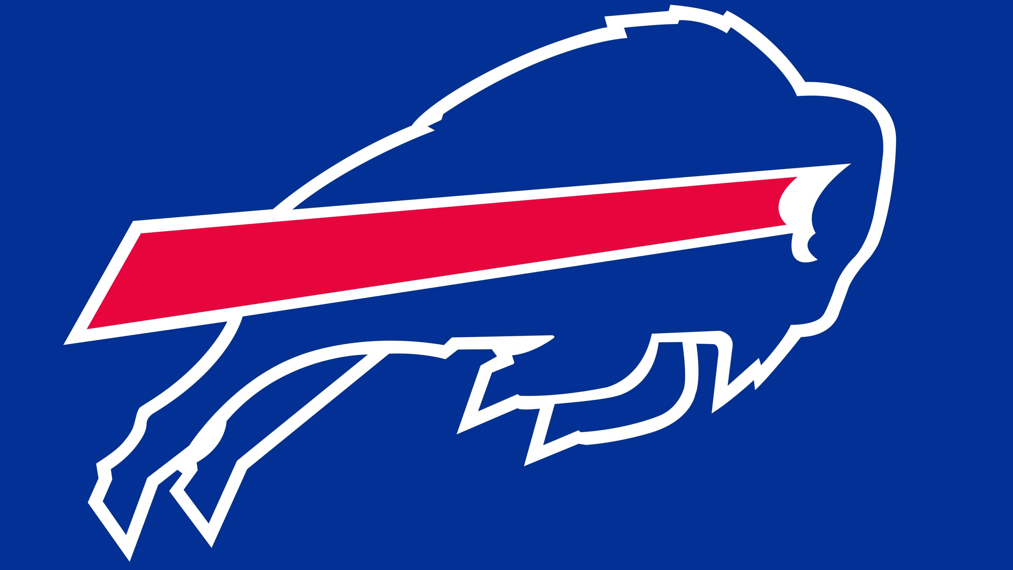
The buffalo, the club’s primary symbol, is depicted in an abstract style. However, this did not prevent the artist from creating a sense of dynamics, showing the animal’s character, and expressing its individuality. Movement is indicated by the silhouette of a running buffalo and an expanding red line stretching from the white horn to the emblem’s invisible left border.
The logo designer did not use any tags. As an artist, he focused all attention on the graphic component and did so at the highest level. Jere Wright chose a combination of only three colors: royal blue for the animal, red for the stripe, and white for the surrounding space and small details.
Thus, he combined the main shades from the official Buffalo Bills palette without overloading the logo with extra elements. And the version he created became a classic: the club still can’t “get rid” of its iconic red-and-blue badge, which fans have grown so fond of.
FAQ
Why is there a red stripe on the Buffalo Bills logo?
The red stripe on the Buffalo Bills logo symbolizes movement and acceleration. It gives dynamism to the image, indicating that the “Buffalo” is not standing still but rushing forward at high speed.
Why is a bison depicted on the Buffalo Bills logo?
The bison in the Buffalo Bills logo represents the team’s name.
Where did the Buffalo Bills’ logo come from?
Stevens Wright drew the logo for this NFL franchise in 1971. He used the previous version as a basis, making the silhouette more proportionate and adding dynamic elements to the bison.