


![]() Jacksonville Jaguars Logo PNG
Jacksonville Jaguars Logo PNG
The emblem is an impressive demonstration of the team’s main characteristics. The mascot’s unpredictability, its irresistible ability to defeat the enemy, and its selfless drive to protect are symbolically reflected in the Jacksonville Jaguars’ emblem.
The Jacksonville Jaguars are a professional football team from Jacksonville, Florida, competing in the AFC South division of the National Football League.
The franchise was officially established in 1995 as an expansion team. Its origins trace back to 1989, when the group “Touchdown Jacksonville!” was formed by Jeb Bush, Tom Petway, and Wayne Weaver to secure an NFL franchise.
Local authorities committed $ 60 million to stadium construction, after which the group applied for league entry. In 1991, the NFL announced plans to add two new teams. Jacksonville faced strong competition from larger cities and was considered an unlikely candidate because of its population size and an outdated stadium.
By 1992, the list of applicants had narrowed to five cities. During this period, the stadium in Jacksonville was renovated, which strengthened the bid. In 1995, the Jacksonville Jaguars began play, with Wayne Weaver as the sole owner.
Weaver led the club until November 29, 2011, when he announced its sale. In 2012, businessman Shahid Khan acquired the team for $ 770 million and kept it in Jacksonville. By 2015, Forbes valued the franchise at $ 1.48 billion.
The name “Jaguars” was selected through a fan vote before the team’s debut, chosen over “Sharks” and “Stingrays” because of the presence of a well-known jaguar at the local zoo.
Meaning and History
![]()
The Jacksonville Jaguars logo features none other than a jaguar. This is quite an expected decision, as even the team’s official colors match its fur. However, there were surprises: the players never used their first emblem due to claims from an automaker. Ford Motor Company accused the “Jacksonville” club of copyright infringement. The club’s owners found the image of the jumping predator suspiciously similar to the Jaguar brand logo. To avoid legal disputes, the team was forced to change the logo’s design.
The team’s official colors are black, gold, white, and teal. They match the jaguar’s natural colors, which were chosen as the main symbol. As a result, the Jacksonville Jaguars’ logo did not change for many years, transforming only at significant stages of the franchise’s development.
What are Jacksonville Jaguars?
The Jacksonville Jaguars are one of the few National Football League teams that have never played in the Super Bowl. It has existed since 1993, is in the AFC South, and has won several division championships. Its original home stadium was the TIAA Bank Field.
1993 – 1994 (unused)
![]()
This Jacksonville Jaguars logo design was not used, even though it was initially recommended. It turned out that the proposed “Jaguars” logo was too similar to an automaker’s logo. Although the case did not go to court, the team’s lawyers and the automaker reached an amicable agreement. Therefore, the logo was changed. In the authentic design, a jaguar is depicted leaping at full height. The animal’s body is noticeably elongated, teeth bared, and claws extended. All this speaks of an active attack. The logo’s color palette is yellow and black.
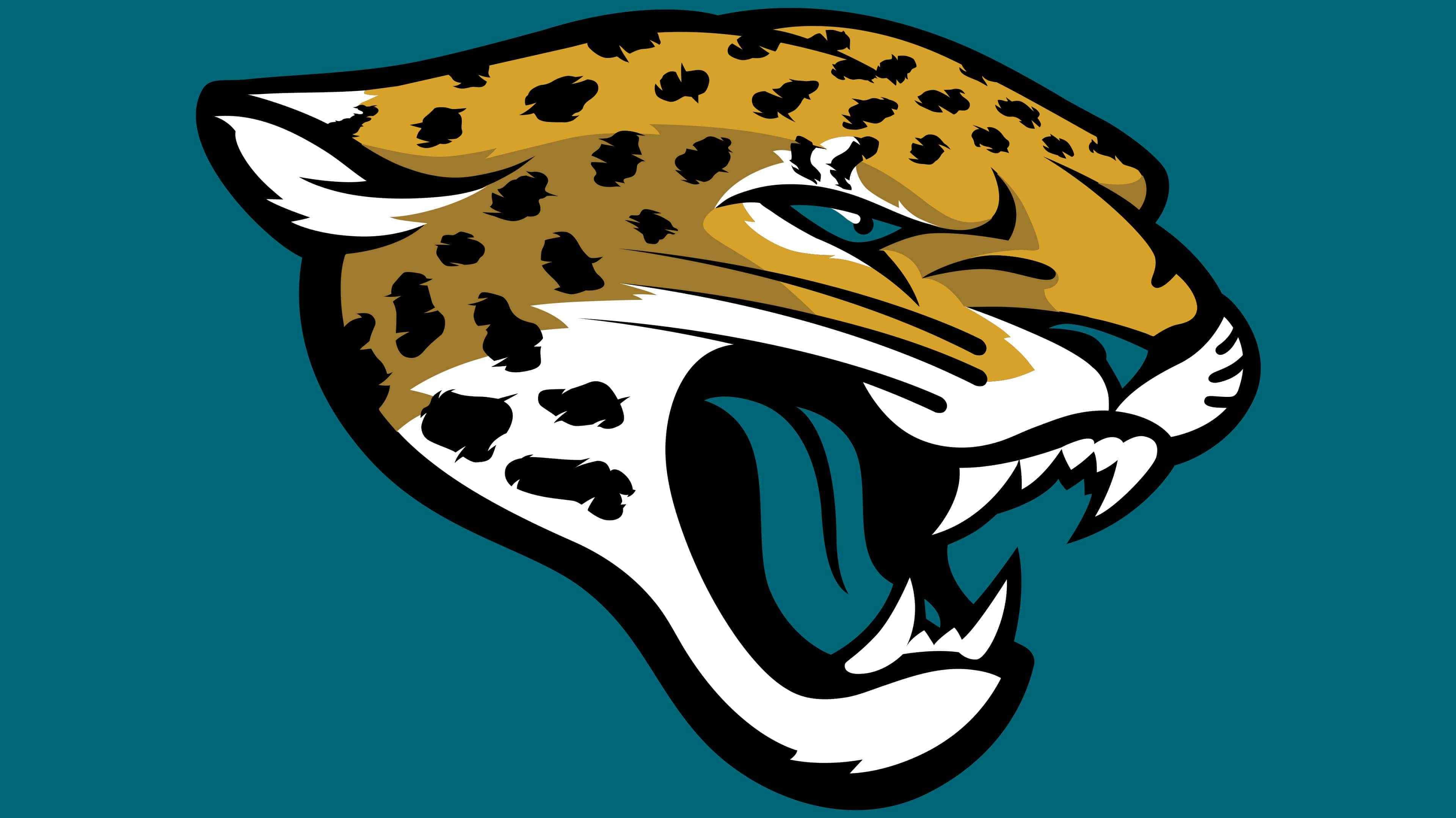
1995 – 2012
![]()
Ford Motor Company, then the parent of the automaker Jaguar, did not take the case to court because the Jacksonville Jaguars developed a new logo – a snarling jaguar head. The animal’s ears are close to the head, the nose is wrinkled, and the white teeth are bared.
This formidable image is complemented by a teal tongue, which was a touch from Wayne Weaver’s wife. Wayne Weaver also claimed that the teal tongue appeared because the “Panthers fed our Jaguars,” a clear jab at their expansion brethren. The unusual color makes the Jacksonville Jaguars logo memorable. Other shades are typical of a wild animal’s natural pattern.
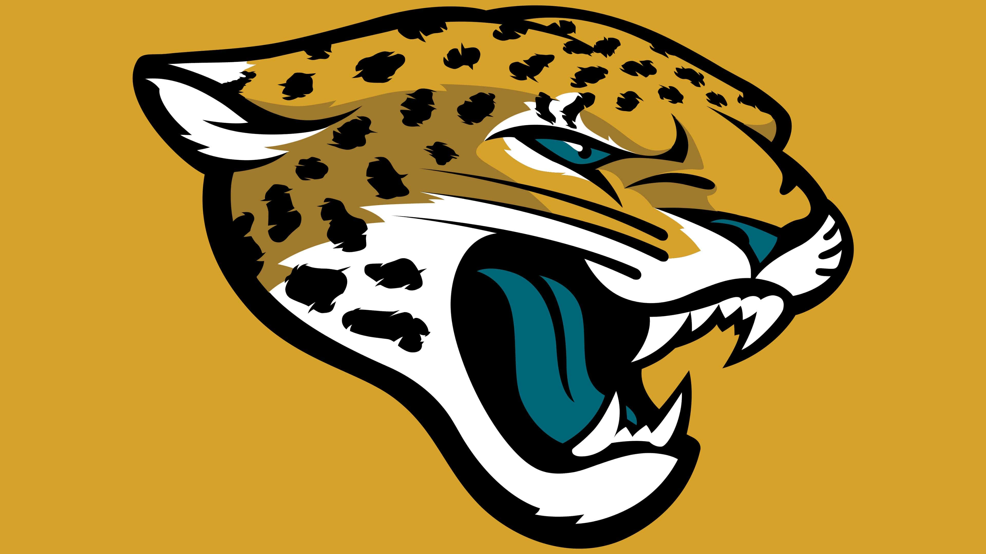
2013 – today
![]()
In 1995, amid the rising conflict, the Jacksonville Jaguars adopted a new emblem, perhaps slightly less dynamic than the previous one but just as “dangerous.” The snarling jaguar head became the team’s image base. Initially, the drawing seemed inaccurate: the artists violated proportions, making the animal look unrealistic. In 2013, the brand’s name was slightly transformed for the better. This hardly affected the style but allowed designers to correct past mistakes and give the jaguar a modern look.
Another logo design was created after the franchise’s new owner, Shahid Khan, initiated a design change. They made the jaguar ferocious to make the logo original, stand out, and grab attention. Additionally, the image was to be as realistic as possible. This was embodied in the updated Jacksonville Jaguars logo.
They made the animal’s head modern and enhanced the cat’s powerful characteristics. Intentionally, the jaguar’s mouth is open; the predator is growling. Its ears no longer resemble a triangle. They are naturally pulled back, as if the wild cat is listening to its surroundings before attacking.
The jaguar’s eyes are made much more realistic, spots are adapted to the real animal’s speckles, and the lower jaw is dropped more strongly. Designers removed the sharp lines from the Jacksonville Jaguars logo; the colors remained the same, except for teal: the tongue, eyes, and nose are now teal.
Font and Colors
The Jacksonville Jaguars’ logo has not changed since 1995. The main symbol of the football club is a jaguar’s head, which looks very angry. It presses its ears and bares sharp teeth with long fangs. In the latest version, artists paid attention to detail, mimicked real colors, and tried to convey expression realistically. Moreover, they used gradients and falling shadows to create a 3D effect. The redesign was made at the request of Shahid Khan, the new franchise owner. He initiated this decision and then personally approved the new emblem.
The developers did not include the football club’s name on the logo. They decided that one jaguar would be enough to understand who owned this sign. This allowed them to focus on the graphic image and its color palette.
The upper half of the head is painted in two shades of orange, while the lower half is entirely white, except for black spots. The black color also emphasizes details and contours. An interesting decision is to use the teal color for the tongue, nose, and eyes. It seems the jaguar has eaten its main enemy, the panther. The original idea belongs to Wayne Weaver’s wife.
FAQ
What is the team logo for the Jacksonville Jaguars?
A snarling jaguar head is the most suitable emblem for the football club from Jacksonville. The predator is depicted in white-golden color; only the spots and contours are black, and the eyes, nose, and tongue are teal. Artists detailed the drawing, adding shadows for volume.
Why does the Jacksonville Jaguars logo have a blue tongue?
According to J. Wayne Weaver, leader of the first “Jacksonville Jaguars” group, his wife suggested making the tongue teal. Supposedly, this is a hint that the jaguar ate the panther of the rival team – “The Carolina Panthers.”