The Arlen Ness logo is radiant and soaring. The emblem conveys the transformation of an ordinary motorcycle into a work of art that rises above everyday life. The sign strikes the imagination with wealth and fantasy.
Arlen Ness: Brand overview
| Founded: | 1970 |
| Founder: | Arlen Ness |
| Headquarters: | California, United States |
| Website: | arlenness.com |
Arlen Ness is an American customizing salon, auto parts, and equipment store. The Arlen Ness logo can be seen on 40 models created by the master and kept in his museum in Dublin.
Arlen Ness was incorporated in 1970. Brand custom is known worldwide: Ness-Stalgia, Jet Bike, Untouchable, Two bad, and Mach Ness. They are not for sale. However, the company helps owners customize their bikes with hundreds of custom-designed parts sold through a catalog.
Meaning and History
The logo demonstrates freedom and speed and embodies motorcycles’ movement and powerful motors.
What is Arlen Ness?
California company that specializes in customizing and sales of spare parts. Power plants from a helicopter, two engines, similarity with famous brands of cars, a fantastic look – all these are options for transforming ordinary motorcycles by the founder of Arlen Ness.
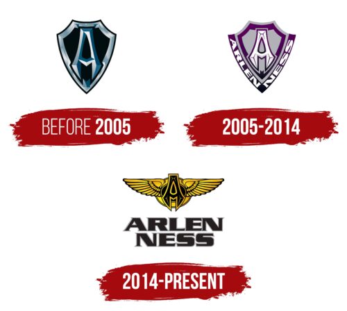
Before 2005
2005 – 2014
2014 – today
An image and an inscription represent the sign. The emblem is based on a golden circle with outstretched eagle wings, a black oval in the center, and the letter A with sharp wedge-shaped glyphs. Under the image is a large title on two levels.
The letter A is the first in the name of the manufacturer and the central one in the figure. They are stylized as motorcycle frames when viewed from the front. The black oval represents the gas tank. The alteration and shaping of the letter alluded to the transformation of production motorcycles thanks to imagination and details from Arlen. Golden edging A indication of luxury, beauty, and style. Artistic processing and painting of all parts of the product.
Eagle wings or the bird itself is a common sign in logos and coats of arms. Initially, it was a symbol of the solar gods living in the sky. Now the wings represent flight, movement, freedom, greatness, and power. In the Ness logo, it is:
- transformation,
- new life of earthly things,
- significant advantage and superiority of customized products,
- Acquisition of increased speed and other characteristics by replacing parts.
The brand’s name is associated with the name Arlen Daryl Ness (1939). An American bowler founded a motorcycle customization company. Starting with rebuilding Harley-Davidsons in his garage, Ness gradually developed an empire of modified bikes and parts for them, naming it after himself. After his father’s death in 2019, the founder’s son Corey and grandson Zach ran the business and retained not only the surname but also the name of the father in the brand.
Font and Colors
Black and gold are the main colors of the logo.
- Black – brutality, a solid approach, an eternal trace in history.
- Gold – conveys the value, uniqueness, and impeccable style of motorcycles.
Lettering font Serpentine Bold. The power of the letters indicates the capabilities of bikes that are superior to ordinary ones.
Arlen Ness color codes
| Raisin Black | Hex color: | #241e1f |
|---|---|---|
| RGB: | 36 30 31 | |
| CMYK: | 0 17 14 86 | |
| Pantone: | PMS Neutral Black C |
| Dark Gray | Hex color: | #aaaaaf |
|---|---|---|
| RGB: | 170 170 175 | |
| CMYK: | 3 3 0 31 | |
| Pantone: | PMS Cool Gray 6 C |
| Middle Yellow | Hex color: | #feec17 |
|---|---|---|
| RGB: | 254 236 23 | |
| CMYK: | 0 7 91 0 | |
| Pantone: | PMS 3955 C |
| Goldenrod | Hex color: | #dea01b |
|---|---|---|
| RGB: | 222 160 27 | |
| CMYK: | 0 28 88 13 | |
| Pantone: | PMS 130 C |
| Black | Hex color: | #000000 |
|---|---|---|
| RGB: | 0 0 0 | |
| CMYK: | 0 0 0 100 | |
| Pantone: | PMS Process Black C |


