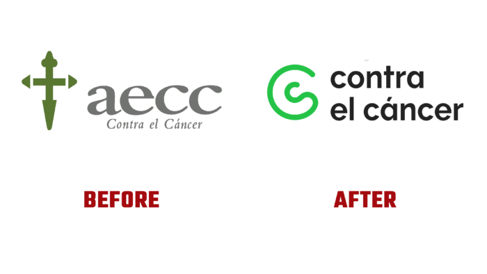
Asociación Española Contra el Cáncer (Spanish Association Against Cancer), the Spanish non-profit cancer association, has undergone a complete rebranding. The renewal of the identity was due to the importance of the tasks solved by the brand and the need to reflect the efforts and developments made in this direction. With cancer now, the disease of the century, with more than 280,000 cases in Spain alone, combatting it is particularly relevant. The brand has been fighting this serious disease for more than 70 years, leading this direction in its country and being one of the leaders in the whole world. But modernity required adjustments to its own corporate identity and external identity, which were developed by the professional team of the Saffron design studio.
The new visualization made it possible to form a brand that provides high-quality communication with a huge audience that is an interested party in the success of the company’s developments. The updated brand has managed to preserve the core values that have been developed over the long years of existence, having modernized them in the light of the requirements of the new reality. First of all, this affected the logo and the name, which, due to its length and lack of completeness of information, caused identification problems. The rejection of the abbreviation made it possible to emphasize the essence of the company’s activities. The text module Contra el Cáncer, distinguished by the dynamics and courage of execution, reflects the real position of the Association – the struggle for the protection of the rights of patients, seeking to change the existing reality with this disease.
The identity is based on one common line, symbolizing the unity of relations in the fight against cancer for all possible parties – patients and their families, researchers, and volunteers. In this way, important information was conveyed about recognizing the uniqueness of perception by different people and groups of the company’s activities. It reflects everything personal, filled with ups and downs, moments of optimism and disappointment, with all its flexibility, which gives the visualization the effect of a living element.
The created tone of voice places the disease itself at the center of identity, which becomes the basis for all “talks.” Simple and emotional, it is action-oriented and is distinguished by its optimism, professionalism, and versatility. The Raleway font chosen for the text block communicates the required message. The corporate color palette is bright, energetic, and optimistic. It is fully adapted for use in modern typographic and digital environments. An important addition was the use of photographs that helped to display the disease naturally, adding naturalness and honesty to the style.


