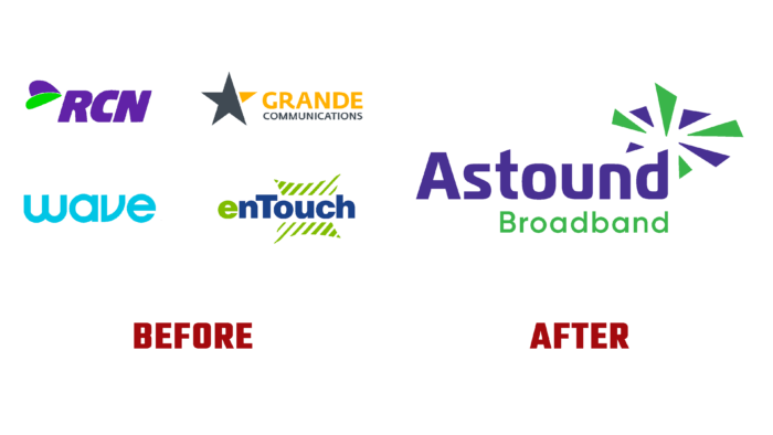
Astound Broadband, American telecommunications holding from Princeton, New Jersey, presented its updated look. It was founded in 2018 through reorganizations and a merger of several of Stonepeak’s infrastructure partners and initially provided cable TV, telephony, and broadband Internet services. It was part of WaveDivision Holdings, LLC. Constantly developing and merging with smaller organizations, the brand has grown to the largest holding in the provision of telecommunications services. In 2015, the company took a new name – Wave, later returning to its first name. This transition and fundamental changes in the company’s structure, the expansion of the range of services provided, and new opportunities required changes in the brand’s visual identity.
The new logo consists of a text display of the brand’s full name – Astound Broadband and a sign that can be seen as a symbolic information explosion in the form of flying fragments. The title text is created using a group of custom fonts. One of them – type Magistral Cond Bold by ParaType – is used to display the first word of the name. The first letter A has an even cut in the upper part, and the last letter d, the bevel of the upper part of the leg. The second one is the Neometric Alt Medium by TypeUnion type used to write the second part of the name. Both fonts are crisp, and easy to read the text at any scale. Their graphic differences favorably highlight the features of each of the elements that make up the logo. To focus attention on each of the words of the name, they were highlighted each with their color.
The color palette consists of 2 corporate colors – purple and light green. These colors are used in the formation of the brand sign and to highlight the text name. The first word of the title is in purple, the second in light green. The core business of the company determined the choice of these colors. Violet – endowed with mystical properties since ancient times, very effectively symbolizes the main properties of the services offered by the brand. This is the color of idealism, originality, individuality, and creativity. Light green is a symbol of a defining beginning, promising development. At the same time, this color ensures the formation of a harmonious perception of the entire composition in its two-color version.


