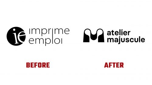
Atelier Majuscule, a pioneering digital printing company with a social mission, has recently introduced a new brand identity, including a refreshed Atelier Majuscule logo, to mark a new chapter in its journey of promoting socio-professional integration. As a non-profit organization, Atelier Majuscule is dedicated to offering paid on-the-job training for individuals facing challenges in entering and remaining in the job market. By teaching valuable skills in bookbinding and finishing within the printing industry, Atelier Majuscule not only aids in the personal development of its trainees but also provides high-quality digital printing services to many clients, including businesses, organizations, institutions, and individuals.
Established to bridge the gap between learning a trade and securing employment, Atelier Majuscule supports an average of 42 adults annually through its innovative program. The organization’s dual focus on social impact and professional service delivery sets it apart, making it a unique entity in the digital printing world. Introducing the new logo and brand identity is a strategic move to communicate better this unique positioning and the values at the core of Atelier Majuscule’s mission.
The newly unveiled logo features a distinctive “M” monogram that subtly nods to the printing process, drawing inspiration from the imagery of paper passing through printer rollers. While the reference may not be immediately apparent to all, it conveys a sense of craftsmanship and attention to detail that resonates with the brand’s artisanal approach to digital printing. This artistic touch aligns with the “atelier” aspect of the organization, suggesting a workshop or studio environment where creativity and technical skill merge.
Despite moving away from a more descriptive name, adopting “Atelier Majuscule” as the brand’s moniker is a bold decision to spark interest and convey a sense of intrigue. This shift towards a more engaging identity is seen as a positive step towards raising awareness of the organization’s mission and attracting a broader audience.
The rebranding includes a new logo and an updated visual language that reflects the organization’s commitment to quality and social responsibility. The design elements, characterized by their vintage texture reminiscent of mid-20th-century print samples, add depth to the brand’s story and visual appeal.


