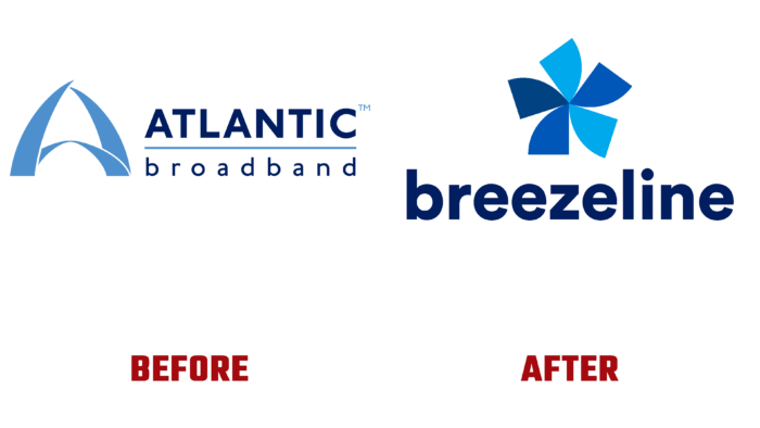
Atlantic Broadband, an American Internet and television provider that provides voice services, has undergone a complete rebranding, including changing its name. Since this year, the brand, located in Quincy, Massachusetts, US, has become known as Breezeline, which more accurately reflects the essence and objectives of the company. Over the years of its existence, the brand has entered the top ten in its region. But the time has come to grow and evolve, which has forced the company to expand its capabilities to reach out-of-state users. To meet the new conditions, the company began its transformation. To do this, a large-scale complex of various initiatives was applied, which ensured the rapid expansion and acquisition of new functionalities. As a result, the country’s eighth provider, Atlantic Broadband, has embarked on a radical change in its identity. The change began with the brand acquisition of two cable systems in Cleveland and Columbus, Ohio.
The volume of serviced users necessary for further development was obtained. This included both households and government and commercial enterprises. This move required a mandatory reflection in the company’s visual identity, with the help of which it became possible to describe the expanded geographical coverage of users more accurately. At the same time, the company’s new corporate identity and logo helped to express the expanded list of services and offers to reflect its commitment to customer care.
The reorganization of the brand the change of goals and objectives led to a new understanding of the company’s essence, which has ceased to be only an East Coast provider. The new identity and corporate identity reveal the deep meaning of the enterprise, which today offers much more broadband Internet access. The new name marks the start of a new era of the modern, flexible and diversified enterprise. Breezeline is a state-of-the-art service based on the latest ultra-fast FTTH technology, a cloud-based web service, easy access to connected services. The five-pointed wheel used in the logo has become a symbol of high-speed connectivity, movement, ease of company/user interaction, ease of use of the services offered by the brand. The updated version retained the historically created color palette, thereby paying tribute to the long history of the enterprise. The color palette of cyan and blue demonstrates the direct relationship of the brand with blue ether, forming the required visual perception of the direction of the company.


