The Atletico Madrid logo has a patriotic design and shows that this football club is proud of its origins. Heraldic elements and official symbols of the city demonstrate how athletes are pleased to represent Madrid in the Champions League. Their emblem conveys confidence and endurance.
Atletico Madrid: Brand overview
| Founded: | 26 April 1903 |
| Founder: | Atletico HoldCo, Idan Ofer |
| Headquarters: | Madrid, Spain |
| Website: | atleticodemadrid.com |
The history of “Atletico” began thanks to three Basque students studying in Madrid – Cortazar, Astoria, and Abdon, who sat in the La Maison Dore cafe on Alcala Street in the Spanish capital in early 1903. They gathered to create a football club, which was to become a kind of branch of “Athletic,” created a few years earlier.
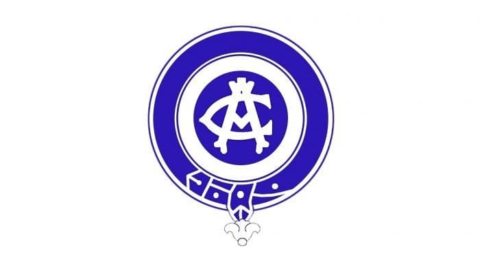
On April 26, 1903, “Athletic Club de Madrid” was proclaimed an independent club. The first logo of Madrid’s “Atletico” replicated the emblem of the Bilbao club exactly.
Meaning and History
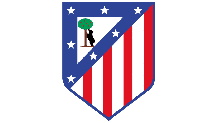
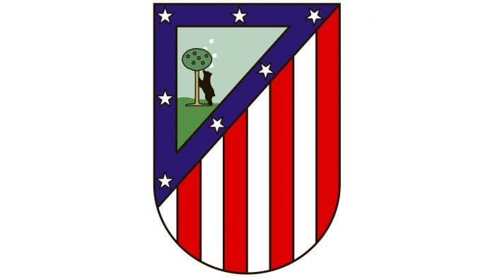
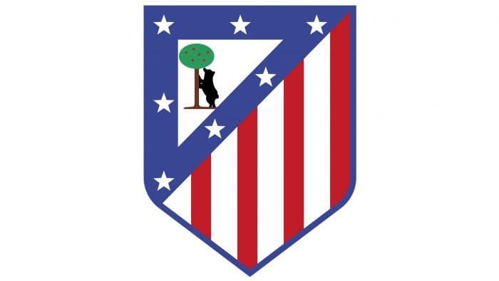
In 1917, the Madrid club finally got its logo. The Madrid city coat of arms with a bear reaching for a strawberry tree became the basis for Atletico’s new emblem. It underwent no changes until 1939.
Besides the bear, the club’s emblem featured seven stars, symbolizing the seven border provinces of Madrid. Red and white stripes symbolize the club’s uniform. As known, the Madrid club’s owners decided to save on shirts and bought the cheapest red-and-white striped material, which at the time was used to make mattresses. Hence, the team got the nickname “The Mattress Makers.”
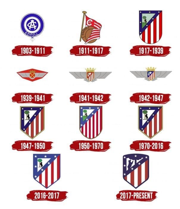
The Atletico logo has changed many times. The composition remained the same; only the shape of the logo was redesigned.
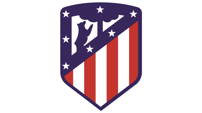
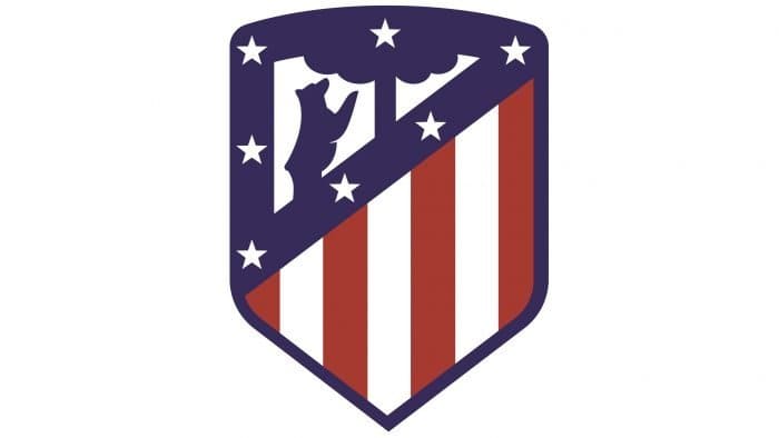
The modern emblem of “Atletico” looks as follows:
The strawberry tree, which the bear reaches for, has lost its green color, and its crown extends beyond the upper contour. There are no more sharp corners, so the emblem becomes round. Also, designers decided to get rid of all colors except red, white, and blue. The red stripes were depicted in bold font, and the four white stripes were replaced with three. And the most important change in the Atletico logo: the bear used to look to the left, but now it has turned in the opposite direction. Will it look towards Atletico’s future victories in the Champions League?
What is Atletico Madrid?
Atletico Madrid is a Spanish sports club consisting of professional football players. Founded in 1903 and located in the country’s capital, the club is part of La Liga. It is also among the top three football teams in Spain by the number of championship titles won. Their home stadium is the “Metropolitano.”
1903 – 1911
In its early years, Atletico Madrid used the emblem of the Spanish football club “Athletic Bilbao,” after which it was created. The graphic sign looked like a rondel consisting of blue and white concentric circles. In the center were intertwined letters “A” and “C” – an abbreviation for “Athletic Club.”
1911 – 1917
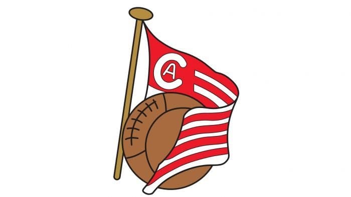
In 1911, “Athletic Bilbao” changed its logo along with the color of its equipment. Madrid’s Atletico decided to keep up and followed this example. Thus, the Madrid team acquired an emblem with a striped red-and-white flag, a brown ball, and a monogram of a large “C” and a small “A.” At the same time, players remained in the old uniform with blue shorts.
1917 – 1939
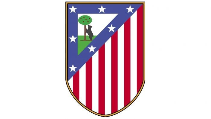
In 1917, “Atletico Madrid” stopped imitating “Athletic Bilbao” in everything and got its emblem, which first appeared in Madrid’s symbolism: Arbutus, known as the strawberry tree, and a bear standing on its hind legs. They have symbolized the city since the 13th century and adorn its official coat of arms. On the team’s emblem, these elements were depicted at the top in the form of a dark blue triangle with seven white stars. Below were alternating red and white stripes. Together, they formed a quadrangular shield with a rounded base.
1939 – 1941
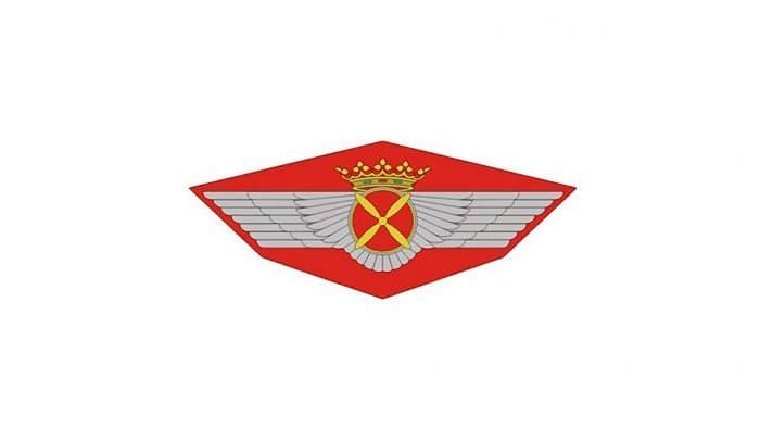
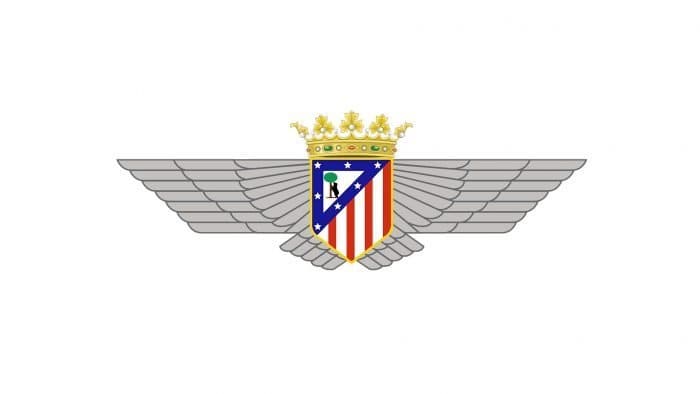
When the Civil War in Spain ended, Madrid’s Atletico merged with the newly formed Spanish Air Force football club. Thus was born “Atletico Aviacion de Madrid.” The logo of the new sports organization was similar to the original Air Force symbol. Wings and a propeller symbolized an airplane, and a crown represented royal power. The predominant colors became red, gray, and gold.
1941 – 1942
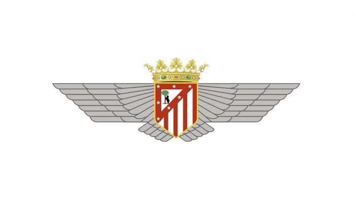
In 1941, the team made the first changes to the original Air Force graphic sign. Designers placed an element similar to the old Atletico Madrid emblem with a bear and a strawberry tree in the center between the wings. Only the lower part of the heraldic shield became pointed, and the blue triangle turned red. Compared to the previous emblem, the crown acquired a new, more elegant form. The red hexagon, against which the “airplane” was previously depicted, disappeared.
1942 – 1947
In 1942, artists redeveloped the multi-component emblem. This time, they made the triangular frame at the top of the shield blue, as in the original.
1947 – 1950
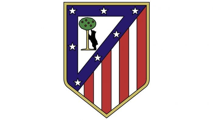
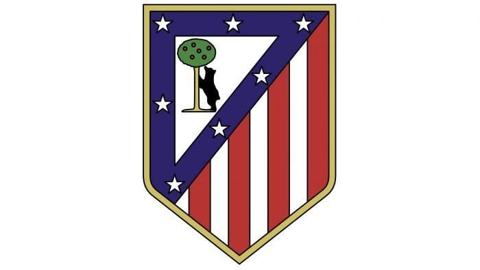
Separating from the Spanish Air Force club, the football team removed all symbols from the emblem that reminded them of the Air Force. What remained was only the modified graphic sign of “Atletico Madrid” in the form of a rectangular shield with a pointed base. Significant differences from the 1917-1939 version included an empty white background behind the bear and a wide golden border around the outer contour. Also, the colors became slightly darker.
1950 – 1970
In the middle of the 20th century, the club revisited the emblem and brought it closer to the original created in 1917. Designers increased the number of vertical stripes and made the bottom of the shield rounded but kept the golden frame. Meanwhile, they changed the classic palette, opting for paler shades of red and blue.
1970 – 2016
In 1970, the old Atletico Madrid logo, adopted in 1947 and used until 1950, returned.
2016 – 2017
The penultimate team emblem resembles the one before. Artists made minor color changes, turning the golden border blue and removing black outlines around the elements. The red vertical lines became slightly thinner, and the white ones, correspondingly, wider.
2017 – today
To mark a new era in the club’s history associated with its move to the “Wanda Metropolitano” stadium, designers developed a new logo. The previous graphic signs were taken as the basis, so there were a few changes in the design. The lower part of the shield is as pointed as before, but the upper part is now not rectangular but rounded. The bear and the tree have been enlarged and turned in the opposite direction.
Atletico Madrid: Interesting Facts
Atlético Madrid is a famous soccer team from Madrid, Spain. They play in the top league in Spain and have a lot of fans who love their team.
- How It Started: The team was made in 1903 by some students who wanted to have a team connected to Athletic Bilbao, another Spanish team.
- Their Stadiums: They’ve played in different places, but in 2017, they moved to a big, modern stadium called Wanda Metropolitano Stadium, where over 68,000 people can watch the games.
- Winning La Liga: Atlético Madrid has won the Spanish league, La Liga, several times. This is a big deal because Real Madrid and Barcelona usually win.
- European Games: They’ve also done well in European tournaments, winning the UEFA Europa League a few times. They’ve been in the final of the UEFA Champions League but haven’t won that one yet.
- The Double: In the 1995-1996 season, they won La Liga and the Copa del Rey, which is very hard to do and shows they’re a strong team.
- Famous Coaches: Diego Simeone has been their coach since 2011 and has helped the team win a lot, including La Liga and the UEFA Europa League.
- Great Players: Some amazing players have been part of the team, like Fernando Torres, Antoine Griezmann, and Diego Godín. They’re very important to the team’s history.
- Big Rivalries: They have a big rivalry with Real Madrid, and games are always exciting and get a lot of attention.
- Training Young Players: Atlético Madrid is also known for its great program for young players, which helps them become good at soccer.
- Fans and Culture: The team’s fans are passionate and always support their team, especially as the underdogs against richer teams.
Atlético Madrid’s long history of success, fighting spirit, and strong connection with its fans make it a special team in soccer.
Font and Colors
The design group Vasava developed the current crest. It preserved the traditional symbols of Atletico Madrid, presenting them in a modern interpretation. Among these signs are seven white stars taken from the constellation Ursa Major. Five of them represent provinces located near Madrid: Toledo, Cuenca, Guadalajara, Avila, and Segovia. That’s why artists placed the stars around the bear and the strawberry tree.
There have never been any inscriptions on the logo, and the colors have remained unchanged – only the main shades have changed. Among them are red (#CB3524), blue (#272E61), and white. Additional ones are gold, brown, and green. The original combination of white and blue was inspired by the professional football club from England, Blackburn Rovers.
Atletico Madrid color codes
| Delft Blue | Hex color: | #262f61 |
|---|---|---|
| RGB: | 38 47 97 | |
| CMYK: | 61 52 0 62 | |
| Pantone: | PMS 2766 C |
| Maximum Red | Hex color: | #ce3524 |
|---|---|---|
| RGB: | 206 53 36 | |
| CMYK: | 0 74 83 19 | |
| Pantone: | PMS 485 C |
