The automobile company Auto-teile-Unger, based in the Bavarian city of Weiden, has been known to car owners since 1985. Its short three-letter abbreviation is well-known, and the service is almost impeccable, as evidenced by its large customer base.
Currently, the company is proud of its huge staff – about 10,000 people work for the comfortable use of vehicles. And 550 workshops have already opened in Germany and Austria, which is far from the limit of the brand’s capabilities.
Today the company is at the stage of expansion and rebranding. This is necessary if only because there were no radical changes in the identity from its foundation. And the metamorphoses that are now taking place with the brand’s design indicate that the company is tired of being in captivity of the creative traditions of the eighties, wants to keep up with the times, and identifies the current needs of customers and help solve their issues.
A company with a solid track record of successful activity does not always need advertising or a discreet mention of its “person.” It should also be added that the Germans, by their mental characteristics, are very conscientious about doing business but not as creatively savvy as, for example, designers from France, Russia, the United States, and other countries. The main priority in their work is to match the reputation of their brand values, to strengthen their business thanks to the quality of work, the abilities of employees, and modern technologies.
Many logos of German companies, as a rule, have a simple design that could be repeated by a beginner creative. The reason is that German business owners do not bother creating hype, a colorful business card for their services, but are concentrated on the internal mechanisms of processes in their system. There is a logo, well, okay.
This approach has a right to exist. After all, taking into account the cultural differences of regions is very important for localizing certain services. Where people trust more reviews, word of mouth, and recommendations from acquaintances, there is no place for a huge, flashy banner with a colorful logo that says, “We are the best in the industry!”.
German companies are, so to speak, more modest. And the fact that they are well versed in automotive technology has been a well-known fact for a long time. How many well-known large engineering companies are located in Germany, and how strong the German car industry is visible to the naked eye. All over the world, German technology and the decency of employees in this niche are appreciated and praised.
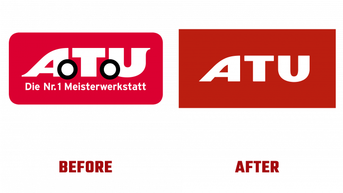
Returning to the ATU identity design, it should be said that the new logo is a modernization of the old one. A few words can describe the ongoing changes – “someone” removed the wheels from the type logo in the form of a car but did not install new ones. The slogan was also removed, which was the only way to declare its leading position in the market – “Auto workshop No. 1”.
As before, the main colors in the logo are red and white (for a font solution). The red shade of the new symbol is more berry and ripe.
There are no wheels – but there is a homogeneous, organic modern logo in the best traditions of modern minimalist trends. Why add something extra if you are already on top?
We can confidently say that rebranding will contribute to the advancement of the leading company in the context of new economic and technological innovations.


