 Digital evolution has influenced the positioning of the company.
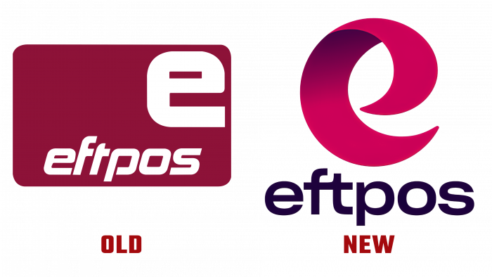
Design agency Hulsbosch was responsible for the rebranding of Eftpos. Experts have developed a new logo and selected bright colors that are responsible for brand awareness. The center image is represented by the letter “e” in rich crimson color with darkened accents for a three-dimensional effect.
The payment network also introduced a new slogan as part of its positioning – “Good for Australia.” According to Eftpos, the brand has developed a new strategy for the next two years, and rebranding is the first step in its implementation.
CEO Stephen Benton said the company is targeting Generation Y or Millennials. The brand also promises that it will not lose all the values that it has managed to accumulate over time and surprise customers with its innovations and updates. Eftpos is moving forward with its users – another statement from the company.
The 50 million cards and hundreds of thousands of stickers used in physical stores across Australia are also expected to be updated. The brand shared that it will improve security, simplicity, and value for all of its customers: merchants, large companies, and ordinary users.
Hulsbosch helped design a striking logo that preserves the brand’s history while also signaling rapid growth. It was important for Eftpos to lose touch with its loyal customers and not spoil its brand, like one of Australia’s most iconic brands.
The company conducted market research, consumer surveys about the attitude towards the new brand. According to Eftpos, the reviews are positive, and the brand has managed to maintain key elements of recognition.
The brand has already taken the first steps to improve its services and agreed with the American company Hedera Hashgraph. Australians can now use a digital wallet and pay for streaming subscriptions.


