In 2021, Avelo Airlines was created to inspire travelers in the United States. It has a simple goal – to show the sky as an unknown wondrous world and the flight as an immersion in a new atmosphere of comfort and the beginning of the adventure.
The airline operates a new generation Boeing 737. Therefore, the convenience of flights, favorable fares allow customers to travel without risk and financial loss. Non-stop flights between 11 destinations in the Western part of America with a base at Hollywood Burbank Airport have already started pleasing its passengers.
It’s not just the ergonomics and comfort that make people pay attention to the new airlines. It is also the bright, pleasing to the eye design of the identity that enhances the public’s interest in flying.
Creative craftsmanship from Kim Berlin has created an impressive visual identity for the company.
Creating an entire brand is a task within reach of experts in their field. The creative team also included Dominic DeMaria, Sara Schor, and Liz Castleman, who handled naming and strategy for Avelo.
In a time of the global pandemic, when it’s only possible to work online, discussions are specially heated because a project like founding an airline brand is quite a feat.
The logo system, the visual language, the signage system, the unified design program, the packaging, the digital media-all of this was touched by the hands and minds of the creatives, so the result was simply magical.
Convenience, accessibility, a direct message to the public – are the three pillars on which the success of the new airline design is based.
In some ways, the design developers were technically limited, and this was due to the difficult crisis during the pandemic. After all, we had to develop solutions such as social distance limiters, for example. Therefore, it was necessary to combine practicality, efficiency, and positive images so that the travelers would have only positive associations and not a single doubt.
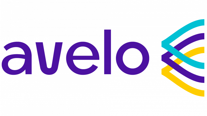
We chose a deep purple color closer to dark blue for the presentation of the logo.
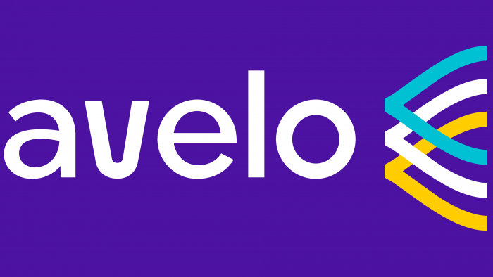
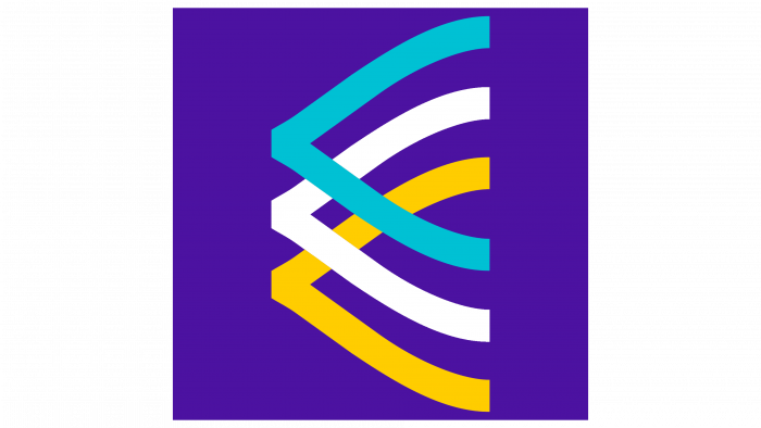
The logo itself is a font solution, which looks like the name in white letters (one of the variations of the logo), made in lowercase letters with rounded lines. The main graphic element is the three letters V, which are turned to the left, where the airline name is located, and these three outline images are highlighted in blue, white, and sandy yellow.
The bright colors, flowing shapes, and color selection for the different design products set Avelo apart from the competition.
The visual image, the tone with which they seem to appeal to customers, “Travel for joy!” makes you think about buying a ticket for the next flight and planning a vacation somewhere in the western United States.
The very sweet visual language, friendly, confident, reassuring, conveys the main message of the brand: travel is always a positive and new experience for the person who decides to go on a trip.


