With its sights on the school system, Avenues has set out to make effective changes to it to match its appearance to this endeavor. This task was assigned to the creative studio Mother Design (New York, NY), which demonstrates creativity and deep immersion in studying the spirit and philosophy of the brand being developed. As an emerging, for-profit, global network of schools under a single brand of New York, São Paulo, Shenzhen, and the new 12-grade distance learning Avenue Online, the organization aims to open 20 more schools in no time.
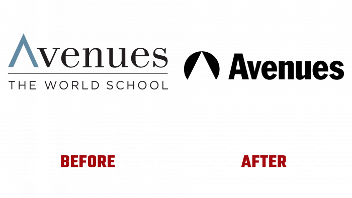
A new identity is an effective way to communicate the basic truth – the ability to go beyond the established framework if the idea is useful, creating conditions for broadening one’s horizons. In addition, to create a strong personality, it was decided to move away from the traditional ways of visualizing brands in this area and make them especially surprisingly attractive. Graphics, a logo, and a new corporate identity contributed to the rethinking of premium education, introducing an understanding of the joy of learning and the ability to imagine how one can feel and behave differently in this world.
Identity has demonstrated the presence of a bright and clear positive energy present in these educational walls while simultaneously symbolizing his leadership in this category. The design has become a reflection of simplicity and versatility, conveyed through the main corporate color palette, original shapes, and many different types of tools. Especially the Froebel blocks helped with this. The progressiveness of the brand and its desire to expand cooperation were effectively reflected. The flexibility of the visualization system made it possible for each campus to reflect its attractive features in a single complex of Avenues identity.
The Franklin Gothic typeface used in the logo provided an individual visual voice for the brand based on typography. His boldness and benevolent, attractive graphics ensured constant recognition, regardless of time frame, linking the text with the communication technology of reflecting style and form. It effectively emphasizes all graphic elements, images, photographs. Highlights messages delivered in various ways to viewers. Futuristic, at first glance, simplified geometry, upon closer examination, turns out to be deeply informational. A triangle formed from a circle is a sign denoting project “A.” It becomes an option for forming negative triangular space in the system, symbolizing the path leading through the circle, which implies a stylized globe.


