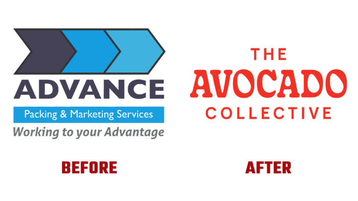
Avocado Collective is an Australian company of 2007, founded in 2007 as Advance Packing & Marketing Services has changed its appearance. The company was founded to create modern conditions for the transportation, collection, safe processing, and packaging of avocados. Developing in this direction, the brand has set new standards in its field with the latest technology specially designed equipment. The brand includes more than 60 Western Australia-based manufacturing facilities providing enhanced capabilities and offerings for the core brand. Among them are the owners of small plots and large allotments, and those who are engaged in this type of business in the first generation, but especially representatives with a great experience. With this rich diversity of perspectives, stories, and experiences, the brand deepens its knowledge and keeps its vision of the future fresh.
The new brand strategy aims to expand activities beyond the national level. It was necessary to carry out a complete rebranding to accomplish this task, starting with the name. The new name had to make it easy to define the target direction of the brand to be easy to understand and understand for everyone, regardless of location. At the same time, an interesting and attractive branding system was developed, which was distinguished by freshness and timeless visibility. A deep redesign was carried out to achieve these goals – from the name to the visual and text guides, the central element of which was the avocado. The text block provided instant recognizability that would last for years to come.
The new image provided the most important thing for the further development of the brand – effective information support that allows you to quickly and accurately determine professional affiliation. It has become easy and simple to determine the company’s affiliation with the production of products, namely the processing and transportation of avocados. The new visualization effectively demonstrated an important area – the logistics associated with transporting fruits using sea containers. An important feature was very accurately reflected – the collective activity in the field of avocado production. The Gooper font by Very Cool Studio, which effectively changes into avocado counters, provides such visual abilities of the logo. This makes the visual perception of font graphics accurate, especially attractive and even smiling. The fun is especially emphasized by the combination with HK Grotesk, which forms a strong brand identity, especially emphasizing it in the packaging design. This effect is enhanced by orange-brown hues that contrast with the green color of the avocado itself.


