In a bold step forward, Bachan’s, the beloved Japanese barbecue sauce brand, has unveiled a refreshed brand identity that marries its rich heritage with a modern aesthetic. Since its establishment in 2019 by Justin Gill, Bachan’s has carved out a distinct space in the culinary world, drawing inspiration from a cherished family recipe passed down by Gill’s grandmother, Judy Yokoyama. The name “Bachan,” which translates to “Granny” in Japanese, is a nod to the brand’s deep respect for family traditions and authentic Japanese flavors.
Bachan’s journey from a heartfelt tribute to Gill’s grandmother to becoming a household name in the U.S. is a testament to its commitment to quality and innovation. The brand prides itself on its cold-filled, small-batch production process and non-GMO certification, ensuring that each sauce bottle delivers the authentic taste of the Yokoyama family recipe. With a lineup that includes original, hot & spicy, miso, yuzu citrus, and gluten-free options, Bachan’s has broadened its appeal and availability, securing a place on grocery shelves nationwide.
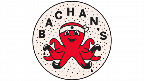
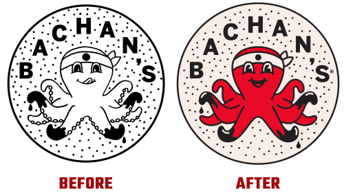
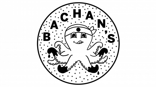
The reimagined brand identity, crafted by the San Francisco-based agency Stout, showcases a refined version of the Bachan’s logo. The redesign builds on the original logo’s charm, featuring an octopus character that has won over fans with its whimsical design. In a move towards a cleaner and more adaptable logo, the new design streamlines the octopus, removing its suckers for a sleeker look while retaining its playful spirit. This evolution addresses the need for a logo that can easily scale across various mediums without losing its impact.
To complement the updated logo, Bachan’s introduces a vibrant illustrations series extending the octopus motif. These illustrations vividly depict a variety of foods immersed in the joy of Bachan’s sauce, integrating the sauce’s rich brown hue into the brand’s color scheme for enhanced recognition. This strategic update clarifies the brand’s visual messaging, aligning the logo’s color more closely with the sauce.
The brand’s typography has received a thoughtful refresh, incorporating the Carrosserie typeface into a new set of arched type treatments. This typographic update balances contemporary flair and traditional warmth, harmonizing with Bachan’s signature script font, Rukola, to further enrich the brand’s visual identity.
Bachan’s latest brand evolution marks a significant milestone in its growth, signaling its readiness to engage with a wider audience while staying true to its roots.


