


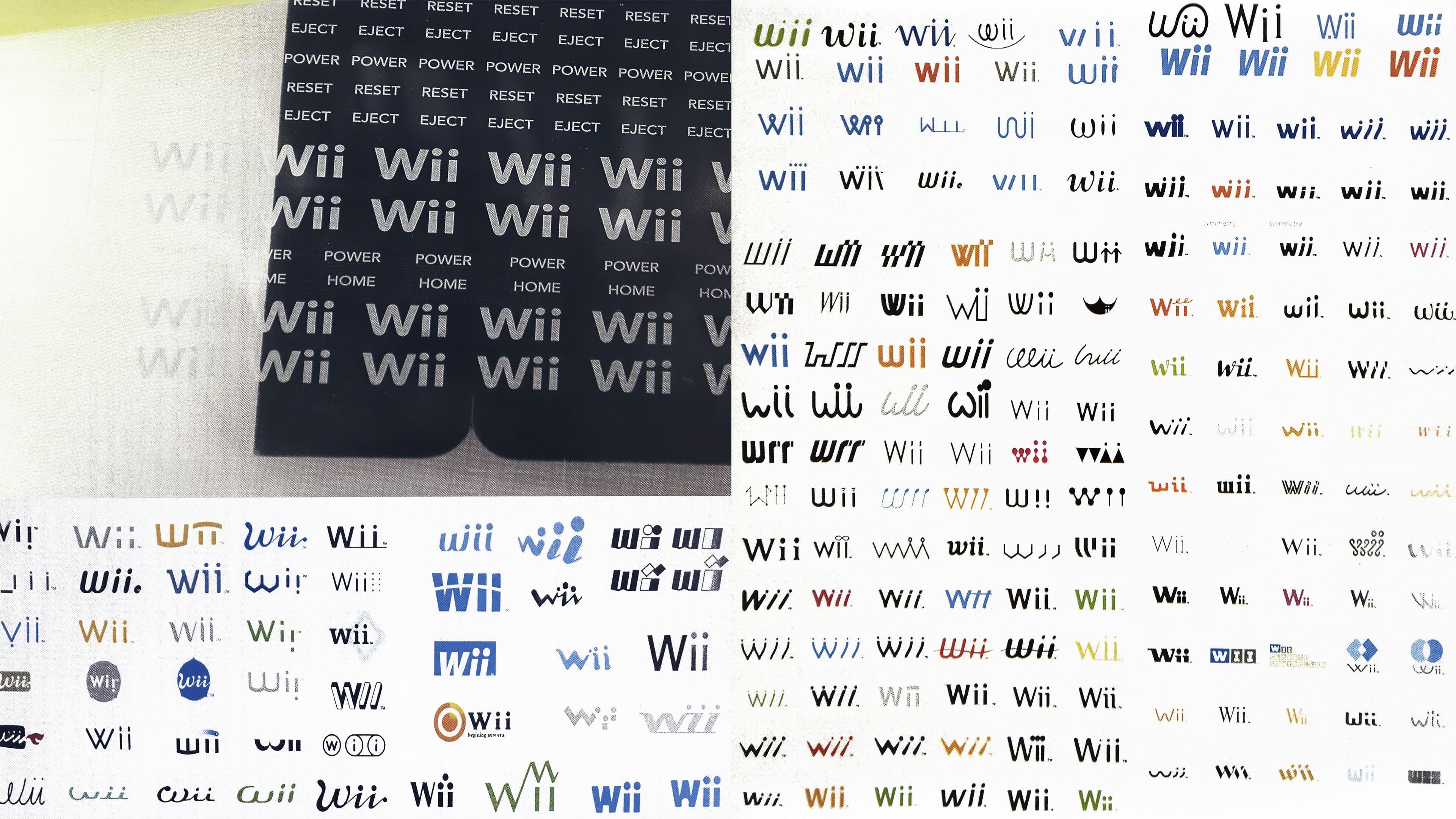
Earlier this year, on Twitter on the Nintendo Memories page, users saw photos with logos that could become a famous console symbol. There are several dozen different options: orange, blue, black, and even pink. Some of them are quite unusual. If the set-top box had originally received a different logo, would it have affected sales and popularity? Would the success be the same, or would no one pay attention?
We are afraid to imagine how difficult it was for the developers to find the perfect option to emphasize the product’s idea. In the picture, you can see logos that look like notes or a cute couple holding hands. There are also emblems with additional graphic details and logos with dots connected in an infinity sign above the letters “I.”
Users on social networks are actively sharing their opinions and choosing their favorites. New details from the iconic products’ stories help unite fans once again and keep the brand “heard.” Each company carefully values its history, which separates them from competitors. Realizing what a tremendous amount of work has gone into the console’s success only confirms the product’s quality.
The Nintendo Wii was a sensation in its years, but the logo never made it to the list of the best emblems in human history. Simultaneously, the console has been sold over 100 million times and won the hearts of users.