![]()
Backslash, formerly known as “\Art,” has revealed a new visual identity created by Cotton Design. This rebranding represents a major shift for the organization, which supports artists involved in nonlinear and unconventional practices, often incorporating new technologies. Based at Cornell Tech in New York, the group continues to explore the intersection of art and technology through residencies and awards.
With its minimalist ASCII art style, the previous logo was a nod to early computer culture, using backward slashes and simple lines to evoke traditional digital aesthetics. While unique, the design eventually felt outdated, no longer reflecting the innovative community the organization serves.
![]()
The new identity adopts a modern, sleek look. The bold, italicized wordmark in black text conveys motion and progress, aligning with the organization’s focus on fostering innovation. A standout feature is the transformed “k,” where the stem turns into a backslash, subtly referencing the group’s digital roots cleverly and integrated.
The black color scheme enhances the minimalist design, conveying professionalism and precision. The simplicity reinforces the idea of a group focused on creativity and technological advancement without distraction.
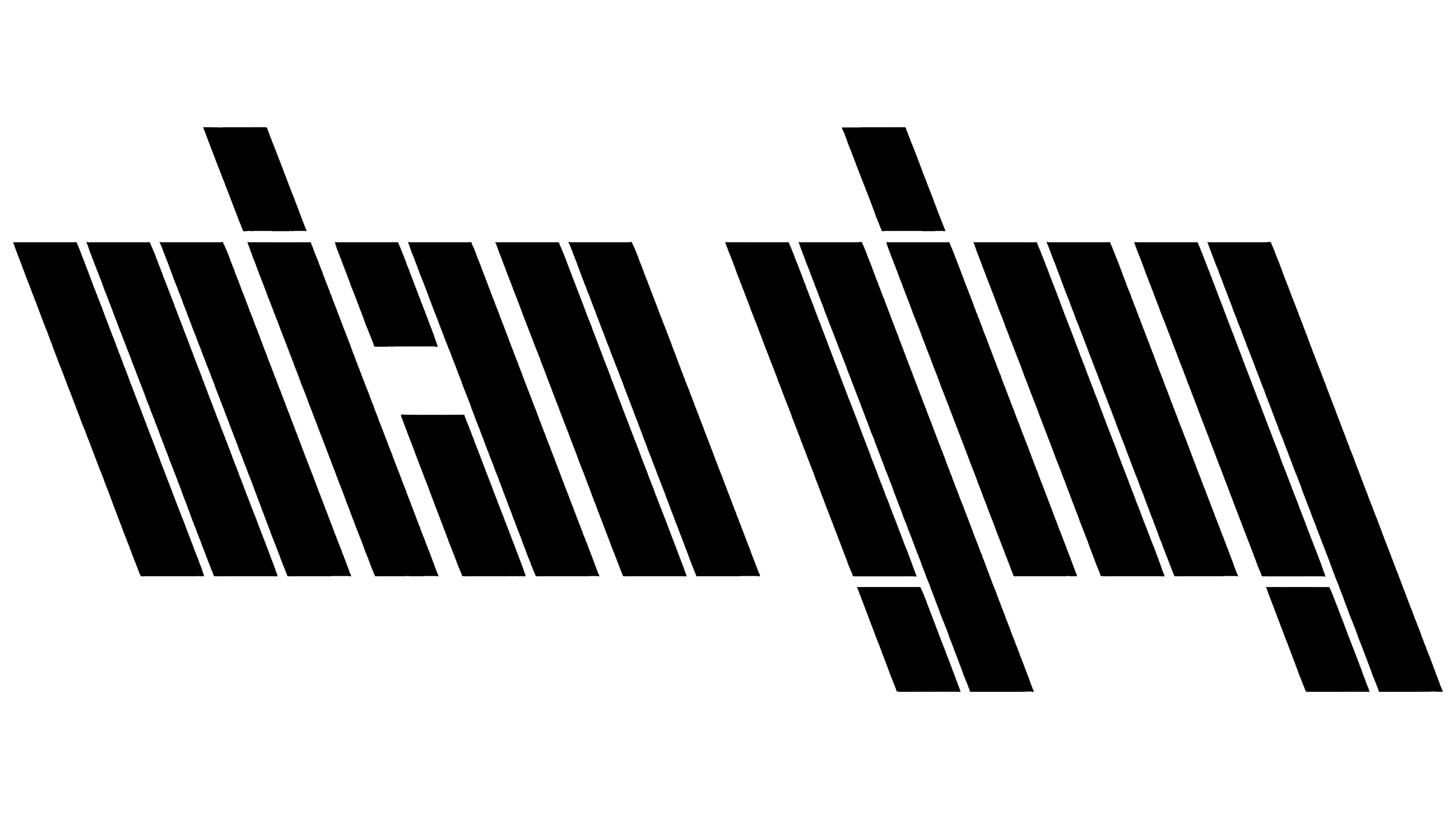
A custom typeface, \Type, was developed specifically for Backslash. The typeface plays on the backslash concept, with characters formed at a -21° angle, reflecting the organization’s unconventional and experimental approach. With square and round variations and multiple weights, the typeface is flexible for various uses. What makes \Type unique is its ability to adapt interactively in digital spaces, changing weights based on user input and maintaining both readability and experimental nature.
![]()
The redesign strikes a balance between honoring the organization’s original mission and evolving for the modern era. By incorporating backslashes into the logo, it stays connected to its roots while pushing forward with a more mature and sophisticated look. The clean design and symbolic elements reflect the group’s commitment to advancing art and technology in new and innovative ways.