The highest level that a properly organized advertising, formed image, and style can reach is the level of an icon. When many are fighting for less high achievements, striving to bring something unique, those who have achieved recognition at the level of the icon already personify it. This task was set before the Florentine design studio Auge Design by the world-famous German brand to produce “sweet” products – Bahlsen. His biscuits, biscuits, and other sweets have been renowned for their high quality and unsurpassed taste since 1898, when Hermann Bahlsen first presented his Leibniz Butter Biscuit to the discerning audience.
Its production has always been characterized by new products, as soon as they were invented. The Bahlsen factory is ten years earlier than Henry Ford used the first assembly line in Europe. The sweet tooth prefers today waffles and biscuits, chocolate bars, and cakes from Bahlsen in 55 countries where the company’s products are supplied.
But times are changing. Particularly significant changes are taking place at high speed now, requiring even the most eminent brands to adapt to them quickly. The wind of change has also touched the conservative Bahlsen, which has unveiled a new, distinctive and bold design for its logo and trademark this year. In the spring of this year, the first batch of Choco Leibniz appeared in a new design on store shelves. The new identity was supposed to form a unique personality, which would be based on the brand’s 122-year history. She was required to ensure recognition, uniqueness, not amenable to copying immediately. Auge Design did it successfully.
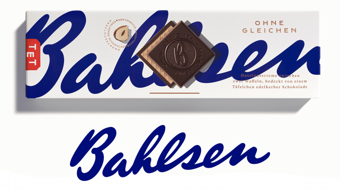
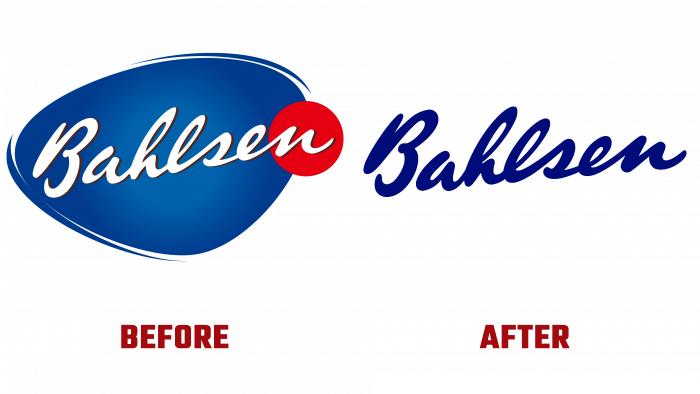
The most prominent element is the blue sign of the company’s founder, which rushes from left to right in a single impetuous stroke as if trying to remove the packaging in a single impulse quickly. All of this is done with a full-color background that can vary depending on the product line. The font color was chosen in a darker and deeper shade than was used in the previous version. The evolution of the sign was carried out very subtly but effectively. An important improvement was its adaptation for high-quality use in digital applications. At the same time, clarity was achieved in the formation of the connection between the letters. At the same time, special attention was paid to the images of products, their selection, which now flaunt on the packaging against the background of the main logo.


