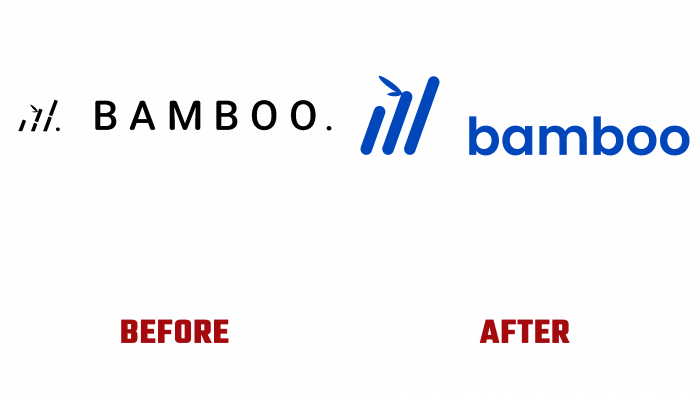
The emergence of cryptocurrencies and other electronic money led to creating convenient ways to manage them. One such option is the Bamboo mobile app for automated micro-investment in digital assets. With its help, it is convenient to manage operations with cryptocurrencies and precious metals in the presence of a mobile gadget and a bank account. Development from Bamboo Core AG of San Diego Area, the US, from January 1, 2018, working in cryptocurrencies, financial technologies, and precious metals, has managed to establish itself as a convenient and effective application. The growth in the number of users, the constant introduction of new features, the simplification of the functionality, and the expansion of its range have led to the need to revise the visual identity of Bamboo.
The peculiarities of today and the opening prospects for the widespread adoption of electronic money led to the adoption of an important decision – the need to improve the visual identity of the Bamboo application. For this, a more attractive design was created, which will better and more efficiently convey information about the software product’s features, capabilities, and benefits.
The new logo has retained the general concept of the familiar to many versions of the old visualization. In the updated interpretation, it has acquired additional meaning, becoming less rigid. Three sticks, symbolizing Bamboo, have acquired a right slope, which characterizes the prospects for growth, moving forward in its development, and improving the application. All sharp corners in the logo elements have been rounded. The gaps in the old logo, like the bamboo trunk segments, have been removed. Due to their absence, the new visualization has become especially convenient for high-quality displays in digital format.
This graphic solution made the design less strict, more fun, and attractive. Selected to reflect the name of the application, the capital font with soft curves and curves reflects the logo owner’s friendliness and sensible approach to development in finance. In the unity of its perception, the whole composition creates an exciting and unique appearance that, on the verge of provocation, demonstrates the courage of development, its accessibility, and the necessity in modern conditions. Its close-to-cobalt color and the original graphic design of the Neometric Bold typeface ensured the emblem was easy to remember and had a powerful visual impact on the viewer.


