Manufacturer of healthy and sustainable products – bath cloth, paper towels, bamboo-based baby wipes – Caboo has updated its visual image. Founded to provide people with the comfort they need while preserving forests and trees from destruction, the company manufactures at US plants. It has offices in Canadian and farms located in China. Two important priorities characterize the brand – people and trees are always of primary importance for the company. Its products are distinguished by a high degree of environmental friendliness and the safety of people’s health. Neither chemicals nor water are used to produce products, which ensures the complete absence of environmental pollution. By growing bamboo on their farms, Caboo has made wood-based paper obsolete. With its offerings, the brand actually and figuratively saves people’s butts. To expand its product reach, increase sales volumes, and communicate more fully and more attractively about itself and its offer, the company, together with Julie Kucinski (Minneapolis, MN), has adjusted its strategy. Based on this, the narrative’s focus was changed, which became the reason for contacting the professionals of Abby Haddican Studio to develop a new design.
The new visualization created a new brand voice that allowed Caboo to speak to the most avid greens and focus on strategy with the largest customer base on an emotional level. At the same time, external identification effectively used the image of bamboo and such cute and attractive animals as pandas directly related to it. The entire identity narrative has been changed to a more popular and optimistic one, focusing on what modern humanity is particularly concerned about: the protection of forests and the animals that live in them.
The result of this approach was a very attractive brand with an accent symbol in the form of a wise owl. At the same time, the company’s “forest friends” were also presented to the viewer in the form of colorful illustrations of trees and animals that cheer up customers. Original visual effects have been applied here, in which paint and faces jump from large shelves of boxes, which has an immediate and perceived impact. In this way, a graphical menagerie thanks people for choosing a product that does not cause tree death.
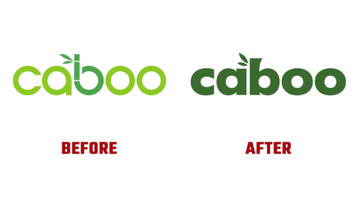
At the heart of the branding is a call to educate, inspire and add playfulness to everyday experience, which is achieved beyond the original illustrated material by taking a less literal approach than was done in the old logo while retaining its reference. The new anatomy of bamboo, in a flared sans-serif, resembles the protruding nodes of the plant and effectively integrates the leaves that sit on top of the “a.” The rejection of the strict geometry of typography makes the logo warmer and less mechanical.


