Various speculations around the Bandai Namco brand have already appeared in the press and media; if their rebranding is too large-scale, they have changed something. They return it; then they separate, then they reunite. The fans themselves are already confused.
As for Bandai Namco itself, it is a large Japanese company specializing in developing video games and music and video products classified as its intellectual property.
The brand was born in 2006 due to the merger of the video game departments of the two brands Bandai and Namco. Interestingly, previously the company was generally called Namco Bandai Games, and later, in 2014, it was renamed Bandai Namco Games.
Continuing this chain of transformations, it is worth adding that there was also Bandai Namco Holdings, later named Bandai Namco Entertainment.
Representative offices of the brand are located in different parts of the world – in North America, Europe, Asia, Australia, and New Zealand. And the headquarters is located in Shinagawa, Tokyo, which remains unchanged.
It doesn’t make sense to spin the tangled biographical webs of the company’s history, but it should be noted that these are great originals. In 2010, Namco Bandai Games was listed in the Guinness Book of World Records as the company with the most video ads for the same product. It was Solatorobo: Red the Hunter. The company has created 100 versions of advertisements according to the 100 chapters of the game. One can only envy their dedication and dedication.
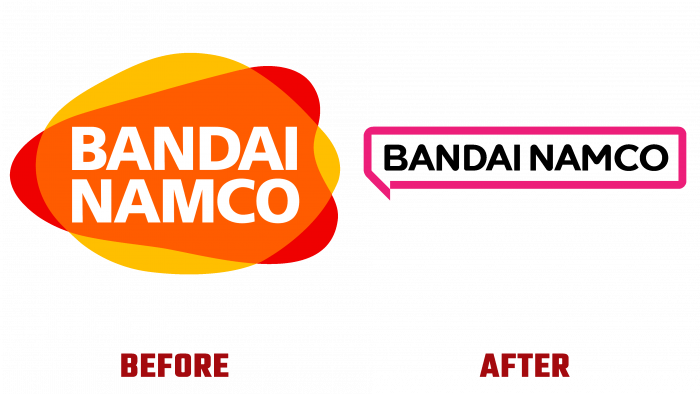
Now, as part of the rebranding, they have changed the logo. We must assume that the era of “ancient” video games is leaving with the old; it’s like saying goodbye to what was before.
The new logo expresses a new vector of brand development – the embodiment of a new goal. And what is the goal of a game tycoon? Entertainment is accessible to everyone. Modest and tasteful, knowledgeable. This entertainment brand has long become a favorite worldwide for its versatile and extraordinary creative character, bright charisma, and wit.
Paying tribute to Japanese culture and manga, which has become a popular genre worldwide, the creators of the new logo made an interesting knight move. First, three colors were used, at the intersection of which a fourth appears.
So, we have white letters of the brand name, which are located inside an orange ball, applied with a layer on a red spot, reminiscent of the “play” button. In this case, the yellow edges of the orange spot still appear when approaching the border of the red one. And the font is too simple and silent—no hint of gaming activity other than vibrant colors and button styling.
Some attentive and dedicated users say there are associations with the logo of a large Japanese bulletin board. But it didn’t go beyond the gossip and idle chatter that filled social networks. Even the brand representatives themselves are silent because they are “above” all this. Their minds are in the clouds in search of inspiration and creative insights.
Let the logos be developed by designers and the branding and advertising fields. Because it was not the logo that earned Bandai Namco’s excellent reputation, but the quality of the engaging content produced.


