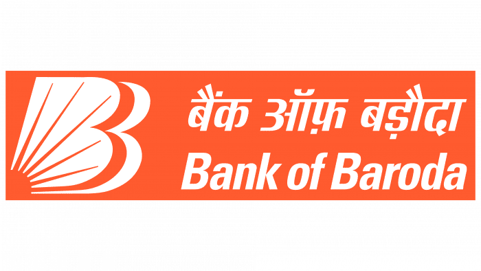
With the opening of this bank for the Indians, the sun rose. The institution provides financial support to people through lending. The Bank of Baroda logo indicates the leading position of the organization in the financial structure of India.
Bank of Baroda: Brand overview
| Founded: | 20 July 1908 |
| Founder: | Sayajirao Gaekwad III |
| Headquarters: | Vadodara, Gujarat, India |
| Website: | bankofbaroda.in |
Bank of Baroda is a banking institution founded in 1908 by maharajas and state reformer Sayajirao Gaekwad III and a group of the richest individuals in India. It is currently one of the top three financial lenders in the country.
The career of BoB (as it is called in abbreviated form) began with personal contributions from the Baroda region’s noble representatives, so the company started as an individual structure. Gradually, the banking organization expanded its activity area, covering Kenya and Uganda, where it opened its branches. She then extended her influence to Europe, founding a London branch in the UK. In 1969, the bank was nationalized and passed under the state’s jurisdiction, without losing its popularity and well-deserved success in the financial sector.
Many years later, in September 2018, the institution was slated to merge with two more financial companies – Vijaya Bank and Dena Bank. This procedure was officially completed in April 2019. Since the merger initiator was BoB, who made a significant monetary contribution to the common fund, the new structure received his name. This is how India has the third-largest lender after SBI and ICICI bank.
Meaning and History
One of the largest state-owned banks in India was founded in 1908 under the name The Bank of Baroda Limited. It was created by the Indian prince Sayajirao Gaekwad-III, who was the ruler of the native principality of Baroda until 1939. He rented a small office in the city center and went there on an elephant to make the first deposit – a silver plate with gold coins. Thus began the history of the Bank of Baroda, also known as BoB. Its modern sun-letter “B” logo was developed only in the 2000s. Before that, it used a “cold” white and blue circle with several symbolic elements that indicated the connection of a commercial financial institution with industry and agriculture.
What is the Bank of Baroda?
Bank of Baroda is one of the largest Indian credit and financial institutions. It has over 8,000 branches in India and more than 100 international offices in the USA, Australia, UAE, Canada, the UK, and other countries. The bank was established in 1908 and was nationalized in 1969. BoB offers various services, including insurance, lending, investments, deposits, currency exchange, and international transfers.
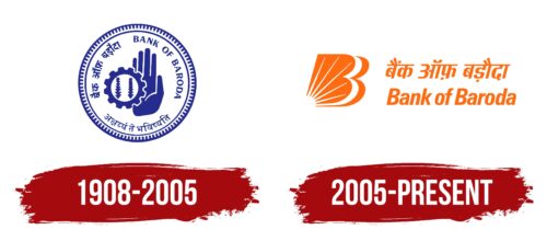
1908 – 2005
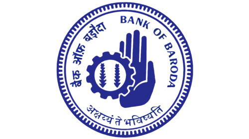
The original logo for Bank of Baroda featured its name in navy blue. It was located in the upper right corner inside the circle and was located along the border; that is, the letters were lined up in the form of a semi-arc. The ring of text was closed by two more inscriptions: in Gujarati and in Hindi. These languages, along with English, dominated the region where the bank was founded, which explains their simultaneous use of the same emblem. The Sanskrit signs were to be read as “Akshayam te Bhavishyati” which means “the future is safe.” The inspirational phrase referred directly to the work of a financial institution that aspired to the status of the most reliable depository.
The same blue rings surrounded the text. One of them was even, and the second contained many small notches directed inward at the ends. In the center of the logo was a composition of gear and two stylized ears of corn. The first element symbolized industry, and the other two symbolized agriculture. This was a reference to the areas of activity with which the Bank of Baroda was associated and which he helped to develop. And on the right was an open palm with fingers raised up. Such a simple but symbolic gesture should be understood as a call not to worry about anything.
2005 – today
In 2005, an unknown designer designed the logo for Bank of Baroda, which was officially unveiled on June 6th. Around the same time, the financial institution signed a contract with Rahul Dravid so that this athlete, known as Mr. Dependable, became a brand ambassador. All the changes were aimed at preparing for introducing revolutionary reforms, opening additional branches, and installing thousands of ATMs in different localities. That’s why the new emblem is so positive.
Unlike the previous version, the modern logo does not contain spikelets and gear in a circle but a triple letter “B” with rays diverging in all directions. With the “solar” emblem, BoB wanted to show that he is as omnipresent as the sun and just as important to the planet. After all, this bank operates in India and other countries, of which there are more than twenty. And he positions himself as the one who gives life and maintains its existence. As for the three “Bs,” they are layered, and none of them have intra-letter gaps. The first and third “B” is orange. They stand for the initials of the Bank of Baroda. The second letter, placed between them, is formed by the negative space of white.
Obviously, the new design is aimed at the younger generation. Because of the white ray-like halo, it is called Baroda Sun. This is a symbol of a source of light that warms with its warmth and saves us from the darkness. Similarly, BoB tries to help everyone in terms of financial needs. At the same time, the bright orange color scheme represents energy and hope for the best. It is used not only for stylized “B” but also for inscriptions that are located on the right. The top line is the brand name in Hindi; the bottom line is English. In the second case, the phrase is in Univers Condensed Bold font.
Bank of Baroda: Interesting Facts
Bank of Baroda is a key player in India’s banking sector and has a strong international presence.
- Early Days: Founded in 1908 by Maharaja Sayajirao Gaekwad III in Gujarat, India, the Bank of Baroda aimed to meet the region’s economic needs.
- Going Global: It opened in Kenya in 1953, becoming one of the first Indian banks to branch internationally. It has branches across continents, including Africa, Asia, the Middle East, Europe, and North America.
- A Major Merger: In 2019, the Bank of Baroda merged with Vijaya Bank and Dena Bank, creating India’s third-largest bank in loans and deposits.
- Innovative Banking: It adopted CORE banking solutions in India, allowing customers to access their accounts from any branch.
- Wide Range of Services: The bank offers everything from personal to investment banking, insurance, credit cards, and asset management.
- Digital Leap: The Bank of Baroda has embraced digital tech with a solid online banking platform, including mobile and internet banking, to improve customer service and efficiency.
- Social Responsibility: It is committed to positively impacting education, healthcare, and rural development.
- Awards and Recognition: The bank has earned many accolades for its services, innovations, and contributions to banking.
- Brand Symbol: Its logo, a bar underlining ‘Baroda,’ signifies trust and reliability in its services.
- Reaching Out: The Bank of Baroda focuses on financial inclusion, bringing banking services to the unbanked, especially in rural and remote areas.
From its beginnings in a princely state to becoming a global banking force, Bank of Baroda’s journey highlights the evolution and modernization of Indian banking, showing its ability to adapt and its dedication to serving customers’ changing needs.
Font and Colors
The bank’s symbolism is a successful combination of text and graphics. On the left is a hand-drawn character in the shape of a large “B.” The letter is double, which is emphasized by the right-sided outline, which repeats the silhouette formed from the name “Bank of Baroda.” It contains both Bs at once. The symbols are separated by white space of the same configuration. In the lower-left corner, there is a half-disk of the sun with rays going up. They are depicted as five thin stripes of different lengths.
The second part of the logo is an inscription made in two languages. At the top, Hindi is used – the state language in India. The text is written in a special calligraphic script called Devanagari, with a special connecting line. Below is the same phrase, but in the English version. This is because many people in India communicate in English, as the country used to be the largest colony of Great Britain.
Although the logo contains inscriptions in two languages, they use the same type of typeface. This technique makes the emblem stylistically integral. Phrases have a slight slope to the right. The first letters in words are uppercase; the rest are lowercase. Sans Serif of medium thickness is used as the base font.
All elements are painted in one palette, which consists of a combination of white and orange. Moreover, the latter color has a pastel shade close to the color of a sandy desert.
Bank of Baroda color codes
| Halloween Orange | Hex color: | #f15a29 |
|---|---|---|
| RGB: | 241 90 41 | |
| CMYK: | 0 63 83 5 | |
| Pantone: | PMS 172 C |
