Barnardo’s, the UK’s leading children’s charity, renowned for over 150 years of service, has launched a significant rebrand to modernize its image and strengthen connections with young people. Annually handling around £200 million through over 600 charity shops and 800 services, Barnardo’s has realized that despite its well-known name, many young people are unaware of how the charity could support them.
Partnering with The Clearing, a London-based branding agency, Barnardo’s has rejuvenated its visual identity and communication strategies to resonate more with today’s youth, addressing their current challenges. Changes in living conditions, impacts from the pandemic, and the digital nature of modern life have altered the landscape that today’s children navigate, increasing feelings of social isolation and anxiety.
The rebrand aims to make every child feel valued and included. Insights from workshops with children revealed many felt disconnected and unsupported, prompting a rebrand that positions Barnardo’s as more approachable and relevant. The new brand design was co-created with children who use Barnardo’s services across Wales, Scotland, and England, integrating their input directly into the creative process to ensure authenticity and engagement.
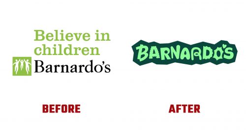
The updated logo symbolizes a safe space, incorporating different emotions into each letter to reflect the varied experiences of the youth it supports. This design choice brings a fresh visual appeal and aligns closely with Barnardo’s mission to provide inclusive support.
Previously, Barnardo’s logo depicted a child being uplifted, using a classic serif typeface that, while meaningful, didn’t capture the vibrant ethos the charity now strives for. The new design shifts away from this, using a bespoke typeface and a playful color palette to inject energy and modernity into the brand.
The rebrand extends to all aspects of Barnardo’s visual communication, employing dynamic shapes and the new custom typeface across various media. This approach enhances the charity’s materials, making them more engaging and accessible to a young audience, breaking down any perceived barriers of formality.
This overhaul signifies a fundamental shift in how Barnardo’s communicates its mission, reflecting a deeper understanding of contemporary challenges faced by youth. By involving young people in the redesign process, Barnardo’s has taken a significant step toward ensuring its services are visible and appealing to those who need them the most.
The new identity is a cosmetic update that redefines Barnardo’s role as a supportive figure in the community. It highlights the charity’s adaptability and commitment to supporting children and families, emphasizing the importance of engaging young people in meaningful discussions about their needs and how best to address them.


