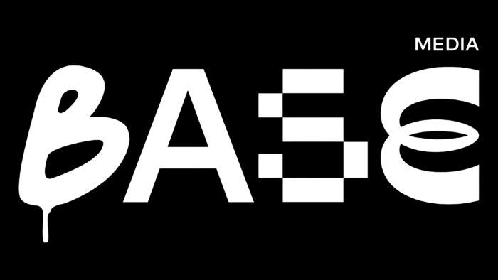
Founded in 2020, the Base media content studio has become the owner of a modern visual identity that reflects its features and basic principles. Positioning itself as a representative of the hipster trend, it does not distance itself from other trends. This brand is characterized by an original mixture of styles and images, demonstrating metamodernism and post-irony. It is no stranger to classic images and strict suits with envelopes or Mohawks. Based on the features and uniqueness of the brand itself, its new visualization was built on completely different principles, which contributed to creating a unique image, possessing attraction and explosive demonstration system, breaking established principles and traditional methods of building an identity.
The company logo reflects the true meaning of the brand, which ensures its literal demonstration and supports the semantic load formed in the brand name itself. The entire communication and architecture of the graphic reflection are built on this. The logo is designed to be dynamic, constantly changing its size. It stretches and forms a visual basis, created to accommodate the required values or pre-designed elements. This way demonstrates the possibility of having different contents, from absolutely insane to reflecting the deep idea of conformity, which is formed on a single and common basis.
As the basis of the visual concept of the brand, the logo took on all the main visual load. This was ensured by the dynamics of the first letter B, which appears to the viewer in three non-standard designs, alternately changing each other. As well as the combination of letters in a text module, each of which is written in a non-sensational font. To meet the requirements of modern minimalist style text – the name of the brand is created in monochrome, and each letter of the font is equal in height to the others. On the right side, above the text sign itself, there is a field with the constant change of three words – media, music, and prod, providing the user with more information about the company’s main focus.
To ensure the attractiveness and memorability of the icon were built on the original dynamic solutions, which were widely used to display logos with other elements. Eccentric drawings, photos, and gifs formed the basis of graphic elements in which, in addition to the dynamics, the composing additions in light pink tone were used to create contrast. Non-observance of the rules of construction of graphics and proportions – all aimed at creating a unique “hipster” atmosphere.


