This year Ireland, a relatively small but very proud part of the British Crown, is hosting the European Small Countries Basketball Championship. This is a good time to present the new identity of the basketball steering committee to the audience and connoisseurs of the bright game.
The rebranding touched all aspects of visual communication; the familiar logo and website needed an update for a long time.
Adam Ingler was commissioned to develop a creative identity project. Interestingly, his parents are coaches Annette and Marc, who founded the DCU Mercy team from Dublin City University, and the creator himself played in this club. Therefore, the brand identity was entrusted not to an amateur but to a person who stood “on the other side” of the field.
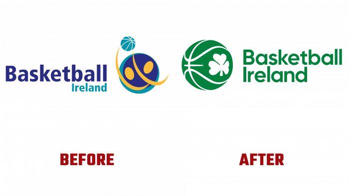
The nondescript, faceless emblem that used to be blurred the identification of Basketball Ireland. She had purple, yellow, light green shades with abstractions. These are the figures that hit the basketball, and nothing interesting.
In contrast to the old logo, a new version appears. Memorable, vibrant, competitive, and Irish. A juicy emerald color, with the ball, turned to see a leaf of clover with three petals – the national symbol of Ireland and stripes that are characteristic only of a basketball. It all looks playful and not boring. On the right side are the two parts of the brand name that form “Basketball Ireland.” Even though the inscription looks massive on two floors in large letters, the name and symbol look organic and indivisible. The font, by the way, is sans serif, simple and even – Gilroy. The same tones are used for the website’s design, so everything fits together and creates a pleasant visual atmosphere for inclusion in the game.
The author of the creative himself believes that he managed to create something fresh and original to distinguish Ireland as a nation and express respect for the basketball community.
We can say that the designer did a good job. There will be no confusion of meanings or double associations when considering a new identity.


