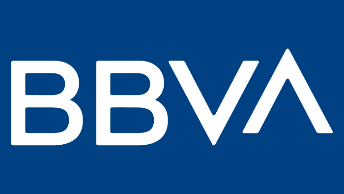
We will give you more than you expect, says the BBVA logo. The image shows that the bank is not afraid of difficulties, and its employees are fluent in financial instruments. Cooperation with an institution will lead to the top.
BBVA: Brand overview
| Founded: | May 28, 1857 |
| Headquarters: | Bilbao and Madrid, Spain |
| Website: | bbva.com |
Meaning and History
Not so long ago, the company undertook a rebranding, modernizing the logo and uniting its branches under one name, “BBVA.” The new identity was to reflect the unity of all parts of the group. She also had to show the bank’s transformation, which was constantly improving but did not change its image for 19 years. In the past, the redesign was much more frequent and was associated with a change in a financial institution’s structure or the search for an individual style.
What is BBVA?
BBVA stands for the Spanish company Banco Bilbao Vizcaya Argentaria, which appeared in 1857 under the name Banco de Bilbao. Since then, it has transformed into an international financial group with a universal range of services – from investment to insurance. It is now one of the largest banking institutions in the world, represented in more than 30 countries, including Romania, Italy, Turkey, and the United States. BBVA is most popular in Latin America.
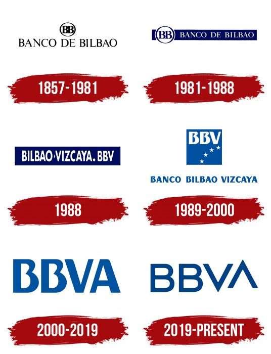
1857 – 1981
In 1857, the Banco de Bilbao was founded, named after its hometown. It is one of the two predecessors of the modern BBVA. Its emblem consisted of a “BB” monogram inside the ring and was complemented by the word mark “BANCO DE BILBAO.” All letters except “O” had short sharp serifs. The thin font was in line with Roman tradition, and the black and white color scheme was in line with 19th-century typography.
1981 – 1988
In the 1980s. Banco de Bilbao approved the logo with a blue rectangle as the background for the lettering. The monogram has moved to the left and remains inside the circle outlined with a dark outline. The name of the financial institution was white, and the letters “BB” turned blue.
1988
In 1988 Banco de Bilbao decided to merge with another Spanish bank – Banco de Vizcaya. When the merger agreement was signed, the newly formed Banco Bilbao Vizcaya used a rectangular logo with its name and the abbreviation “BBV” after the big dot. All lettering was in bold Futura Condensed sans serif. The color scheme resembled the Banco de Bilbao logo’s palette: white text on a dark blue background.
1989 – 2000
The merger procedure was completed in 1989. Simultaneously, the official registration of the BBV brand and a change in its identity took place. She was designed by specialists from Artime, Nebot & Capell. They replaced the rectangle with a square and placed it on top, and inside they placed the abbreviation “BBV” and an arc of four five-pointed white stars. Under the rectangle was a blue inscription “BANCO BILBAO VIZCAYA.” The font was disproportionate: the letters consisted of lines of varying thickness.
2000 – 2019
After the merger of BBV with the public bank Argentaria, a financial institution called Banco Bilbao Vizcaya Argentaria was formed. Its logo was much simpler than its predecessor: it contained only the blue letters “BBVA.” They used the same font that used to write the abbreviation in the square.
2019 – today
The brand needed a reboot, especially after the change of leadership in 2019. The new president of Carlos Torres hired the prestigious consulting firm Landor, and specialists, together with their BBVA team (50 designers from different countries), began to develop a modern corporate image. Representatives of DDB and BBVA Creative agencies participated in the process. Creative searches, a survey of 5,000 people, and creating a corporate identity took four months.
The banking group’s deposition took place at the structural level: all branches, except for the Turkish one, received the common name BBVA and one logo at all. The design update was not fundamental: the traditional bank signature changed the font and had an “A” at the end. Over the next year, the wordmark was integrated into 3,000 e-applications and 8,000 offices.
The designers deliberately did not use graphics because they had a completely different task: to depict the company’s name without additional decorative elements. They decided to play on the letters’ shape, using “V” and “A” to create a diagonal.
Two of the same signs, which are directed in opposite directions, symbolize balance. The “A” is slightly raised above the string, so it appears to be flying upward. There are associations with growth and forward movement. Also, both letters look like arrows, which is a reference to the digital world. This iconography brings the bank closer to the Internet and technology. One arrow looks up and the other down, and this is also no coincidence. The peaks and troughs are reminiscent of the jumps in the stock market.
BBVA: Interesting Facts
Banco Bilbao Vizcaya Argentaria (BBVA) is a major Spanish banking group known for its long history and impact on global banking.
- Formation: BBVA was created in 1999 by merging Banco Bilbao Vizcaya and Argentaria, established in the 19th century. It is now one of Spain’s biggest banks.
- Worldwide Operations: BBVA operates in over 30 countries, with a strong presence in South America, the United States, and Turkey, highlighting its global reach.
- Digital Banking Leader: BBVA is recognized for embracing digital early on and investing in technology to enhance customer service and efficiency.
- Economic Insights: Through BBVA Research, the bank offers insights on economic and social trends, showing its role in global economic conversations.
- Sustainable Practices: Committed to environmental sustainability, BBVA aims for carbon neutrality by 2050, supporting green projects and reducing its carbon footprint.
- Strategic Moves: BBVA has expanded globally through acquisitions, such as Compass Bancshares in the U.S. and Garanti Bank in Turkey. In 2020, it sold its U.S. operations to PNC to focus on core markets.
- Fintech Collaboration: BBVA partners with startups to introduce new financial technologies, including artificial intelligence and blockchain.
- Cultural and Scientific Support: The BBVA Foundation funds research and cultural activities in various fields, including its Frontiers of Knowledge Awards.
- Award-Winning Mobile Banking: BBVA’s mobile banking is recognized for its ease of use and comprehensive features, catering to the digital preferences of consumers.
- Financial Education: BBVA emphasizes financial education with resources and programs aimed at helping people make informed financial choices, reflecting its dedication to social responsibility.
BBVA has grown from a local Spanish bank to a global financial leader by focusing on innovation, sustainability, and social responsibility. It distinguishes itself in the banking world through digital transformation and global problem-solving.
Font and Colors
The biggest change in 2019 was the font update. Designers have ditched asymmetric shapes, rounded edges, and individual style in favor of typography without unnecessary elements. They took the Benton Sans BBVA typeface as a basis but completely redesigned the last two letters. As a result, “V” and “A” look the same and have an angle of 180 degrees.
The color of the logo has also changed, although not so much. It stayed dark blue, just a change to Yale Blue (# 14549C).
BBVA color codes
| Safety Blue | Hex color: | #004284 |
|---|---|---|
| RGB: | 0 66 132 | |
| CMYK: | 100 50 0 48 | |
| Pantone: | PMS 2945 C |
