Beem, an innovative brand committed to democratizing renewable energy for individuals, has unveiled a new logo and brand identity, reflecting its vision to simplify and enhance how people produce, consume, and save energy. Founded by three optimists passionate about sustainable living, Beem has rapidly become a consumer favorite by offering an ecosystem of user-friendly products designed to manage renewable resources efficiently. The highlight of Beem’s product lineup is its do-it-yourself solar kit. This modular, aesthetically pleasing solution connects to an app, allowing users to generate green energy within an hour of installation.
With a recent €20 million funding boost from a series A round in spring 2023, Beem is poised to expand its reach across Europe and continue its research and development efforts to introduce new products. The company has set an ambitious goal to support over 500,000 households in their energy transition by 2030, underscoring its commitment to making sustainable energy accessible to a wider audience.
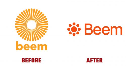
The Beem logo, part of the brand’s refreshed visual identity crafted to convey its mission better, represents a significant evolution from its predecessor. While the old logo was noted for its vibrancy, it was more reminiscent of a flower than the sun. The new design cleverly combines simplicity with symbolism, featuring sun rays composed of abstract houses that represent the sun and invoke the image of a sunflower known for its heliotropic nature. This association reinforces Beem’s focus on solar energy and its role in supporting eco-friendly household energy production.
Complementing the logo uses Manrope for the wordmark, achieving a balance between clarity and appeal that enhances the overall brand presentation. However, the broader brand applications have received mixed reactions for their somewhat generic execution and the introduction of Gazpacho as the headline typeface, contrasting with the logo’s minimalist charm.
Despite these criticisms, Beem’s new identity successfully captures the essence of its mission through engaging photography and clever copywriting, including playful references like “Okay, Beemer” and “Here comes the sun.” A sun mascot and distinctive solar panel designs add unique elements to the brand, although they could benefit from further development to achieve a more cohesive narrative.


