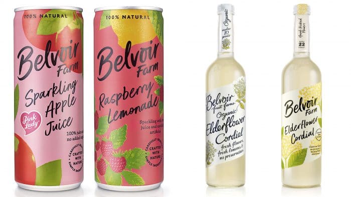
B&B has helped freshen up the brand and focus on naturalness.
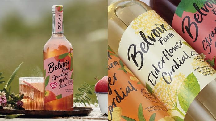
British firm Belvoir Farm intends to increase sales by attracting young people. The new style and packaging design created by B&B studio attract with a riot of colors and beautiful graphic elements.
The roots of the British brand became the basis for the rebranding. Forty years ago, the first bottles of elderberry liqueur were created on a family farm in the Belvoir Valley. Even now, the business continues to use the farm for harvesting elderberries and producing liquor and sodas.
The B&B team decided to use the brand’s philosophy and emphasize naturalness and unity with nature. The issue of ecology in the modern world is discussed in any field, and brands, to increase customer loyalty, are engaged in the protection of flora and fauna. Belvoir Farm carefully selects ingredients for the production of its products and does not use preservatives or flavorings.
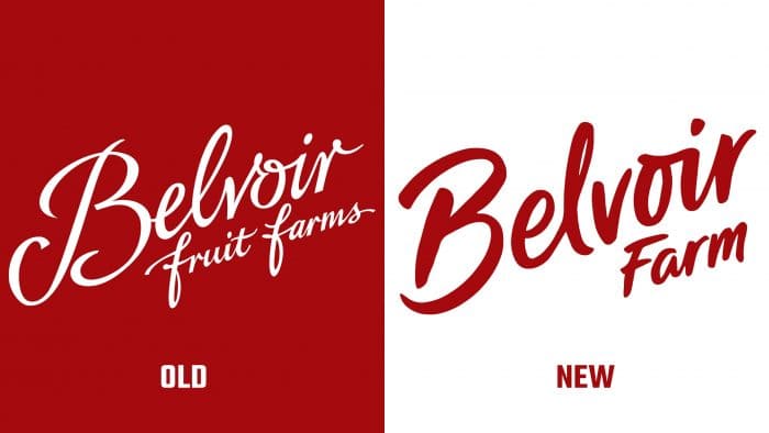
Naturalness became the basis of the new design. Rachel Joy Price, the artist who designed the logo, used a handwritten slanted typeface. All illustrations were developed by the studio independently, and we can see that the result is a bright and attractive design. The B&B team has created a modern solution that informs the consumer about its roots and history, wild nature.
The illustrations of the ingredients show how they grow naturally before being used in the beverage industry. According to the Pev Manners farm owner, the peculiarity of the brand is that the locals help to harvest the elderberry and even do it in their gardens.
The slanted labels and the calligraphic script, and natural product images have become more modern, without a hint of rustic style. B&B studio will continue to work with the company and will deal with social media and advertising.
