The Italian food company chose the Bertolli logo in a classic style with large block letters. They make the inscription clear and visible so the name immediately catches the eye. For greater concentration of attention, the designers circled it with a red oval and added a coat of arms with a crown at the top.
Bertolli: Brand overview
Bertolli is a well-known Italian food production company. The brand appeared in 1865 as a producer of olive oil. Over time, the company’s product range has expanded. Now, she produces preserves and sauces, which are popular far beyond the borders of Italy.
In 1865, Francesco Bertolli and his wife, Carolina, started a small grocery shop in Lucca, a charming town in Tuscany, Italy. They sold olive oil and other local foods, beginning a journey to turn Bertolli into a name known for top-notch Italian cooking.
The big change came when their sons, Giuseppe and Giovanni, took over in 1875. They opened a warehouse in Livorno, a nearby port city. This was Bertolli’s first step in sharing their olive oil with the world beyond Italy.
By the early 20th century, Bertolli was in charge of exporting olive oil from Italy, winning over customers in Europe and America. They were innovators, among the first to use bottles and tin cans to package olive oil.
The expansion didn’t stop there. In the 1920s and 1930s, under the leadership of Guglielmo Bertolli, a third-generation family member, the company grew even more. They added vinegar, tomato paste, and canned vegetables to their product line and opened new manufacturing plants.
After World War II, as Italian cuisine became popular worldwide, Bertolli was ready to supply the growing demand. They began selling their products in the United States, Japan, Australia, and other countries.
The 1970s and 1980s were times of further growth. Bertolli introduced pasta sauces, frozen meals, and flavored olive oils. They also started buying other Italian food brands, like Carapelli and Sasso, increasing their culinary influence.
In the 1990s, Bertolli moved to get even more people to recognize and trust their brand. They worked with the American Heart Association and the American Culinary Institute, which helped enhance their reputation for quality and authenticity.
In 2008, Bertolli joined forces with Unilever, a big international company. This partnership led to new products, like premium olive oils and high-quality frozen meals, while keeping true to Bertolli’s Italian roots.
Today, Bertolli is celebrated in over 40 countries as a symbol of Italian cooking. Despite the changing food industry and what people want, Bertolli has stayed relevant and loved. Their commitment to quality and tradition pays homage to their beginnings in Tuscany while adapting to modern tastes.
Meaning and History
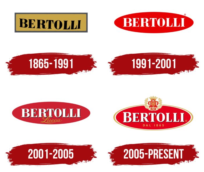
The logo’s first version was relevant for over a hundred years, but there have been as many as three redesigns since 1991. Visual recognition of the brand “Bertolli” is at a high level. All variations of the logo look authentic and luxurious. They reflect the company’s history and heritage.
What is Bertolli?
First of all, this is a company that has established itself as one of the leaders in the Italian market for the production of canned food and other food products over the years of its existence.
1865 – 1991
The first version of the logo was introduced in 1865. It contained the company’s name on a golden background. The word signature “Bertolli” used a classic sans-serif typeface. Capital letters are easy to read, so the buyer had no problems identifying the brand on store shelves. Despite the severity and conciseness, the logo looks quite high-quality and natural, given that, at that time, the company was selling olive oil.
1991 – 2001
The logo variant that appeared in 1991 significantly differed from its predecessor. It was an emblem, the features of which were minimalism and not overloaded with unnecessary elements. The company name, in white letters, was inside a red oval. The classic bold serif font with white caps looks fresh and modern. Around the name, you can see the light black letters that create a shadow. Thus, “Bertolli” customers felt the three-dimensionality of the picture.
2001 – 2005
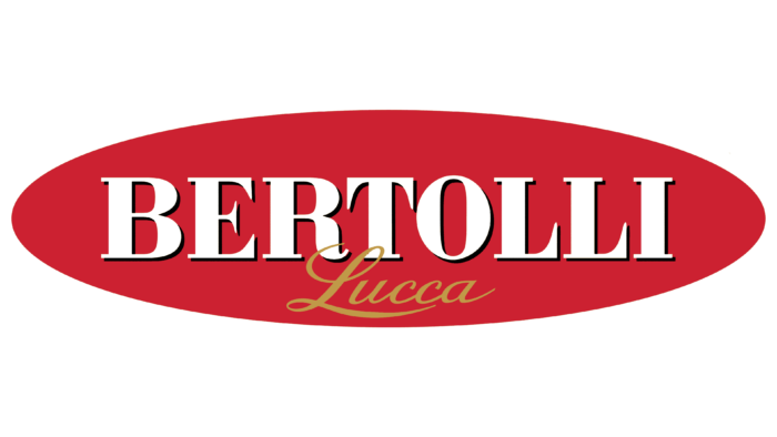
The 2001 update made the logo more modern and confident. The rich red color of the oval looked quite impressive in the context of the verbal inscription. The font style has remained unchanged. At the same time, not black but a barely noticeable green outline was used at this stage. Below the main title was the word “Lucca” in cursive letters using gold.
2005 – today
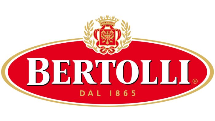
Again, the word inscription remained unchanged in terms of the font and the style used. At the same time, the red oval received a double contour – white and golden. With the help of this element, a feeling of confidence and strength was created. Instead of the word “Lucca,” the inscription “Dal 1865” appeared. It is done in dark yellow capital letters using a classic sans-serif typeface. However, the main change concerns the addition of the coat of arms at the top of the oval. It depicts a royal ornament, indicating that the company is one of the leaders in the market.
Font and Colors
Even though the brand name used a classic font, it looked stylish and modern, making the company stand out. This chic font with serifs and capital letters immediately grabs the target audience’s attention. Globally speaking, the font “Bertolli” is as close as possible to FS Sally Pro Heavy and URW Antiqua ExtraNarrow Extra Bold. However, they have been slightly modified.
The logo’s basis is the red, white, and gold color palette. This combination directly indicates that the company is a respected and powerful project in the market, including its considerable experience, which it values above other qualities.
FAQ
Is Bertolli an Italian brand?
Bertolli is an Italian brand with a 150-year history, starting in Lucca, a small town in Tuscany, Italy. It’s well-known for making high-quality Italian food products. One of their most famous products is their extra-virgin olive oil, now sold by Deoleo. They also offer tasty sauces from R&B Foods and various frozen meals and desserts from ConAgra.
Bertolli started locally but is now known worldwide. The brand keeps traditional Italian flavors alive while ensuring they fit today’s tastes and diets. This mix of staying true to its roots while innovating has made Bertolli very popular.
Their extra-virgin olive oil is a big hit for its quality and taste. It’s essential in Mediterranean cooking and as a finishing touch that adds flavor to food. Bertolli’s sauces bring the taste of Italy’s regions into your home, making it easy to enjoy Italian flavors without much effort.
Bertolli also makes frozen meals and desserts that are easy to prepare and fit well into today’s busy lives. These products show Bertolli’s focus on quality and effort to keep Italian cooking traditions alive while being practical for modern life.
In short, Bertolli takes pride in its Italian roots, offering a wide range of food products that celebrate Italian cooking traditions. They manage to keep the traditional appeal while meeting the needs of today’s kitchen, which is why they’re loved worldwide.
Where is Bertolli from?
Bertolli started in 1865 in Lucca, Italy’s Tuscany region. Francesco Bertolli and his wife, Caterina, opened their store there. Lucca was a great choice because it’s close to many olive groves, which are key for making olive oil, one of their main products.
At first, they sold wine, cheese, olives, and olive oil. They chose these items carefully because they’re all important in Italian cooking. Olive oil, especially, is a big part of what they sell. It’s something that’s been used in Italian food for a long time.
Choosing Lucca in Tuscany was smart because of the location. The area is perfect for growing olives, which helped Bertolli make good olive oil. Their dedication to quality helped Bertolli become well-known all over the world.
Their business wasn’t just a small local shop. They had bigger dreams. Focusing on important Italian products like olive oil helped them connect with people who cared about good food. Starting from Lucca, Bertolli grew to bring Italian tastes to people everywhere.
Bertolli is known for making great Italian food products, especially olive oil. A lot of this success comes from Francesco and Caterina’s hard work and their choice to start in the beautiful area of Tuscany.
What is Bertolli made from?
Bertolli Original spread is made from high-quality olive oil, giving it a unique flavor, and is healthier than butter. It’s great for adding taste to dishes, whether drizzling it over vegetables or pan-frying. The big advantage of Bertolli Original is that it has much less saturated fat than butter—69% less, to be exact. This makes it a good option for people who want to eat well without sacrificing flavor. Using olive oil as the main ingredient is part of Bertolli’s way of making tasty, quality products that fit with Italian cooking traditions and meet the needs of those who are mindful of their health.
How long is Bertolli good after opening?
After you open a bottle of Bertolli Olive Oil, how long it lasts depends on how you store it. Store the olive oil in a cool, dark place to keep it fresh. Close the bottle tightly whenever you use it to keep air out, as air can lower the oil’s quality. It’s best to use the olive oil within a few months of opening it. This way, you get the best flavor and health benefits from it. Remember, storing the olive oil correctly is important to keep its quality high and make it last longer.
Does Bertolli need to be refrigerated?
Bertolli olive oil doesn’t need to go in the fridge. Keeping it there isn’t a good idea because it can get too cold and turn solid, which ruins its texture and quality. The best way to store it is in a cool spot away from heat, but not so cool that it solidifies. An olive oil expert from Bertolli, Paul Miller, suggests storing it at about 68 degrees Fahrenheit. This keeps the oil’s flavor and quality right without getting too hard or going bad from the heat. So, find a place in your kitchen or pantry that’s cool enough to keep your olive oil just right.
What is the meaning of the Bertolli Logo?
The Bertolli logo greatly benefits the brand, especially in showing its role and ideals in the Italian food scene. The crown in the logo isn’t just for looks; it shows Bertolli’s top spot compared to other brands, highlighting its leadership and good name. The logo’s colors are carefully chosen, too. Gold stands for Bertolli’s high-quality ingredients, highlighting the brand’s dedication to top-notch taste. Red adds to the logo by showing the brand’s energy, strength, and constant move towards new achievements and innovation.
The logo’s elliptical shape was picked to show that Bertolli is all about endless possibilities. It means the brand isn’t stuck in one place but is always looking to try new things in food, giving people many options and experiences. In short, the Bertolli logo captures the brand’s history, its focus on quality, and its ongoing effort to bring something new and great to Italian food worldwide.
What does the logo symbolize, Bertolli Logo?
The Bertolli logo represents the brand’s drive for growth, new ideas, and quality in food. The red and gold colors weren’t just randomly picked; red shows the brand’s passion and commitment to always improving and bringing new things to the table. Gold highlights the brand’s top position, aiming to provide the best products that stand out.
The crown in the logo isn’t just for show. This means Bertolli offers premium products and a taste experience fit for royalty. Bertolli is dedicated to bringing its customers the best Italian cuisine, aiming for unmatched quality and taste.
In short, the Bertolli logo stands for the brand’s commitment to being a leader in the food industry by focusing on innovation, quality, and delivering an exceptional taste experience. It shows Bertolli’s dedication to excellence and providing products that are a cut above the rest.
